.webp)
Did you know 96% of visitors leave a website without converting?
With odds like that, every element on your landing page needs to be working overtime.
And brands like Airbnb, Netflix, and Codecademy know that.
They've cracked the code on what makes visitors actually stick around — from compelling headlines and clear value propositions to strategic CTAs and seamless user flows.
Let's dive into 10 standout landing page examples from these industry leaders and other conversion champions that have mastered the art of turning casual browsers into committed customers.
Keep Exploring:
- Discover how a UI/UX designer improves website conversions and the impact of thoughtful design on your bottom line.
- Also, get actionable insights with these 7 landing page design tips to help you build high-converting pages.
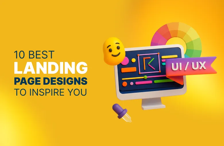
Top 10 Landing Page Examples That Convert
We’ve curated a list of 10 standout landing pages from tech startups, and e-commerce, to wellness brands, breaking down exactly what makes each one a conversion powerhouse:
1. Netflix — Minimalist & Conversion-Focused

Netflix keeps it simple: a dark, cinematic background splashed with popular titles, bold white text, and a single red “Get Started” button.
It’s all about instant appeal — minimal copy, one email field, and a clear promise: unlimited shows and movies for a low monthly price.
Industry: Entertainment
Why We Find It Inspiring:
- Bold Headline: Quickly communicates the core value — endless movies and shows.
- Single-Field Form: A simple email address entry lowers friction and boosts signups.
- High-Contrast CTA: The bright red “Get Started” button draws instant attention.
- Cinematic Hero Image: A recognizable collage adds depth without distraction.
- Transparent Pricing: Clear cost and cancellation terms build trust fast.
- Strong Visual Hierarchy: Headline, copy, form, and CTA flow naturally.
- Concise Copy: Under 200 words makes it easy to scan and digest.
- Dropdown FAQs: Other details and info are there if you want it, but not in-your-face.
Learn more about How Designity’s Eye-Catching Ad Design Boosted Mimio Health’s ROI .
2. Codecademy — Interactive and Tech-Driven

Codecademy’s landing page feels modern and tech-driven, with an animated headline that mimics coding and rotating hero images that add warmth.
Clear signup options and a straightforward message make it easy for users to see the value: gain in-demand skills to move your career forward.
Industry: Education/EdTech
Why We Find It Inspiring:
- Dynamic Typing Effect: The animated headline feels interactive, mirroring a coding terminal.
- Code-Like Branding: Slash prefixes and color changes reinforce the tech theme.
- Relatable Hero Images: Warm, aspirational photos create connection and trust.
- Frictionless Signup: One-click Google sign-in or email keeps it simple.
- Clear Value Proposition: Emphasizes career growth and in-demand skills upfront.
- Eye-Catching CTAs: Yellow buttons pop against a dark, modern background.
- Strong Visual Hierarchy: Headline, message, and CTAs are perfectly prioritized.
- Minimal, Focused Copy: Communicates benefits quickly without overloading text.
- Bold Black-and-Yellow Palette: Reinforces brand identity while staying clean.
- Powerful Trust Signals: Showcases logos of top companies where Codecademy learners work, boosting credibility and results.
3. Calm — Immersive & Emotion-Led

Calm's Landing Page lives up to its name: a full-screen, tranquil mountain-and-lake scene sets the tone instantly.
The headline and subtext are short, soothing, and benefit-driven, with a clear “Try Calm for Free” button that blends soft gradients and rounded edges for a peaceful vibe.
Industry: Health & Wellness
Why We Find It Inspiring:
- Serene Hero Image: A breathtaking mountain lake backdrop instantly conveys peace.
- Simple, Reassuring Headline:“Calm your mind. Change your life.” says it all.
- Minimalist Layout: White space mirrors the app’s calming mission.
- Clear Value Proposition: Establishes Calm as the #1 meditation and relaxation app.
- Soft, Inviting CTA: A gradient “Try Calm for Free” button is prominent but not pushy.
- Clean Navigation: Top nav links are minimal, keeping focus on the core message.
- Gentle Branding: Rounded fonts and subtle gradients align with the wellness theme.
4. Grind — Bold & Playful

Grind brews up a landing page as strong as its coffee: bold pastel visuals, playful packaging, and a punchy headline instantly grab attention.
The design mixes personality with a clean layout, high trust signals, and a sharp CTA, making it both stylish, fun, and conversion-ready.
Industry: E-commerce
Why We Find It Inspiring:
- Bold Hero Design: A pastel-pink background with colorful product photography creates instant visual impact.
- Confident Headline:“This is better coffee.” is short, punchy, and aspirational.
- Strong Value Proposition: Eco-conscious and customer-friendly perks(home-compostable pods, free shipping) are highlighted upfront.
- High Social Proof: Trustpilot reviews and press logos add credibility and brand authority.
- Clean, Focused Navigation: A slim, well-structured nav bar keeps attention on the product.
- Conversion-Driven CTA: “ Shop now” button contrasts sharply against the pastel palette, making it easy to take action.
- Playful Branding: Custom packaging, typography, and color choices communicate personality and premium quality.
5. One Dutch — Minimalist & Immersive (By Designity)

With muted tones, soft shadows, and a textured backdrop that feels like sunlight streaming through a boutique apartment, One Dutch’s homepage blends hotel-level sophistication with the warmth of a friend’s city flat.
Designity’s work keeps the layout ultra-clean — a centered booking form, sleek typography, and intentional white space evoke trust, serenity, and exclusivity.
Industry: Hospitality
Why We Find It Inspiring:
- Textured Hero Background: Soft shadows and natural light give the page warmth and depth.
- Boutique Brand Feel: The soft color palette and refined fonts set a high-end, intimate vibe.
- Streamlined Booking Form: A minimal, above-the-fold booking widget prioritizes conversion.
- Intentional White Space: Strategic spacing adds a sense of calm and sophistication.
- Polished Navigation: A slim, top-bar menu keeps the focus on the brand and booking.
Explore the Custom Graphics and Illustrations Designity created for One Dutch .
6. DoorDash — Conversion-First & Action-Oriented

DoorDash doesn’t waste your time. The second the page loads, you’re hit with a bold $0 delivery fee headline and one simple ask: enter your address.
The bright red backdrop grabs your attention, while close-up shots of fries, tacos, and bibimbap make it impossible not to click. It’s clean, punchy, and straight to the point — exactly what a food delivery site should be.
Industry: Food Delivery
Why We Find It Inspiring:
- Bold Value Proposition: A $0 delivery offer hooks visitors immediately.
- Zero-Friction Entry Point: An address bar replaces a traditional hero headline, doubling as the first conversion step.
- High-Contrast Design: Red and white color blocking drives focus and urgency.
- App-Like Experience: Familiar mobile-inspired layout feels intuitive and quick.
- Minimal Distractions: Navigation is stripped down to keep you on task.
- Drool-Worthy Imagery: Crisp, colorful food marketing photos make the product irresistible.
- Copy That Converts: Clear, simple language focuses on action.
- Streamlined Login Flow: Easy sign-in builds trust and encourages repeat orders.
7. Wix — Motion-Assisted Product Demo

Wix doesn’t just tell you it’s one of the best website builders — it shows you.
The hero features floating UI panels, AI tools, and product mockups that mimic Wix’s editor, all orbiting a bold “Create a website without limits” headline. A single “Get Started” CTA keeps things simple despite the feature-rich design.
Industry: SaaS, Website Builder
Why We Find It Inspiring:
- Interactive Hero Design: Floating UI panels mimic Wix’s drag-and-drop editor, visually communicating customization.
- Scroll-Driven Storytelling: The hero animates into a live site preview as you scroll, instantly demonstrating Wix’s editor in action.
- Clear, Empowering Headline:“Create a website without limits” speaks directly to creators.
- Strong Product Visualization: Showcases real tools like an AI image editor, not just concepts.
- Bold Primary CTA: A single blue button keeps the first step simple.
- Balanced Layout: A complex product feels approachable through clean spacing.
- Frictionless Entry Point:“Start for free, no credit card required” removes hesitation.
8. Wise — Trust-Led & Personalized

Wise simplifies global money transfers with bold typography, clear navigation for Personal or Business users, and instant trust signals like 1.3M+ reviews.
A dynamic calculator and location-aware fields personalize the experience, while a short explainer video and transparent fees build confidence, making the process feel secure, simple, and reliable.
Industry: Fintech
Why We Find It Inspiring:
- Bold Typography: Large, heavy text communicates authority and clarity.
- Relatable Subheadline: Real-world scenarios make the service feel easy and global.
- Smart Navigation: Separates Personal and Business flows to reduce distractions.
- Trust Signals: Prominent ratings and reviews build immediate credibility.
- Dynamic Calculator: Live rates and fees show transparency.
- Location Personalization: Auto-detected currencies simplify onboarding.
- Explainer Video: Quickly demonstrates how the service works.
9. Airbnb — Visual, Search-First UX

Planning a trip is stressful enough — Airbnb gets it. Instead of flashy taglines, it serves you stays near your location right away.
The search bar has a dead simple design, filters are easy to use, and clear pricing with “Guest Favorite” tags makes booking feel effortless and trustworthy.
Industry: Travel & Hospitality
Why We Find It Inspiring:
- Location Personalization: Shows listings based on your current city and travel dates.
- Clear Search Bar:“Where, When, Who” keeps booking steps simple.
- Visual Listings: Photo-first cards help users quickly scan options.
- Transparent Pricing:“Prices include all fees” removes surprises.
- Trust Badges: Ratings and “Guest Favorite” tags build credibility.
- Intuitive Filters: Easy navigation helps users refine results fast.
- Conversion-Focused Layout: Prioritizes availability and pricing over marketing copy.
10. Superhuman — Premium & Conversion-Optimized

An email app that makes you feel Superhuman — and the landing page proves it.
The bold promise to save 4 hours every week dominates the hero, paired with sleek gradients, sharp typography, and FOMO-driven copy. It’s clean, confident, and built to sell speed and exclusivity.
Industry: SaaS Productivity Platform
Why We Find It Inspiring:
- Specific Value Prop: Quantified time savings make the pitch feel real.
- FOMO Messaging: Bold claims like “The most productive email app ever made” create exclusivity and urgency.
- Premium Visual Design: Dark gradients and sleek typography convey luxury.
- Focused CTA: A single, bold button above the fold streamlines conversion.
- Minimalist Layout: Zero distractions keep attention on the core offer.
15 Landing Page Best Practices to Boost Conversions
To boost landing page conversion rates, every section of your page, from messaging to design to CTAs, should work together to guide action.
A strong page builds trust, delivers value instantly, and focuses on encouraging visitors to take the next step with clarity and confidence.
Here are a few best practices to help you create a landing page that converts:
- Match the headline to the source: Your headline should reflect the ad, email, or social media post that brought visitors there to build trust and relevance.
- Lead with a strong value statement: A benefit-driven headline above the fold tells visitors why they should stay and how you solve their pain points.
- Add a concise sub-headline: Expand on your headline with one line that adds context or a key benefit.
- Place CTAs strategically: Place a bold, high-contrast CTA above the fold, repeat it throughout the page, and keep the wording consistent.
- Focus on one goal: Use multiple CTAs only if they lead to the same action, like signing up for a free trial or booking a demo.
- Create a conversion-focused design: Design a visually appealing page with strategic whitespace, bold colors, and directional cues (like arrows or gaze lines) to guide attention
- Prioritize scannability: Opt for bullet points, content blocks, and icons over long text to make your message easy to digest.
- Establish a clear visual hierarchy: Adjust font sizes, colors, and spacing to create a natural reading flow.
- Optimize for mobile: Ensure your page is fast, responsive, and fully functional on mobile — most users browse on their phones.
- Build trust upfront: Showcase testimonials, logos, press mentions, and product or service reviews early to reassure visitors.
- Highlight social proof: Include stats, customer videos, or trust badges for extra credibility.
- Keep forms short and sweet: Limit fields to only what’s necessary to reduce friction. A Crazy Egg study found that forms with five or fewer fields can convert at around 50%.
- Test and refine constantly: A/B test headlines, CTAs, layouts, and form lengths to maximize conversions.
- Use analytics wisely: Track user behavior to improve structure and navigation over time.
- Make SEO part of your strategy: Use keyword-rich headlines, meta descriptions, and alt text to drive organic traffic.
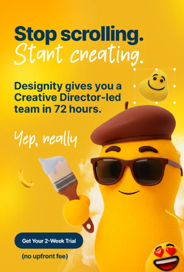
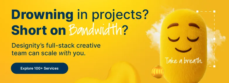
Build High-Converting Landing Pages with Designity
Great landing pages don’t happen by accident.
They’re the result of smart strategy, bold creative, and a deep understanding of what makes visitors click.
At Designity, we bring all of that together with a team of top 3% vetted creatives and marketers and seasoned Creative Directors who know how to turn any landing page into a conversion machine.
Whether you’re after a single high-performing page or a full-scale website refresh, our subscription-based Creative-as-a-Service model gives you access to on-demand web designers, UI/UX pros, copywriters, branding experts, and more — all under one roof.
Book a demo today and see how Designity can take your landing pages (and your brand) to the next level.
.webp)