<iframe src="https://share.listnr.tech/embed/voiceover/68f0e750e91b68001a3f995b" frameborder="no" scrolling="no" seamless width="100%" height="165" loading="lazy"></iframe>
Ever opened your font menu, ready to design something brilliant, and suddenly felt paralyzed by font choices? (And maybe, just maybe, 47 tabs deep into Google Fonts?)
Pairing fonts is tricky — too similar and they clash, too different and they look mismatched.
At Designity, our creatives know the best pairings rely on contrast and harmony. A bold serif with a clean sans-serif typeface, or fonts from the same superfamily in different weights, create balance and cohesion every time.
We’ve turned these principles into timeless top font pairing formulas — the jeans-and-t-shirt of typography: simple, classic, and designed to make your brand stand out.
Keep Exploring:
- Find more inspiration in our guide to Choosing the Perfect Fonts for Every Design Project — your quick cheat sheet for every scenario.
- And speaking of t-shirts, check out our Guide on T-Shirt Graphic Design to learn how to elevate your design from basic to standout.
The 5 Best Font Pairing Formulas for Stunning Designs
Here are five foolproof font combinations to make your fonts look like they were made for each other:
1. Formula 1: Classic Serif + Clean Sans-Serif

This combo is the little black dress of typography — elegant, reliable, and forever in style.
The serif brings depth and a touch of sophistication, while the sans-serif font keeps everything light, modern, and easy to read.
Together, they create balance and hierarchy without stealing attention from your actual message.
It’s a pairing that feels just as at home on an editorial spread as it does on a brand’s sleek landing page.
Why it Works: Old-meets-new balance, versatile for many brands.
Examples: Playfair Display + Lato, Georgia + Open Sans
When to use it: Perfect for brands that want to communicate trust and timelessness — think upscale blogs, editorial layouts, and professional services.
2. Formula 2: Bold Sans-Serif + Neutral Sans-Serif

Want to make a statement without yelling?
This pairing does exactly that.
The bold sans-serif grabs attention with confidence, while the neutral sans-serif keeps things grounded and easy to read. It’s the design equivalent of pairing a statement jacket with a crisp white tee — striking but never over the top.
Combined, they create a look that feels sleek, modern, and built for impact. Perfect for brands that want to stand out in crowded digital spaces while still looking polished.
Why it works: High impact but still clean and modern.
Examples: Montserrat Bold + Source Sans Pro.
When to use it: Ideal for startups, tech brands, and portfolios where impact and clarity are equally important.
3. Formula 3: Handwritten or Script + Sans-Serif
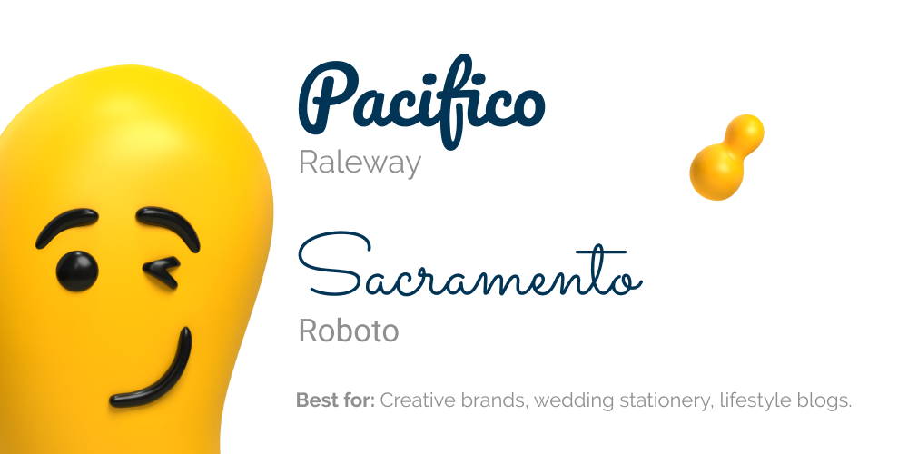
This pairing is perfect when your brand needs a signature touch — literally.
A script or handwritten font brings warmth, flair, and personality, while a clean sans-serif makes sure your message doesn’t get lost in the flourish.
The sans-serif keeps things clear and easy to read, while the script adds charm and individuality.
This formula is perfect when you want designs that feel human and approachable but still polished enough for professional use.
It works especially well for fashion, beauty, and food brands and any lifestyle project that wants to stand out with style.
Why it works: Adds personality while keeping text legible.
Examples: Pacifico + Raleway, Sacramento + Roboto.
When to use it: Great for lifestyle brands, boutique businesses, or personal blogs where personality matters as much as polish.
4. Formula 4: All in the Family (Font Superfamilies)
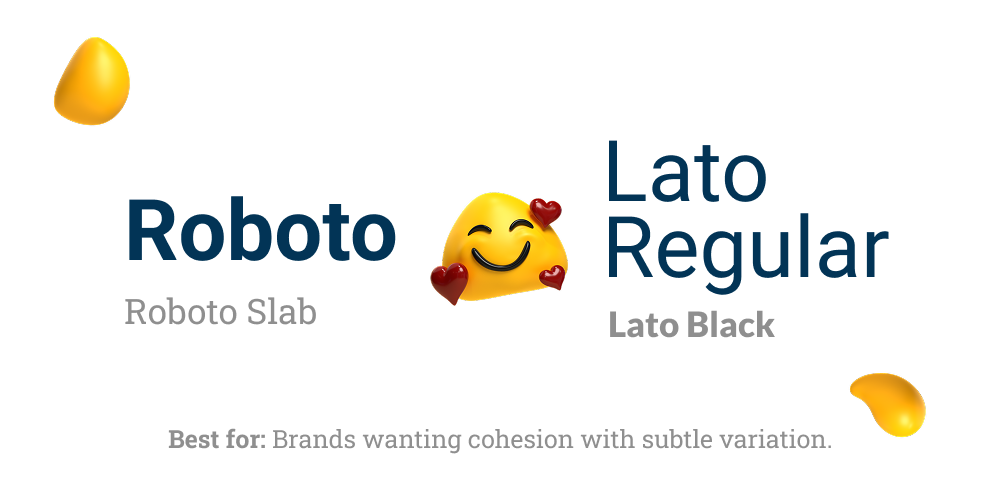
Sometimes, you just gotta keep it in the family.
Using a font superfamily, think variations like Roboto and Roboto Slab or different weights of Lato, gives you built-in harmony without the guesswork.
Because these fonts were designed to complement each other, you get cohesion with just the right amount of contrast.
Swap between regular, bold, or slab styles to create hierarchy while keeping your brand identity consistent.
If you’re a brand looking for versatile font families that work seamlessly across websites, presentations, ads, and print, this one’s for you.
Why it works: Guaranteed harmony because all styles were designed to work together.
Examples: Roboto + Roboto Slab, Lato Regular + Lato Black.
When to use it: Perfect for brands needing a versatile type system that works seamlessly across print, digital, and marketing assets.
5. Formula 5: Minimal Sans-Serif + Quirky Display

When you want your design to make an entrance, this pairing delivers.
A clean, minimal sans-serif lays down the foundation, while a quirky display font steps up as the showstopper.
The contrast creates instant visual hierarchy, keeping your text legible while letting the display font pack the punch.
It’s a smart and beautiful way to add personality without sacrificing clarity, making it perfect for headlines, campaigns, and graphics where first impressions count.
Why it works: Lets the fun, unique font be the star without sacrificing readability.
Examples: Futura + Lemon Milk, Helvetica Neue + Abril Fatface.
When to use it: Best for marketing campaigns, hero graphics, and social content where grabbing attention is priority #1.
4 Core Principles Behind Good Font Pairing

These simple principles will help you create combinations that look intentional, balanced, and built to last:
1. Embrace Contrast & Harmony
We all know that great outfits thrive on balance. Think a structured blazer with casual jeans.
The same applies to font pairing.
Serif paired with sans-serif, or bold weights with lighter ones, creates contrast while still belonging together.
So while fonts don’t have to match perfectly, they need a common thread to look intentional.
2. Establish Hierarchy
Every outfit has a focal point.
In typography, the headline is your statement piece, while body copy text is the everyday essential that makes it all work.
Give each font a role, one leads, the other supports, so readers know exactly where to focus.
3. Limit Your Palette
More isn’t always better.
Just like an outfit can feel busy with too many extras, designs with too many fonts lose their focus.
Two, maybe three at most, is the sweet spot. A streamlined selection keeps things cohesive, professional, and confident without overwhelming the reader.
4. Keep Accessibility and Readability in Mind
No matter how stylish your font pairing looks, it has to be easy to read.
So, make sure your headlines and body text are clear at different sizes and across devices.
Good readability keeps your design polished and professional, because if people can’t read it, they definitely won’t buy it.
Designity’s Formula: Pair Fonts Like a Pro, Build Brands That Stick
With these timeless pairing formulas, you can move from trial-and-error to confident, professional design decisions.
At Designity, a subscription-based Creative-as-a-Service (CaaS) platform, we take the guesswork out of typography and branding so you don’t have to.
Our top 3% of vetted creatives, guided by seasoned Creative Directors, apply the same design fundamentals to everything from brand identities and marketing collateral to motion graphics, websites, and beyond.
Want your brand to always look polished without spending hours second-guessing fonts?
Book a demo call and we’ll set you up with a 2-week free trial, so you can try out our 100+ creative services risk-free.


.png)
.webp)
.png)

















.webp)
