.webp)
Even in the age of digital … everything, you might be surprised at just how powerful and effective a well-designed brochure can still be.
Whether it’s handed out at an event, tucked into some packaging, or downloaded as a PDF from your website, a good, old-fashioned brochure gives you a handy space to tell your brand’s story in a tangible and focused way!
That is … if it’s done right!
To grab attention (and hold it) the design of your brochure needs to be on point! Smart layouts, compelling visuals, creative formatting …all of it needs to speak to your audience and be in tune with your brand and marketing goals!
So, if your brand is in need of some impactful brochure design and looking for some inspiration to help you get it done the right way, we’ve rounded up 15 of the most creative brochure design ideas including some from real-world brands you know and love!
Whether you’re planning your next campaign or looking to refresh your print collateral, the following 15 ideas are a great place to start!
Let’s take a look!
15 Creative Brochure Design Ideas with Real-World Examples
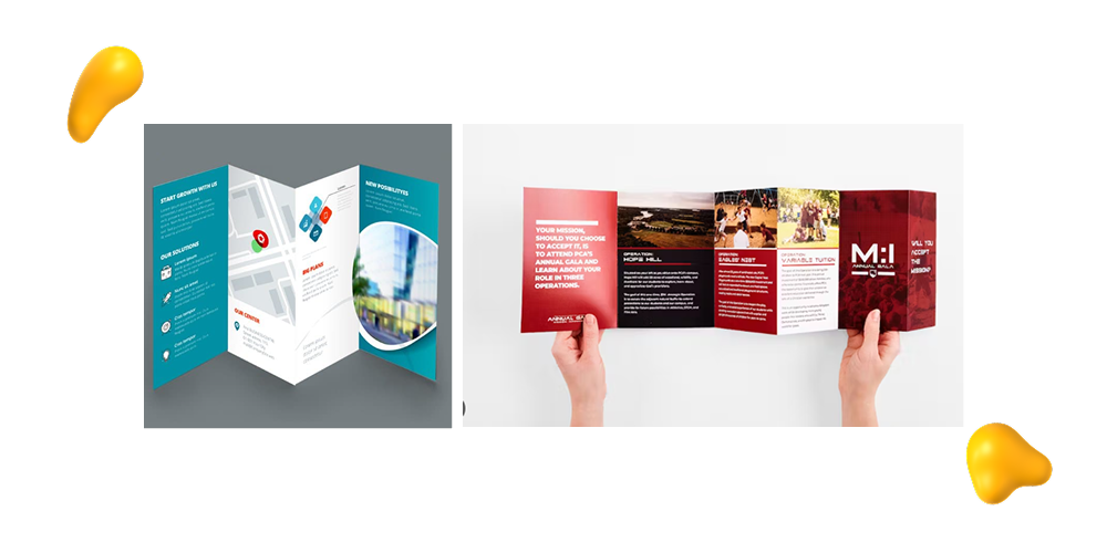
1. Professional Tri-fold Brochure Design Template
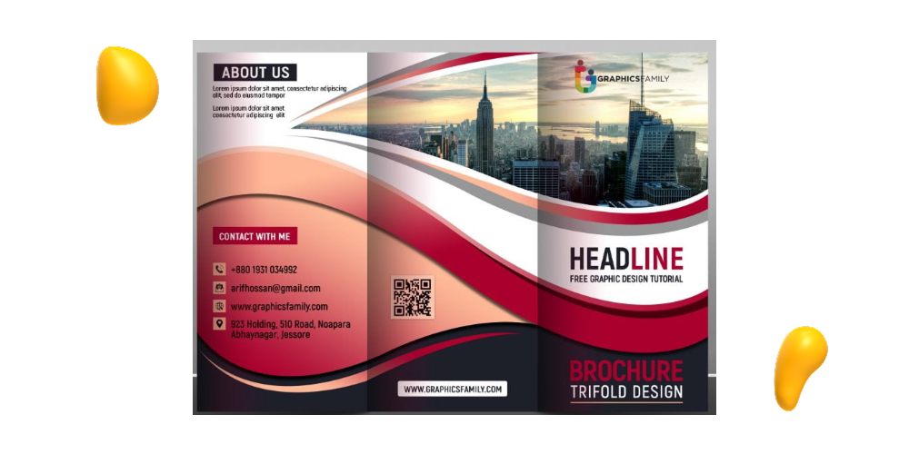
If you’re looking for a clean and polished layout that’s easy to digest, a tri-fold brochure is a solid choice.
This type of design opens up to six panels — enough space to lay out your content and fold up nice and neat, without overwhelming your reader. It’s a classic format that works great for everything from service overviews to product highlights. Whether you’re sharing company info at a trade show or dropping a leave-behind after a sales pitch, bi-folds keep your content looking sleek and organized!
2. Zara’s Lookbook-Style Fashion Brochure
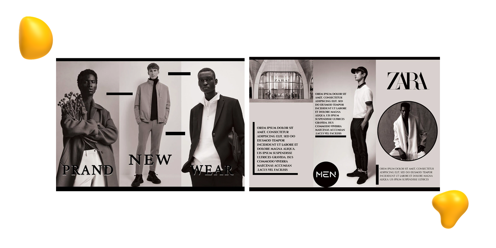
Fashion brand Zara takes a high-end editorial approach with its brochure design, creating fashion lookbooks that feel more like mini magazines!
These brochures use full-bleed photography, clean layouts, and minimal text to let the clothing speak for itself. This lookbook style works especially well for brands like fashion, beauty, or lifestyle that rely on visuals to sell their products.
Whether it’s a seasonal collection or a special capsule launch, Zara’s lookbook-style brochure is guaranteed to turn your marketing into an experience!
Check out Zara’s Brochure on Behance for more examples of this style!
3. Airbnb’s Storytelling Brochure
Airbnb’s brochures don’t just list features — they tell a story!
Through warm imagery, conversational copy, and a thoughtfully structured layout, the brochure walks readers through what it feels like to book an Airbnb stay.
It introduces hosts, showcases real-life spaces, and paints the kind of lifestyle picture of what the brand stands for.
This type of design is great for service-based brands looking to build an emotional connection with its audience. By prioritizing storytelling over sales pitches, Airbnb brochures create a sense of trust and belonging!
Here’s an example of a host-made Airbnb brochure!
4. Apple’s Fold-Out Product Launch Brochure
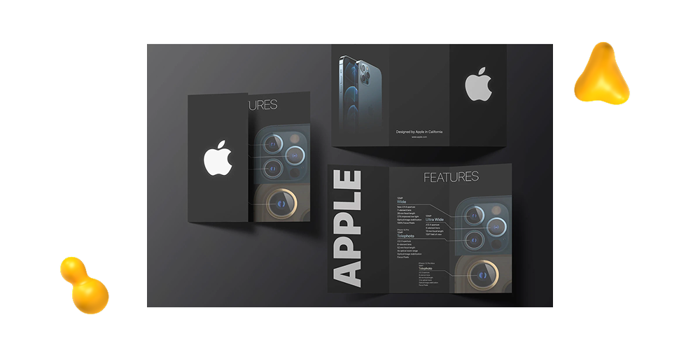
When Apple launches a new product, they don’t just announce it — they make it into an entire experience.
Their fold-out brochures help them do it. Using Apple’s signature minimalist design, plenty of white space, and crisp typography, Apple’s brochures unfold to reveal product details in a clean and easy-to-read way.
The fold-out style of their format makes for a narrative journey and guides the reader through features and benefits, ideal for brands looking to make an impact with product launches and major announcements!
Check out the rest of Apple’s Trifold Brochure Design by designer Telli Guliyeva.
5. Accordion Fold
If you’re looking to guide your reader through some step-by-step information, then the accordion fold makes a great choice.
This layout features multiple panels folded in a zigzag pattern (sort of like a paper fan), making it ideal for brochures that have a linear flow to their content, like product timelines, travel itineraries, how-to guides, or multi-step service processes.
It’s an easy-to-follow format that leads your readers from one panel to the next and offers plenty of design flexibility: open it all at once for a full view or one panel at a time for interactive instructions that don’t take up your entire coffee table.
6. Mailchimp’s Illustrated Brochure
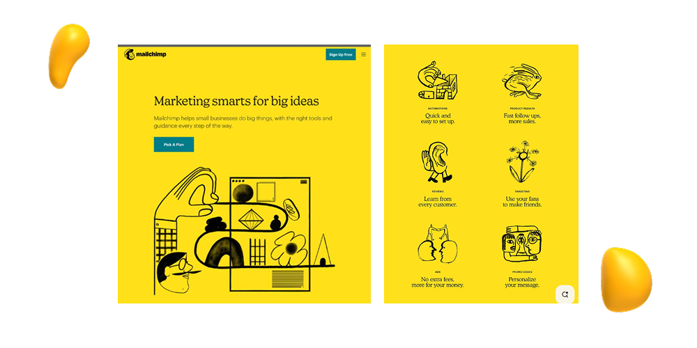
Email marketing platform, Mailchimp, has a brochure design that is great for showing how custom illustration can completely shape the tone of your brand!
Instead of relying on photography or heavy text, these brochure designs lean more into playful, hand-drawn visuals by illustrator Franz Langn to create a style that feels both unique and approachable.
The illustrations not only catch the eye, but support Mailchimp’s messaging in a fun and memorable way, making their content feel less like a sales pitch and more like a friendly introduction!
So, if your brand’s bread and butter is personality and relatability, this type of illustrated brochure is a great way to make a lasting impression on your audience!
Check out some more examples of Mailchimp Rebrand Illustrations on Pinterest!
7. Nike’s Folded Poster-Style Brochure
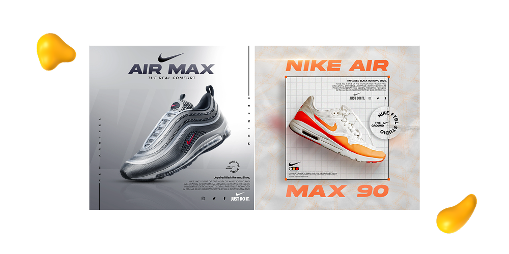
Nike’s brochure takes a bold approach by doubling as a poster, giving audiences something both interactive and striking to look at!
Designed by Muhammad Talha, this format unfolds to reveal oversized visuals, motivational taglines, and layouts that really capture the brand’s athletic edge.
What makes this design stand out is how it turns the brochure into more of a collectible. Instead of reading it and tossing it out, it’s the kind of artwork that you’d pin to your wall instead, giving the message extra shelf life.
If you’re marketing to a younger, style-conscious crowd or looking to have your messaging live on after an event, this kind of impactful poster-style design is worth exploring!
Check out more of Talha’s Nike Brochure Designs on Pinterest!
8. IKEA’s Catalog-Style Brochure
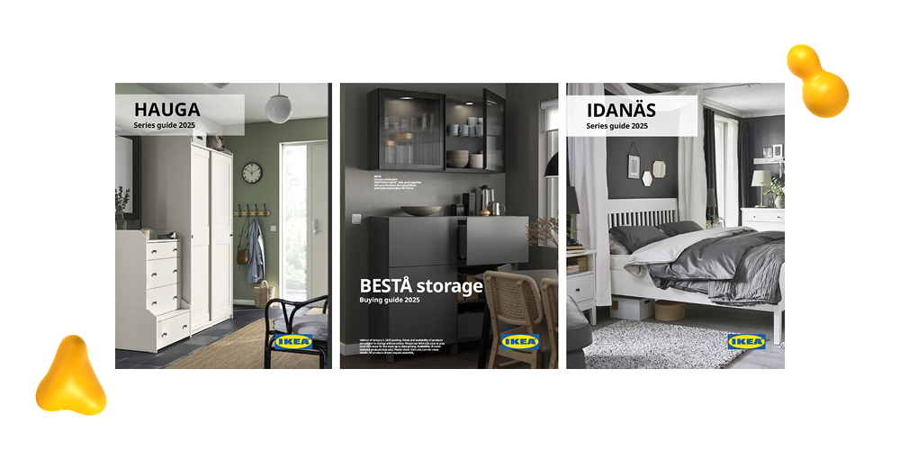
Aside from coming in 111 different pieces, IKEA’s brochure design is just like its furniture — practical, approachable, and cleverly laid out!
They have a catalog-style format that blends product highlights with lifestyle imagery to show potential buyers how each piece fits into a real space. Instead of simply listing products, IKEA tells a story with each spread, guiding readers from room setup to everyday scenarios to help them visualize how products would work in their lives.
If your brand is looking to showcase a product line in a way that’s immersive, relatable, and easy to flip through, then this format is a tried-and-true winner!
9. MoMA’s Artistic Z-Fold Brochure
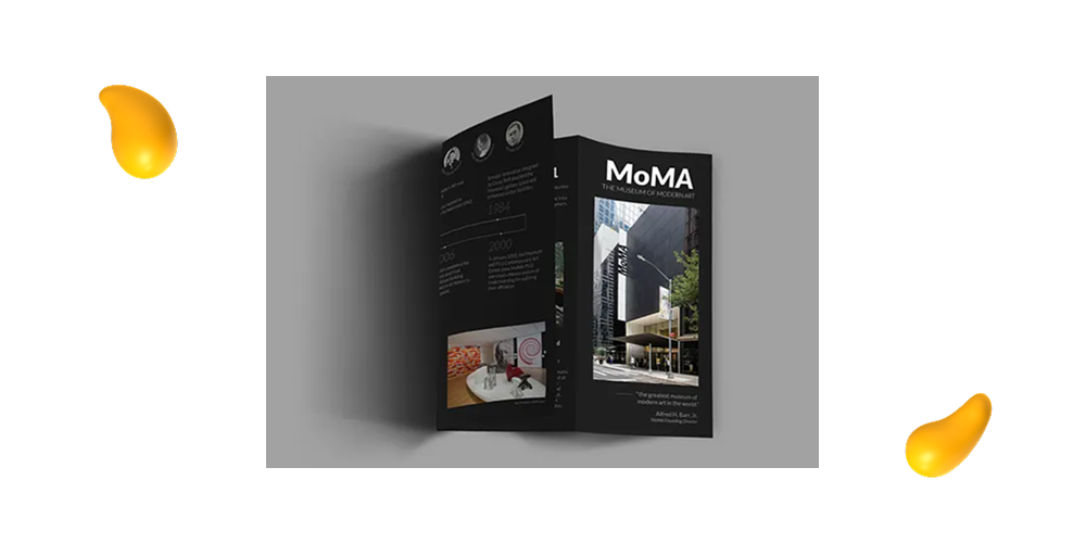
MoMA’s brochure design (seen above, designed by Bernard Iiew Guan Cheng) is as artistic as the museum itself!
Using a Z-fold format (where the panels unfold in a zigzag), the layout mirrors the rhythm of an art exhibit and guides your readers through each section just like a gallery tour.
This approach gives each panel its own stage while still connecting visually to the one that comes next. With bold colors, striking typography, and layout choices that echo modern art principles, this brochure feels more like an experience than a piece of marketing collateral!
If your brand leans creative or wants its brochure to be an experience, then this artistic style gives you plenty of room to make an impression!
Check out the rest of the designs here!
10. Glossier’s Pastel Aesthetic Brochure
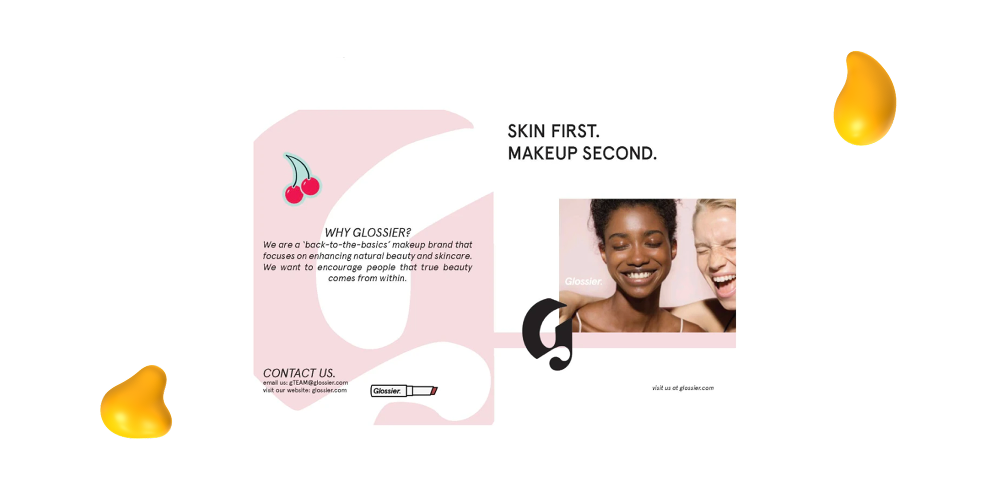
This Glossier brochure design by Gabrielle McDonald perfectly mirrors its brand identity: clean, soft, and effortlessly cool.
The layout shown above uses light pastel colors, minimal typography, and plenty of white space to let the visuals breathe and the product take center stage!
This kind of design proves that you don’t need to shout to be heard. If your goal is to give your brand a polished, high-end feel without going over the top, a pastel-forward and minimalist brochure like this one is a great way to get started.
Check out the rest of Gabriell’s Glossier Half-Fold Brochure on Behance!
11. Spotify’s Playlist Promotion Brochure
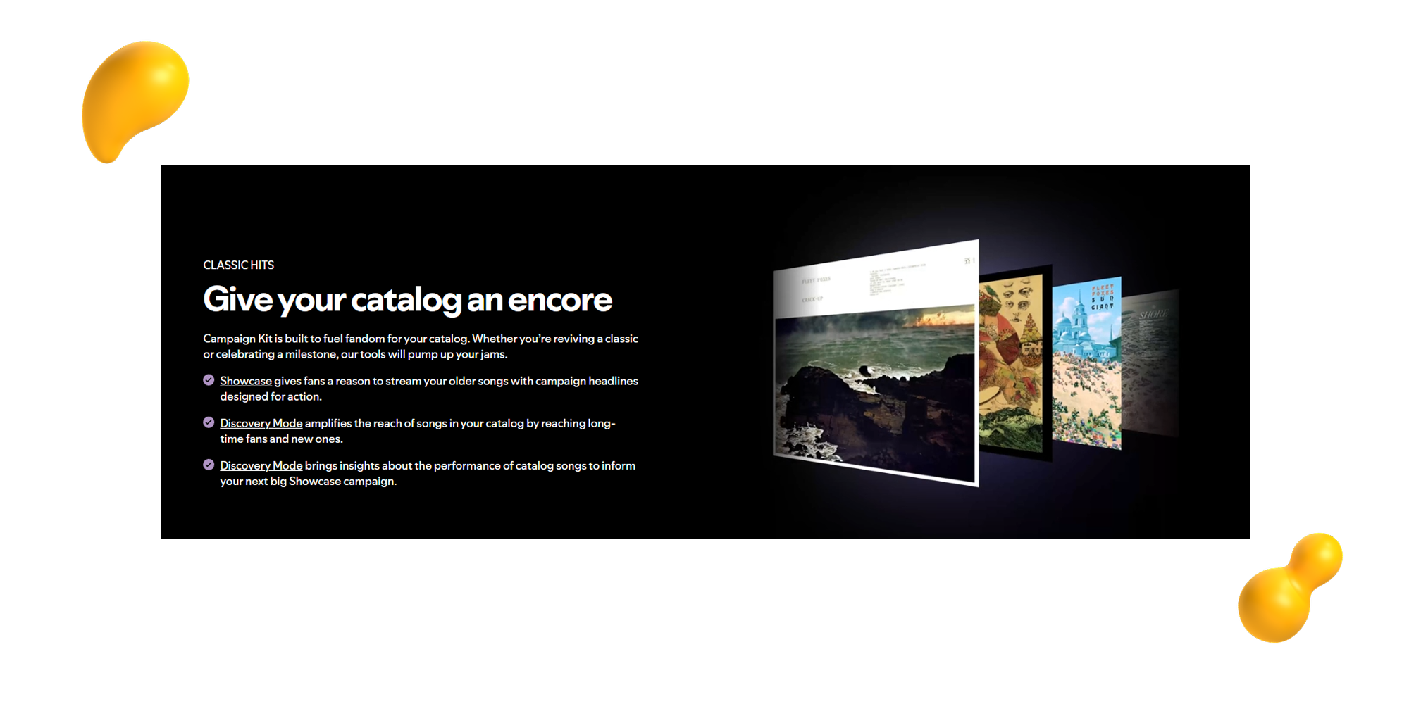
Spotify’s brochure isn’t just eye-catching — it’s designed to be interactive! Designed as part of a campaign kit (click the link to see the full kit!), this brochure uses bold colors, playful graphics, and, most importantly, scannable QR codes that link directly to playlists.
It’s a perfect example of how print and digital can work together, allowing readers to flip through genre-themed pages, discover new artists, and instantly stream playlists on their phones.
If you have digital content to share, like playlists, videos, or landing pages, this kind of brochure design is a great way to bridge the gap, and a fun way to stand out from the traditional handout!
12. Die-Cut Shapes
Sometimes, standing out is as easy as trimming some excess.
Literally.
Die-cut brochures use custom shapes, windows, or cut-outs to create visual interest and give a simple brochure a unique, tactile quality that immediately grabs attention.
Whether it’s a logo cut-out on the cover, a brochure shaped like your products (a gear, a coffee cup, a , or peekaboo panels that reveal key information, this die-cut style turns your brochure into something interactive and memorable!
This works great for brands who have the budget for it (die-cuts will raise your print costs a bit), want a premium feel and to make an impression at events or trade shows!
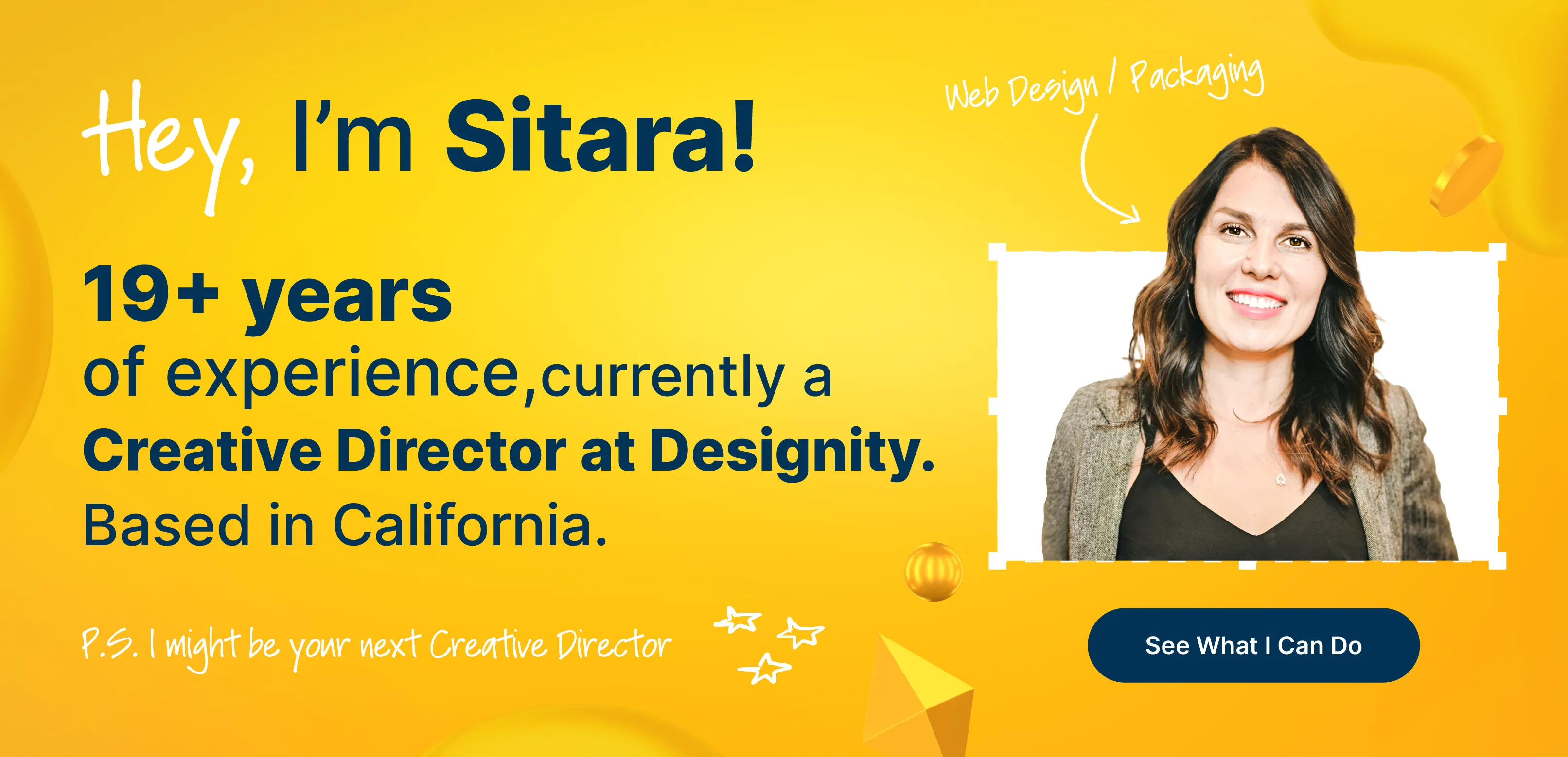
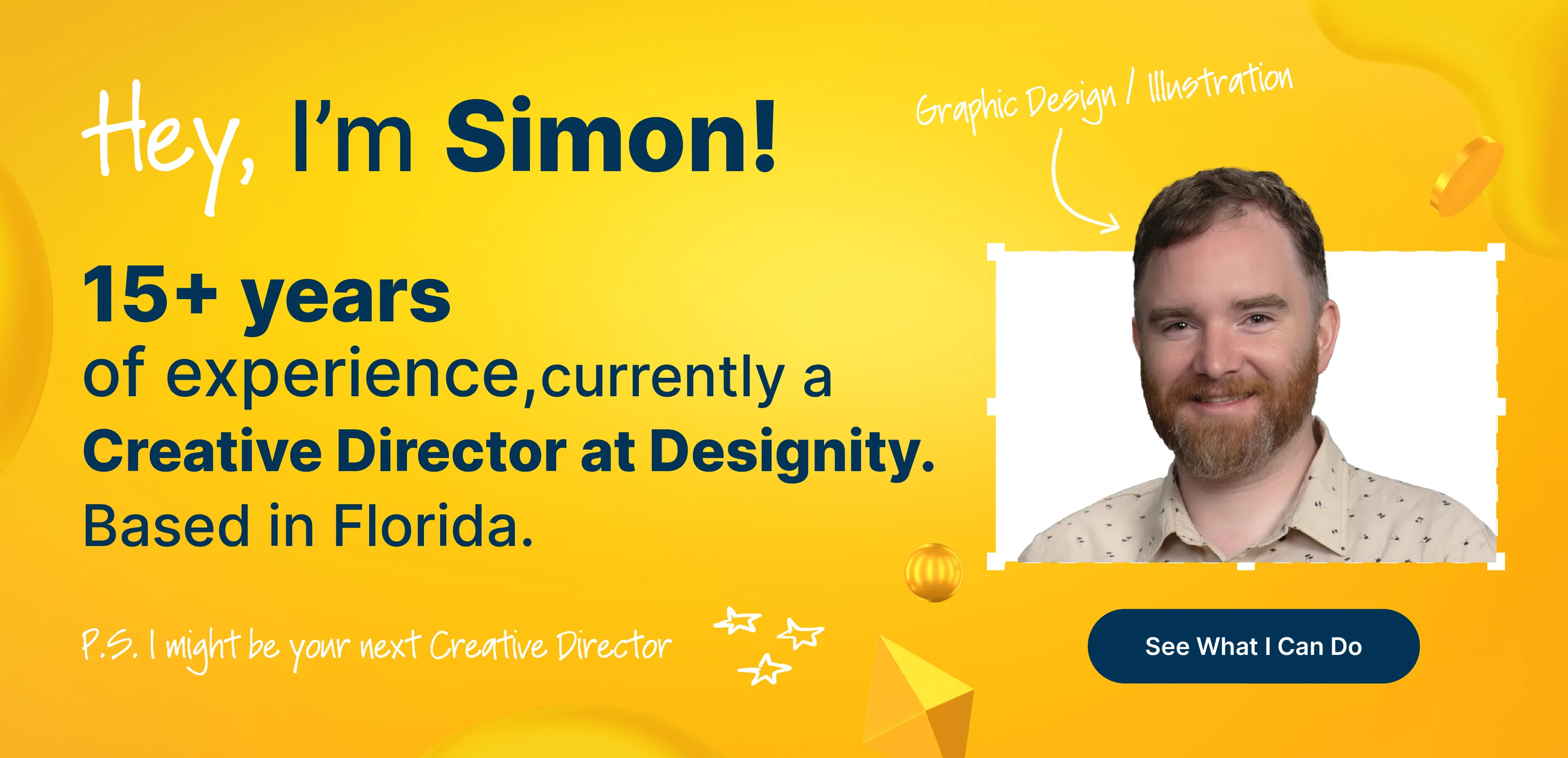
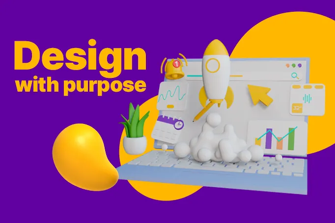
13. Designity’s Bold Typography Campaign Brochure
When it comes to making a statement, bold typography can go a long way.
And Designity knows exactly how to make that work. The brochure concept depicted above uses large, high-impact fonts to help set the tone, draw the reader’s eye, and highlight key messages.
Paired with a clean layout, strategic use of color, and the right content hierarchy, it’s a great example of how typography alone can take a brochure from “meh” to “wow!”
Check out their brochures, booklets, and editorial services page and portfolio to see more of Designity’s stellar work!
14. Medical Health Tri Fold Brochure Template
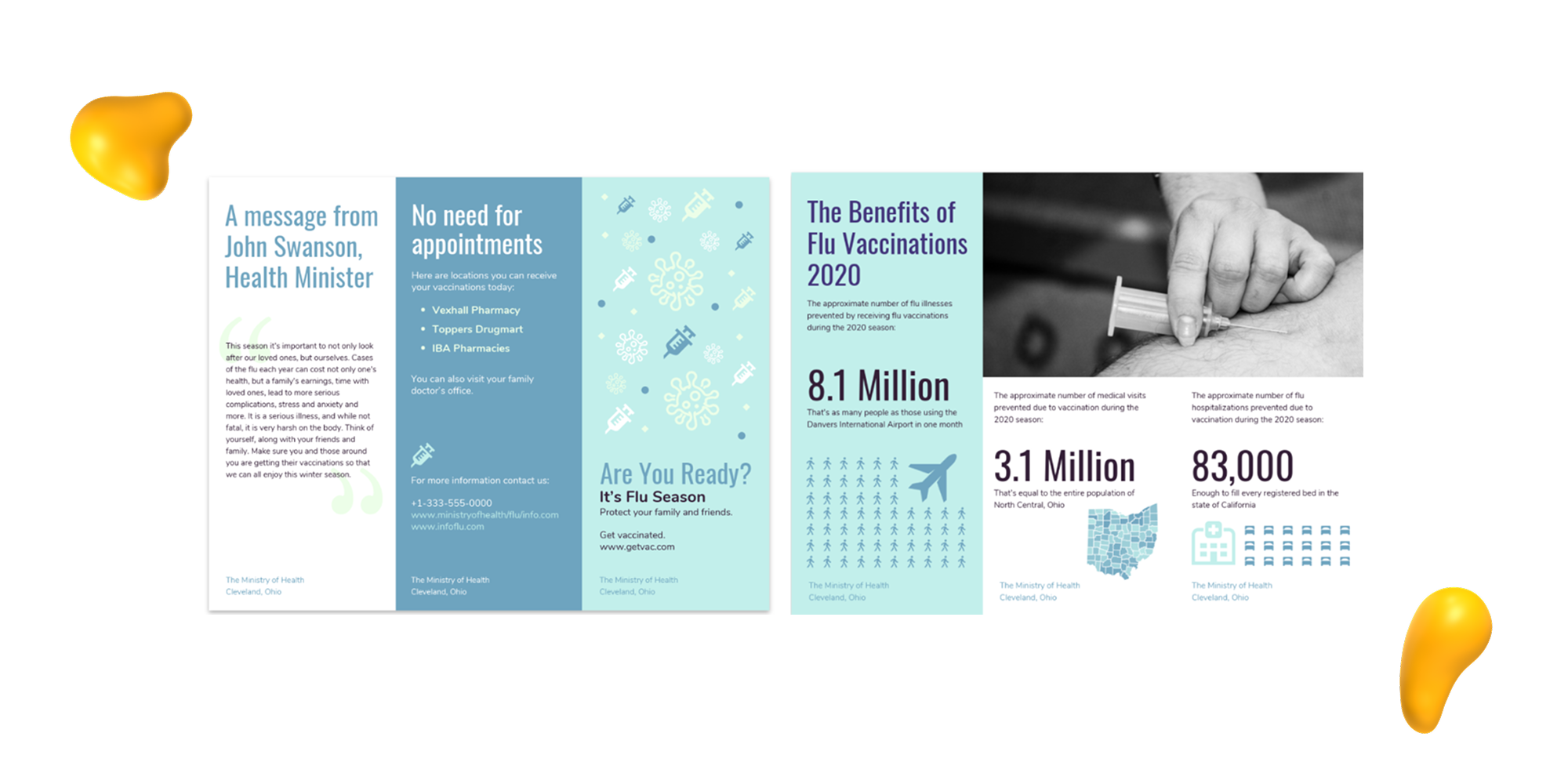
If you’re in the healthcare space, a well-designed brochure is an excellent tool for keeping your patients feeling informed, supported, and confident in your services.
This medical tri-fold brochure from Venngage is designed with exactly that goal in mind, offering a clean, professional layout that’s easy to follow and packed with helpful info.
Its three interior panels are perfect for outlining services, offering preventative care tips, or walking patients through what they expect during a visit. The clear section headings, soft color schemes, and friendly icons also work to keep things approachable, while the tri-fold format makes it easy to distribute at clinics, health fairs, or through direct mail.
Whether you’re a doctor’s clinic, a wellness center, or a health education nonprofit, this format is an ideal choice for keeping your message clear and your brand trustworthy!
Check out the rest of the Medical Health Tri-Fold Brochure Template by clicking this link!
15. CCA Architecture
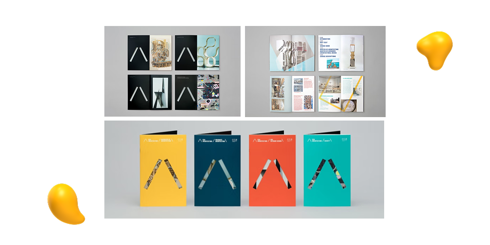
This brochure, designed by the creative studio Manual for CCA Architecture, is a great example of how to strike the right balance between form and function!
The layout uses large-format visuals to pull the reader in, while selective use of color fonts and clean typography highlights the content without overwhelming it.
The layout flows more like a gallery guide than a traditional brochure; a perfect representation of the artistic nature of the brand it represents.
If your brand is looking to express some creativity while keeping things structured and easy to navigate, this is a format that could work for you.
What to Include in a Marketing Brochure
A brochure is more than just a pretty piece of paper or PDF. It’s a compact marketing tool that needs to clearly and confidently communicate who you are, what you offer, and why it matters.
So, whether you’re looking to design a sleek handout for your next event or a downloadable brochure for your website, there are a few key elements every effective brochure should include:
- Headline —Your headline is the first thing people see, so make it count. It should grab attention and set the tone for what’s inside.
- Key Message —This is the heart of your brochure—what you’re offering and why it matters. Keep it focused and easy to understand.
- Visuals — Use high-quality images, illustrations, or graphics to enhance your message and give your content visual impact.
- Call to Action (CTA) — Tell readers what to do next, whether that’s visiting your website, booking a demo, or giving you a call. Make the CTA clear and compelling.
- Contact Information —Always include how and where people can reach you—phone number, email, website, or social handles.
- Brand Elements —Stick to your brand’s colors, fonts, and logo to ensure consistency across all your materials.
- Proof or Support — Testimonials, stats, or awards help back up your message and build trust with your audience.
Tips for Choosing the Right Brochure Format
Of course, not just any brochure design will work for your content.
You need to choose the layout that best fits you, and that can make a huge difference in how your content is received and remembered! You want something that works with your content, not against it, and can support how and where you plan to share it.
Here are few things to consider to find the right brochure style:
Bi-fold, Tri-fold, Gatefold, Z-fold
Each of these formats offers a different way to guide your reader’s experience.
Check out the differences below:
- Bi-folds are simple and sleek, great for straightforward messaging.
- Tri-folds are classic and compact, ideal for breaking content into sections.
- Gatefolds offer a dramatic reveal—perfect for high-end product launches.
- Z-folds are great for storytelling or step-by-step content.
Content Volume and Visual Assets
Have a lot to say or show?
Choose a format with enough real estate to avoid cramming.
Minimal content? A clean, simple layout helps your message shine without any unnecessary distractions.
Audience and Distribution Method
Think about who you’re targeting and how they’ll receive your brochure.
A printed piece for a tradeshow might need sturdier paper and bold visuals, while a digital version might benefit from interactive elements or clickable CTAs.
<div class="c-blog_comp-cta cc-component-1"><div class="c-blog_comp-cta-left"><div class="c-blog_comp-cta-left-wrap"><img src="https://global-uploads.webflow.com/61cdf3c5e0b8155f19e0105b/6369722e59155470b6840033_Potential-clients.png" loading="lazy" alt="" class="c-blog_comp-cta-left-img"></div></div><div class="c-blog_comp-cta-right"><div class="c-blog_comp-content"><div class="c-text-wrapper cc-mb-32"><div class="c-title-4 cc-bold"><strong>Want to save money without sacrificing the quality?</strong></div></div><div class="c-text-wrapper"><div class="c-text-2">Say goodbye to traditional, expensive agencies and unreliable marketplaces. Say hello to Designity.<br></div></div></div><div class="c-blog_comp-wrapper"><a href="/pricing" target="_blank" class="c-button cc-primary cc-inverted w-button"><strong>Get Your 2-Week Trial</strong></a></div></div></div>
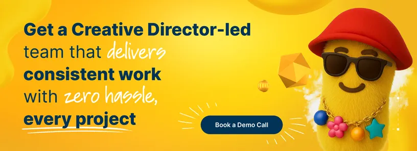
Looking for Brochure Design that Actually Gets Results?
Designity is ready to get you there.
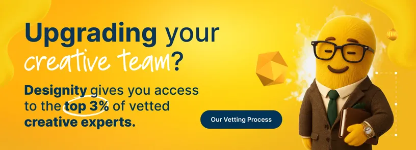
Designity is an on-demand Creative as a Service platform made up of only the top 1% of all creatives and marketers who apply.
Meaning that if you partner with Designity, your next brochure isn’t just going to look amazing (and it will), it’s also going to be strategic, on-brand, and designed to convert.
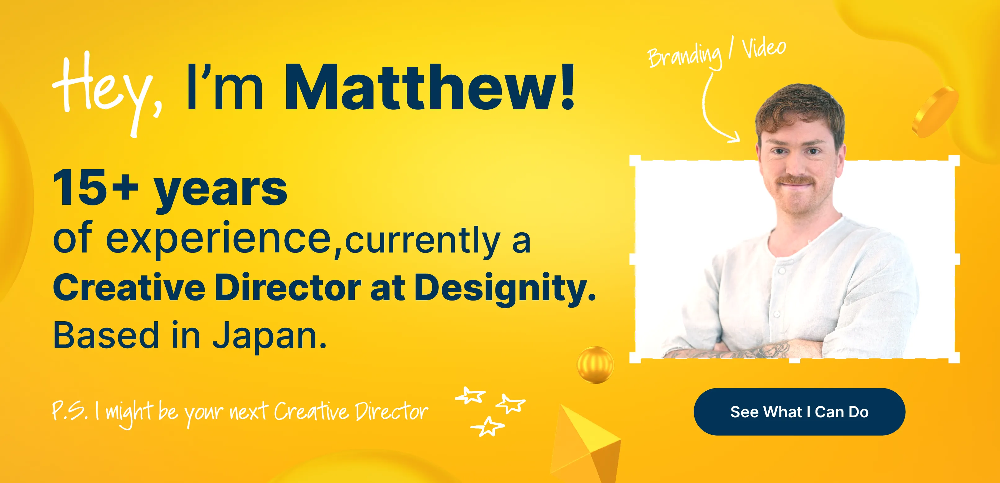
And with a designated Creative Director in your corner to manage your creative and marketing team, keep up with your timelines, and make sure everything is in your hands when you need it, you can get it all done without having to lose focus on where your job needs you most.
So, whether you’re dreaming up a bold new campaign, breathing new life into your sales materials, or need a sweet brochure for a new product launch, Designity brings the creative firepower you need to bring it to life.
Check out our brochure and editorial design services page and portfolio to see how Designity’s experts have been able to elevate the marketing collateral of brands just like yours.
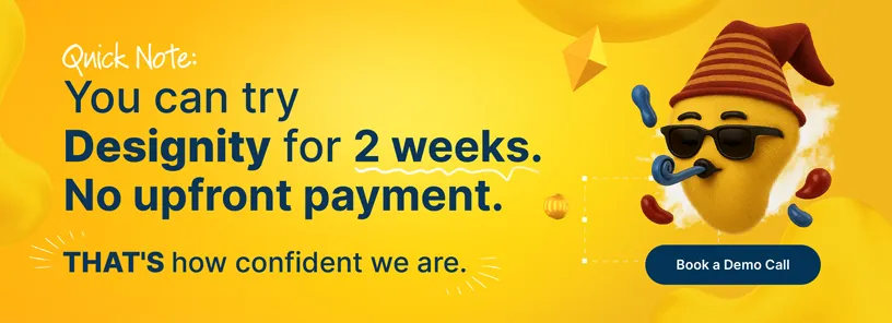
Like what you see? Book a demo call today so we can get you started on a two-week trial, no upfront payment needed, and talk about what we can create together.
Are you ready for a brochure design that gets your brand results?