.webp)
When it comes to email marketing, your content is only half the battle.
Your content will make a reader stick around but it’s the other half — the half that makes people actually want to click in the first place — that we’re talking about today.
We’re talking about your email marketing design and campaing.
Email design is the look, layout, and overall structure of your email. It includes everything from fonts to colors to spacing, imagery, CTAs, and how your message is visually organized. Do it right, and your content is easier to digest, more memorable, and way more likely to drive results.
Do it wrong, and well …
We’re not going to do it wrong.
Because inboxes are crowded, attention spans are short, and click-through rates don’t just improve on their own. Whether you’re sending newsletters, product announcements, on onboarding flows, a well-designed email helps you stand out, communicate your message, and get your audience one step closer to action.
And if it’s great email design inspiration you need, this blog has it.
We’ve rounded up 10 standout email designs from real brands that are doing it right to show you how good design leads to great performance — and where you can start when designing your own high-performing emails.
1. Collider Newsletter
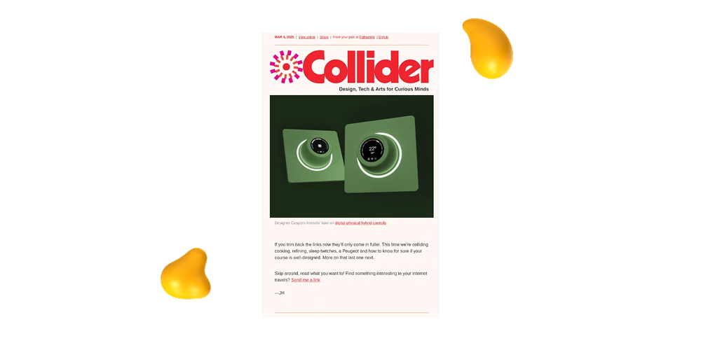
If you’re looking for an email layout with a refined, sophisticated look, that’s still easy to read, the Collider newsletter is something to look at.
This design, tech, and arts-focused site uses a clean, modular layout that makes browsing for multiple topics easy. From clever use of white space to well-balanced imagery and short copy blocks, every section gives its content room to breathe and invites you to keep on scrolling.
It’s smart, polished, and minimal without feeling cold. A perfect balance for any brand who wants to do the same!
Key Features
- Modular layout with clear visual hierarchy
- Strong use of white space to guide the eye
- Minimal copy for quick scanning
- Clean, consistent design that highlights both visuals and links
- Subtle, effective CTAs that don’t overwhelm the message
Best For: Creative publications, curated content newsletters, or brands that want a clean, gallery-like design that prioritizes easy scrolling and visual discovery.
2. The Cut
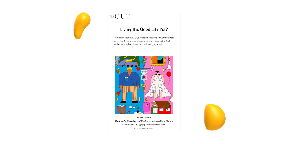
For an example of clean, editorial-style email design that brings elegance and edge to your content, check out The Cut.
Part of New York Magazine, The Cut uses bold typography, minimalist color palettes (usually black, white, and an accent color), and smart content hierarchy to keep viewers reading and scrolling.
The layout is structured almost like a magazine with headlines taking center stage, full-width images, and plenty of white space to let it all breathe. It’s a great reminder that sometimes less really is more.
Key Features
- High contrast, editorial-inspired typography
- Balanced use of white space
- Full-width images that don’t overpower the content
- Clear visual rhythm for easy scanning
- Simple but bold CTA buttons
Best For: Brands that want to lead with content but still make a strong visual impression — especially media outlets, fashion brands, or personal brands that want their emails to feel like a curated publication instead of a marketing push.
3. Absolut
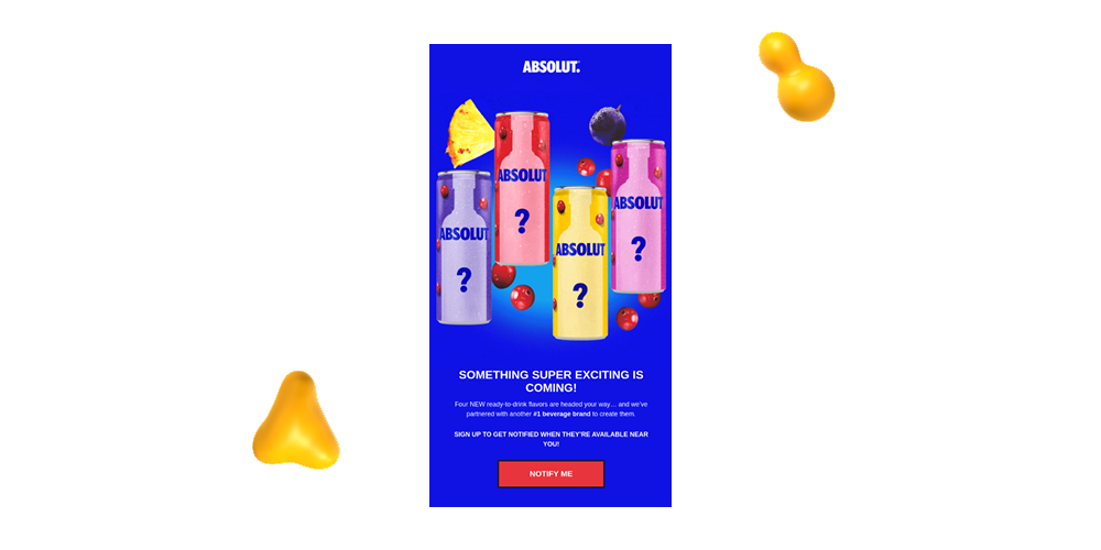
Vodka brand Absolut knows how to stick to their identity and that definitely extends to the emails they send.
Like their branding, their email designs are bold and vibrant with sleek layouts, high-quality product shots, and eye-catching colors that make everything stand out in a fun way without being too “in your face” about it.
Key Features
- Bright colors and accents that grab attention immediately
- A single-column, scroll-free format with one clear message
- Brightly colored CTA buttons that are hard to miss
- Fun, modern, and totally Absolut
Best For: Brands launching new products or building anticipation. If you want to generate hype with minimal copy and maximum visual punch, this kind of layout and visuals do the trick.
4. Athletic Greens
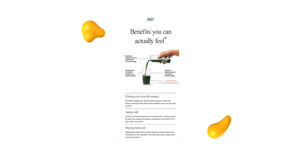
Athletic Greens keeps things clean — diet, lifestyle, and, of course, their email design.
Instead of packing in too much information or flashy visuals, Athletic Green’s emails tend to lean into white space, calming shades of green, and sharp product photography that keeps the focus on where it should be — wellness!
It’s a minimal look but never boring, and the short blurbs, bold headings, and short, easily-digestible sections of text do a great job of highlighting benefits without overwhelming the reader.
Key Features
- Clean spacing, simple formatting, and zero clutter
- Lots of green, white, and earth tones that support the wellness vibe
- Clear photos that show off the product in everyday use
- Brief, persuasive content that ties directly to audience goals (energy, immunity, etc.)
Best For: Health and wellness brands — or really, any brand that wants to communicate clarity, trust, and calm. This kind of design works especially well when you want your product to speak for itself.
5. Aesop
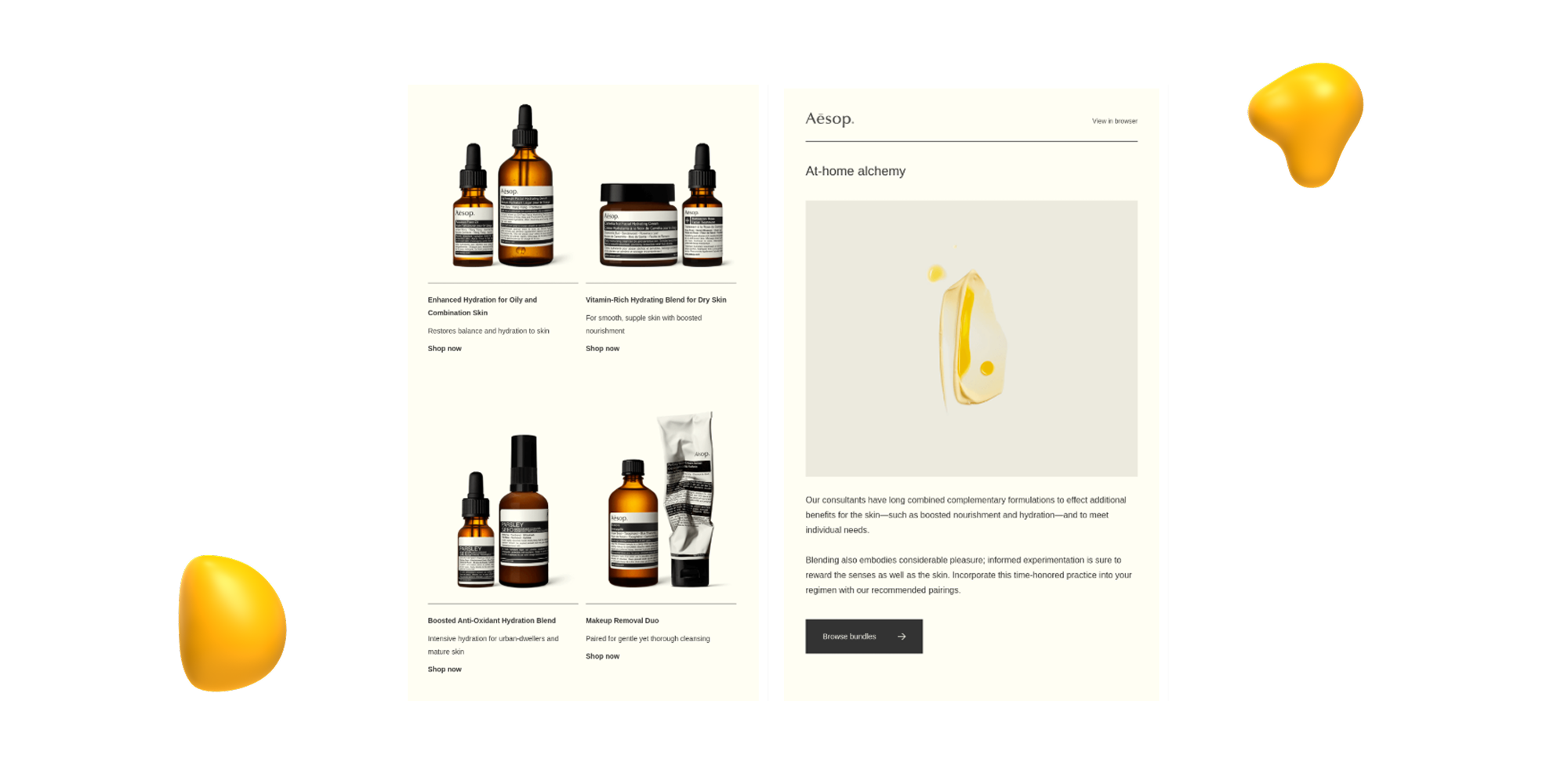
Aesop emails feel less like marketing and more like art direction.
This skincare brand’s design approach is minimal, elegant, and very consistent— just like their branding. You won’t find busy graphics or cluttered layouts here. Instead Aesop emails like the one picture above rely on neutral color palettes, copy/image balance, high-end photography, whitespace, and elegant typography to create a calm, editorial feel.
Everything about their design gives off a premium and thoughtful feel!
Key Features
- Minimalist layout with refined fonts and muted tones
- Crisp, artful images that reflect the brand’s aesthetic
- Short, elegant language that complements the design
- Buttons and links feel natural and never pushy
Best For: Luxury, skincare, or lifestyle brands that want to build trust and stand out with sophistication. If your brand voice is quiet confidence, this kind of design will feel right at home.
6. Furtuna Skin
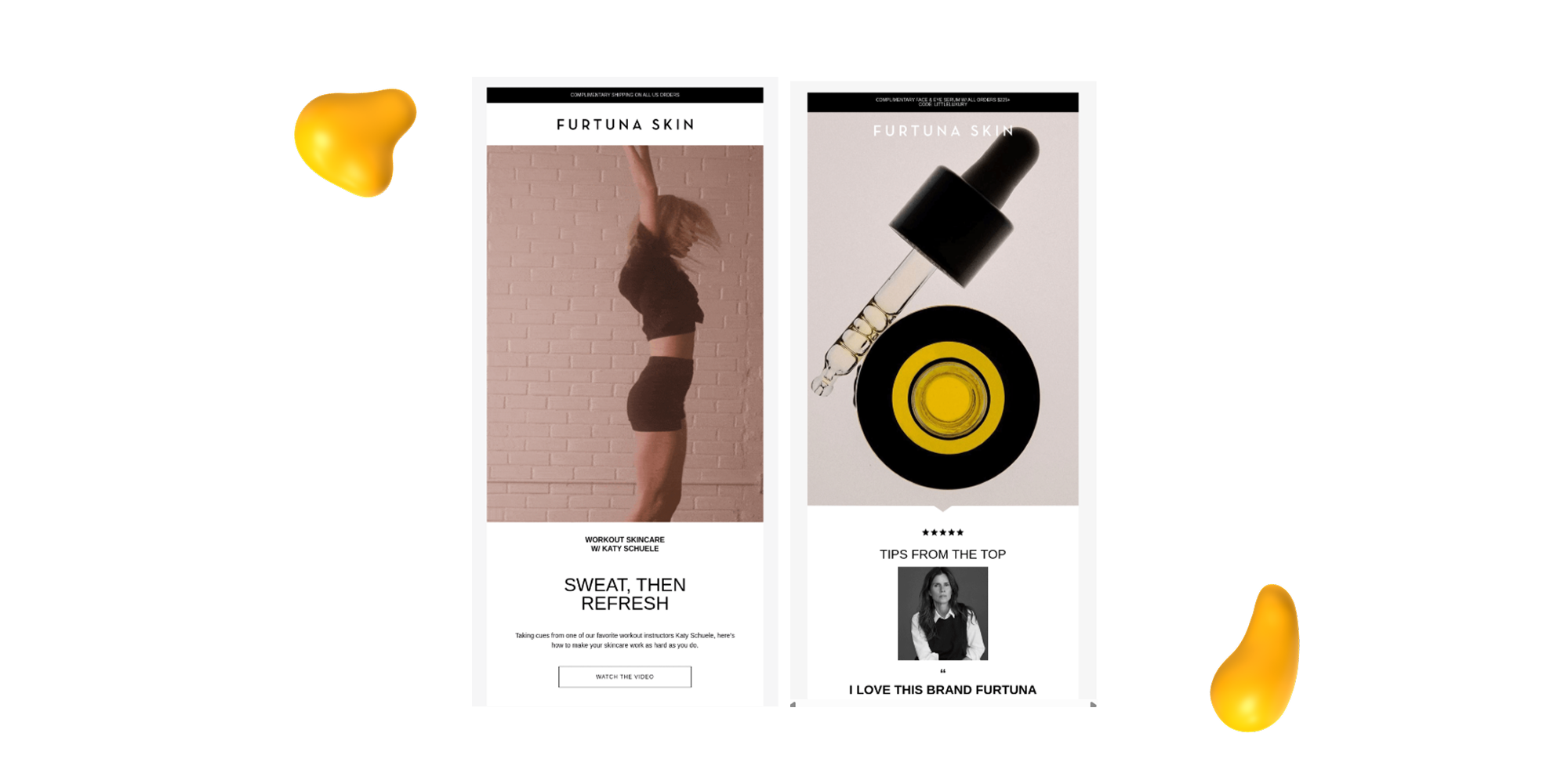
Furtuna Skin blends luxury with nature, and their email design does too.
Their emails use rich, earthy visuals paired up with a soft, sophisticated color palette of olive greens, muted creams, and gold accents. Product photos are usually front and center, typically accompanied by natural textures like botanicals or ingredients used in their formulas.
They also do a great job tying product benefits to features, using short blocks of copy, white space, and typography that matches their packaging and brand voice. It’s an elevated design that still feels grounded!
Key Features
- Earthy tones and ingredient-focused imagery
- Easy to scroll, with generous whitespace and a gentle flow
- Light, modern fonts that match the premium feel
- Short blurbs that explain what the product does and why it matters
Best For: Premium wellness or skincare brands that want to connect with their audience through beauty, nature, and simplicity. It’s also a great style for any brand looking to convey trust, quality, and refinement without overwhelming the reader.
7. Haus Labs
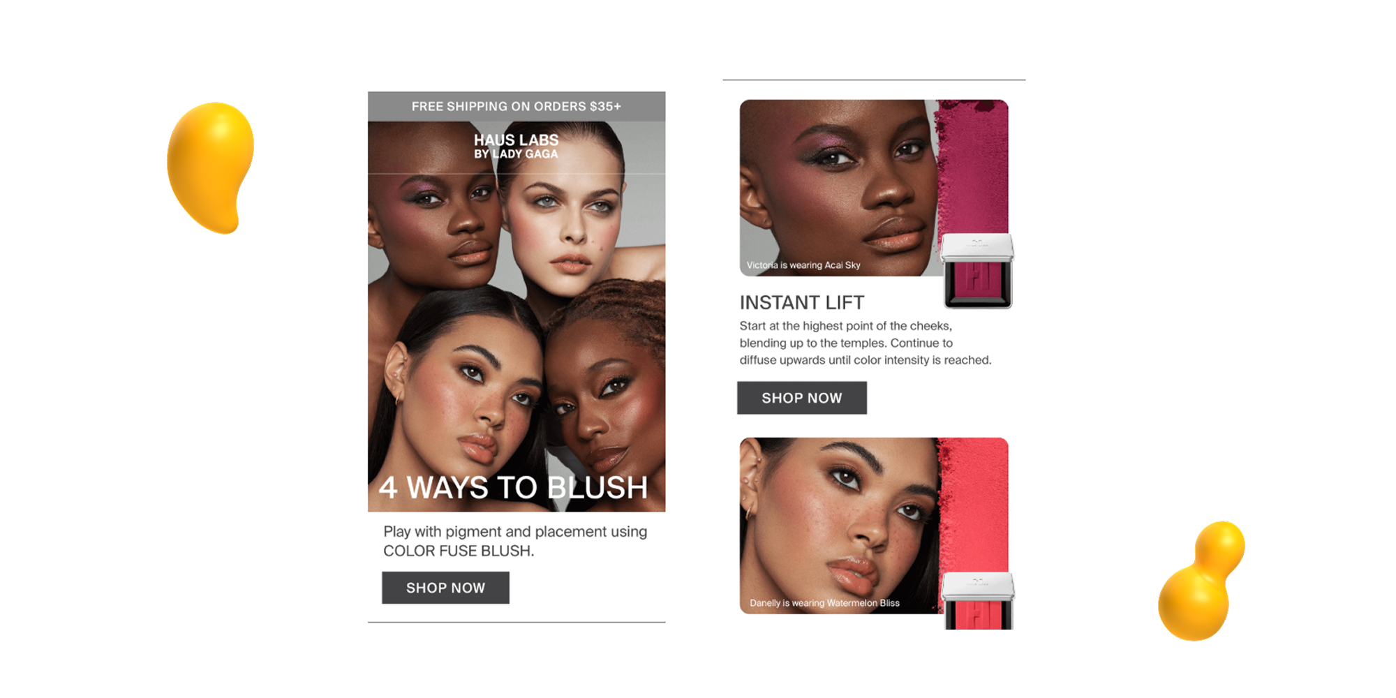
Haus Labs, singer/actress Lady Gaga’s clean beauty brand, brings its bold and expressive aesthetic into every email they send.
Their design is vibrant and editorial, often featuring full-bleed product photography, sleek layouts, and Gaga herself as the visual centerpiece. And it’s not all about looks! There’s strategy involved as well.
They use personalized flows like shade-matching follow-ups, post-purchase tutorials, and “Recreate the Look” features that tie products to celebrity moments.
A great example of how to make a brand feel both luxurious and accessible!
Key Features
- Full-width images, clean lines, and strong visual hierarchy
Emails tailored to user actions, like quiz results or past purchases - High-contrast color schemes and striking visuals that reflect the brand's identity
- Features like “Recreate the Look” that engage users and showcase products in actionsuperside.comdtcpatterns.com
Best For: Beauty, fashion, or lifestyle brands that want to blend high-gloss visuals with smart, user-focused content. If your brand is about self-expression, creativity, or transformation, Haus Labs’ email approach is a great one to study.
8. Venmo
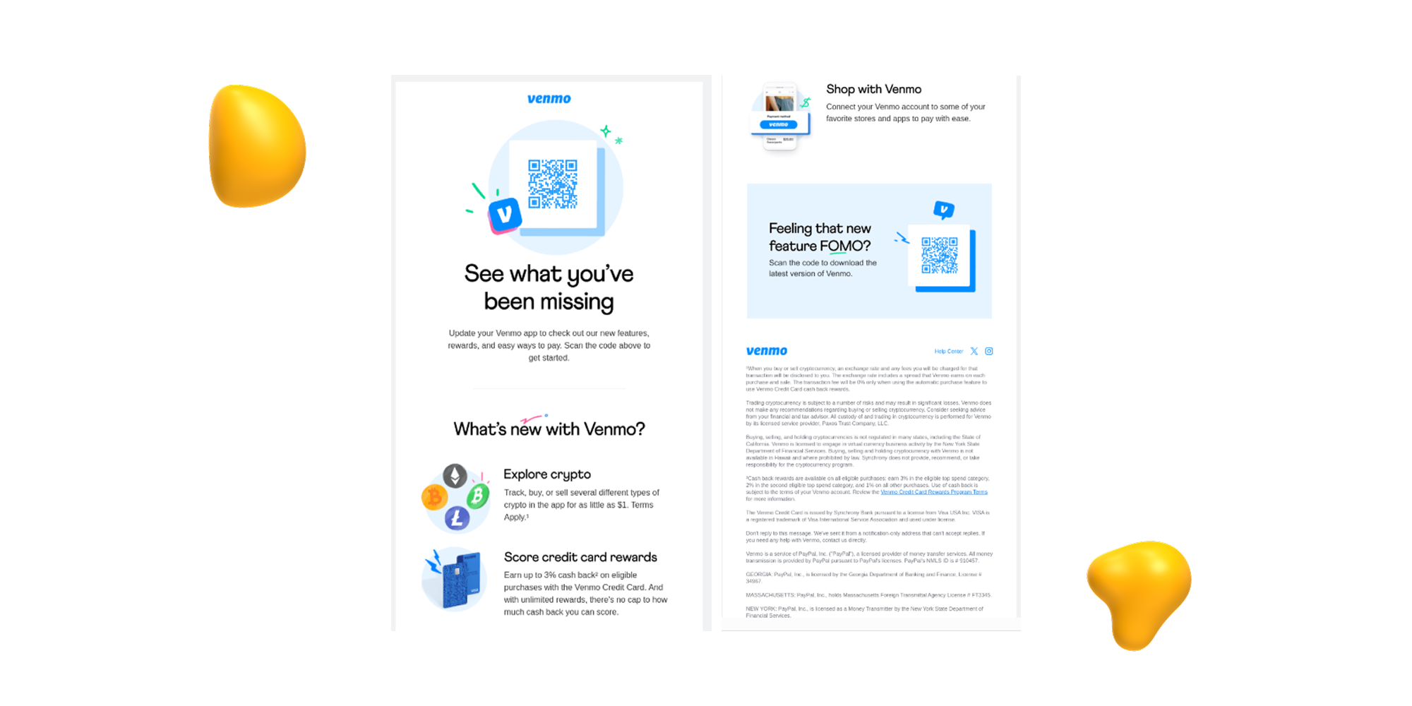
Venmo is best known for making it easy to pay for your kids’ stuff at school or exchange cash between friends, but their email design shows that they’re just as good at communicating clearly and creatively too!
Their emails are usually short and sweet, on-brand, and built with a mobile-first mindset. Whether they’re promoting a new feature or offering a rewards update, they keep things easy to read, nice to look at, and always on-brand with that signature Venmo blue!
Key Features
- Prioritizes mobile-friendly layouts with large text and tappable buttons
- Uses clear headlines and digestible chunks of copy
- Maintains consistent brand colors and friendly, conversational tone
- Often includes subtle animations or illustrations to keep things fun
- CTAs are direct and action-oriented, perfect for quick engagement
Best For: Fintech, app-based platforms, or any brand that needs to deliver quick updates without losing visual appeal. Venmo’s style proves that even functional emails can feel fresh, inviting, and easy to act on.
9. Hestan
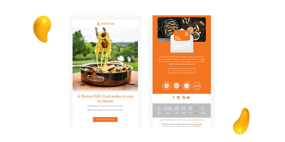
Hestan is a premium kitchen appliance brand, and their emails are just as sleek and high-end!
They usually feature big product visuals paired with clean typography and minimal copy to let their craftsmanship shine. Just like we love a clean kitchen, we also love this clutter free design — the focus stays on layouts that highlight a product’s beauty and functionality with elegance.
Key Features
- Large, high-resolution product imagery
- Plenty of white space for a clean, editorial look
- Short copy that complements the visuals without distraction
- Neutral, elegant color palette that matches the brand
- Strategic CTA placement that drives interest without being pushy
Best For: Luxury or product-focused brands that want to elevate their email presence. If your visuals speak for themselves, this kind of minimal design helps you showcase products with polish and confidence.
10. ARMRA
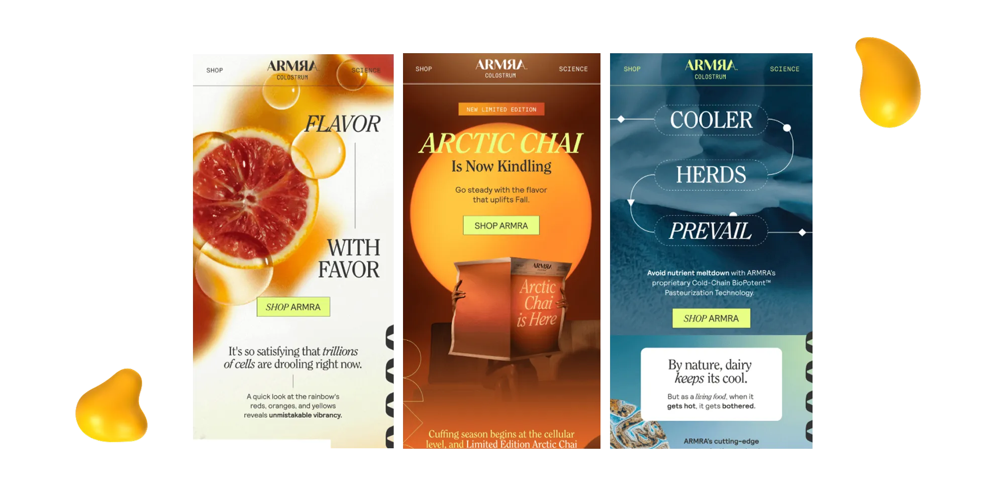
ARMRA, a wellness brand known for its colostrum supplements, uses email design to communicate both credibility and clarity! Their emails usually focus on educating the reader with bite-sized science facts, simple benefits breakdowns, and trust-building elements like testimonials and certifications — all in a clean, easy-to-skim layout.
Key Features
- Balanced use of educational content and visual storytelling
- Clean, medical-adjacent design without being cold
- Icons and infographics to break down benefits quickly
- Brand-aligned colors and soft typography for a calm feel
- Clear CTAs and product spotlights that don’t overwhelm
Best For: Health, wellness, or supplement brands looking to build trust while still standing out. ARMRA’s design is a solid model for combining informative content with sleek presentation.
What Makes Good Email Design?
Good email design is more than just visual appeal — it’s about usability, clarity, and driving action. A well-designed email grabs attention, delivers your message quickly, and nudges the reader toward the next step.
Here’s what makes an email design stand out:
- Clear Visual Hierarchy — Use headers, subheaders, and consistent text sizes to guide the reader’s eye and make the content easy to scan.
- Mobile-Friendly Layout — Over half of emails are read on phones. Make sure your design is responsive, buttons are tappable, and text is legible on any screen size.
- On-Brand Design Element — Your colors, fonts, tone, and imagery should reflect your brand identity and stay consistent from email to email.
- Clean, Readable Fonts — Choose fonts that are easy to read across devices and don’t distract from the message.
- Purposeful Imagery — Use images to break up content and highlight key points — but make sure they serve a clear purpose and support your message.
- Compelling CTAs (Call-to-Actions) — Include one or two clear CTA buttons that are easy to find, click, and understand.
- Thoughtful Use of Whitespace — Don’t cram it all in. Spacing matters — it makes your content easier to digest and your email feel less overwhelming.
- Accessibility Considerations — Use high-contrast colors, alt text for images, and a clear structure so your email is accessible to everyone, including those using screen readers.
When all of these elements come together, your emails won’t just look good — they’ll perform.
And that’s what good design is all about.
Email Design Best Practices
Of course, your email has to do more than just look awesome.
You need to be able to get your message across clearly and prompt readers into action. So, whether you're creating a newsletter, a promo blast, or a product launch email, these best practices will help you hit the mark every time.
- Keep it focused — Don’t overload the email with multiple goals. Stick to one primary goal to keep your message clear and effective.
- Use a visual hierarchy — Organize content so that important elements like headlines, subheaders, and images naturally draw the eye in order of priority.
- Stick to a consistent layout — A repeatable structure makes your emails feel familiar and user-friendly across campaigns.
- Make it mobile-friendly — Use single-column layouts, large fonts, and tappable buttons so your emails look great on any screen.
- Don’t overdo the text — Keep your copy brief and skimmable. Short paragraphs and bullets make it easier to read quickly.
- Use high-quality visuals — Strong imagery supports your message, grabs attention, and reinforces your brand’s look and feel.
- Include a clear CTA — Every email should point to a next step. Make your button stand out and use action-oriented language.
- Test before you send — Preview your email on multiple devices and email clients to catch issues with layout, links, or image rendering.
- Optimize for accessibility — Use alt text, readable font sizes, and high-contrast colors to ensure everyone can engage with your content.
- Stay on-brand — Keep visuals, tone, and formatting consistent with the rest of your brand for a polished, professional experience.
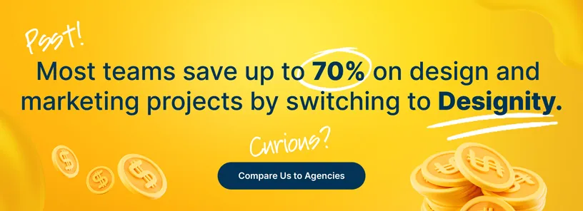
<div class="c-blog_comp-cta cc-component-1"><div class="c-blog_comp-cta-left"><div class="c-blog_comp-cta-left-wrap"><img src="https://global-uploads.webflow.com/61cdf3c5e0b8155f19e0105b/6369722e59155470b6840033_Potential-clients.png" loading="lazy" alt="" class="c-blog_comp-cta-left-img"></div></div><div class="c-blog_comp-cta-right"><div class="c-blog_comp-content"><div class="c-text-wrapper cc-mb-32"><div class="c-title-4 cc-bold"><strong>Want to save money without sacrificing the quality?</strong></div></div><div class="c-text-wrapper"><div class="c-text-2">Say goodbye to traditional, expensive agencies and unreliable marketplaces. Say hello to Designity.<br></div></div></div><div class="c-blog_comp-wrapper"><a href="/pricing" target="_blank" class="c-button cc-primary cc-inverted w-button"><strong>Get Your 2-Week Trial</strong></a></div></div></div>
Ready to Upgrade Your Email Design?
Your emails deserve way more than just a generic template.
So, if you’re looking to upgrade your email marketing efforts and start sending the kind of emails that get read instead of instantly trashed, then Designity is here to make it happen.
Designity gives you access to top-tier creative and marketing talent who know how to design high-performing emails that not only look great but help you get results!
So, whether you’re launching a bold new campaign, keeping your recipients up to date with newsletters or polishing up your onboarding flows, Designity has all the creative and marketing talent plus a designated Creative Director to refine your current strategy and help you get the emails that reflect your brand and drive action!
Check out our email marketing and design services page and portfolio and scroll through samples of our previous work. If you like what you see, then book a demo call today! We’ll get you started on a two-week, no-risk trial so you can test drive our design and marketing services and see why Designity is the last email marketing partner your brand will ever need!
Are you ready to get emails that work harder for your brand?