
Email marketing is one of the most powerful and effective tools for businesses everywhere to connect with their audiences and generate new leads.
But keep in mind that your emails are not the only emails your customer is getting on a daily (or hourly) basis. Not by a long shot.
So, with your customer’s inboxes practically flooded with emails that they’ll most likely never even open, how can you be sure that YOUR emails are standing out from the rest of the rabble and keeping your customers engaged and clicking?
It’s all in the design, baby.
Effective email design grabs attention, it stops that vicious “click-delete” cycle, and it drives action!
So, if you’re ready to stop having your unread emails end up in the spam folder, then this blog is ready to help you create an email template design that engages your customers and finally gets you the results you’re looking for!
Email Template Design Strategy: Know Your Goals

Before rolling up your sleeves and diving into your email design, you first need to thoroughly understand your goals.
Why?
Because effective email design needs to align closely with your objectives, whether those objectives are boosting your sales, increasing your brand awareness, or encouraging more customer engagement.
One strategy you can implement is to use the Jobs-to-be-Done framework as a way to uncover your and your readers’ needs and make it easier to see the steps you need to follow.
Know Your Email’s Audience
To uncover what your audience is looking for and what is more likely to make them read instead of sending your email, unread, to their recycle bin, you need to know more about them.
A useful way to do that is to create customer persons.
A customer persona is like an ICP, only much more detailed, in that it's a fictional representation of an individual member of your target audience. It’s an important component of Account-Based Marketing, and that’s because it allows you to really get inside your customers’ heads so you can better understand their needs, their pain points, and what they’re looking for from your brand.
Choose Your Email KPI Metrics
Now that you’ve figured out what your audience is looking for from you, you’ll need to decide on the metrics you’ll be using to measure their engagement and the effectiveness of your email campaign.
Here are a few of the many metrics you can choose to measure:
- Open rate — This tells you the percentage of recipients who opened your mail. Higher open rates can tell you that your subject line and sender name are getting the job done.
- Click-through rate (CTR) — This measures the percentage of recipients who clicked on a link inside your email and is a good indicator of engagement levels.
- Heat map — HubSpot and other providers give you a visual heat map showing which links got the most clicks in your design.
- Conversion rate — The percentage of recipients who complete your desired action. To better measure this, it would be helpful to have a landing page as a destination, so you can see what people do after clicking on your email.
- Unsubscribe rate — The percentage of recipients who opt out of your emails.
- Spam complaint — Oof. The number of recipients who mark your email as spam. Not something you want.
There are others of course. Choose the metric that best aligns with the goals you set and then it’s on to the design!
Email Design Best Practices

For emails that grab attention, here are some email design best practices to keep your customers engaged.
1. Less is More
If your recipient finds your email subject line interesting enough to open your email, nothing is going to make them regret that decision more than an overwhelming, chaotic mess.
You’re looking for clean design here, friends, so to do that, you’ll need to …
Avoid Design Clutter
Aside from looking “spammy,” cluttered design overwhelms your reader with images, GIFs, and more, making it difficult for them to quickly grasp the message.
It also makes your copy harder to read, increases load time, and looks especially bad when squeezed onto a smaller screen like a smartphone.
Keep your email layout intuitive and clean, in a way that guides your reader easily through short sections of copy and to the call to action at the finish line.
Embrace Your White Space
We mentioned a second ago about design clutter looking “spammy.”
Embracing white space is a good way to clean things up not just for your recipient, but for their email client that could easily send your cluttered email to a spam folder.
Having white space in your email design is also a great way to focus the reader’s attention and improve the readability of your copy.
Keep Your Content Simple
Be sure that your email copy is laid out in a way that’s easy to read and scannable. No long blocks of text here.
Pick one topic and stick to it.
2. Choose the Right Colors
Color scheme is a very important aspect of good email design and can sometimes make all the difference in whether or not your email recipient reads all the way through.
Of course, you’ll want to use your brand colors, but here are some examples of how you can also use additional colors to invoke emotion in your recipients and encourage them to keep reading.
- Red — Red can create a sense of excitement and urgency. Use it for promotions and to draw attention to important info in your email content.
- Blue — Blue can give your emails a sense of trust and professionalism.
- Green — We often see green associated with nature and healthcare. Because of that, it can convey a sense of positivity and freshness.
- Yellow — Another attention-grabbing color. Yellow conveys a sense of optimism, happiness, and warmth.
- Orange — Like yellow, orange is another color that can convey optimism and happiness. It can be used in your emails to call attention to your CTAs or to add a sense of friendliness to your design.
- Black — Black can represent sophistication, power, and importance. Use it to add a touch of elegance and exclusivity to your email design.
3. Limit Your Fonts
Your email messages aren’t the place to experiment with multiple fonts.
Limit your font to one (maybe two if you really need to) to keep your emails on brand and cohesive.
When you’re choosing your font, just be sure it’s a common one that is likely to be installed on your reader’s computer and can easily be read on a smaller scale. You don’t want your readers squinting at their phones because your squiggly font is hard to read.
Decide your font hierarchy and use it to highlight the most important parts of your message. Keep it simple: Header, Subheader, and body copy are all you need to get your message across.
4. Make it Mobile-friendly
There’s a good chance that your recipients are scrolling through social media and checking their smartphones at work all day, so there’s also a good chance that that’s when they’re going to see your email.
Make sure that your emails have a responsive design so that they look just as sharp on a smartphone as they would on a laptop or desktop.
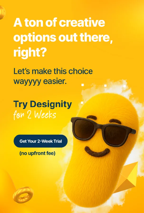
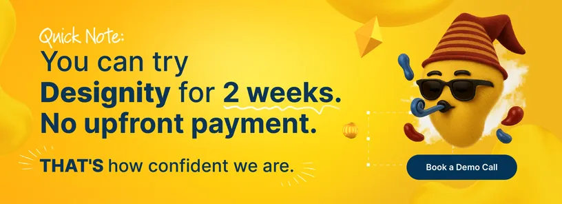
<div class="c-blog_comp-cta cc-component-1"><div class="c-blog_comp-cta-left"><div class="c-blog_comp-cta-left-wrap"><img src="https://global-uploads.webflow.com/61cdf3c5e0b8155f19e0105b/6369722e59155470b6840033_Potential-clients.png" loading="lazy" alt="" class="c-blog_comp-cta-left-img"></div></div><div class="c-blog_comp-cta-right"><div class="c-blog_comp-content"><div class="c-text-wrapper cc-mb-32"><div class="c-title-4 cc-bold"><strong>Want to save money without sacrificing the quality?</strong></div></div><div class="c-text-wrapper"><div class="c-text-2">Say goodbye to traditional, expensive agencies and unreliable marketplaces. Say hello to Designity.<br></div></div></div><div class="c-blog_comp-wrapper"><a href="/pricing" target="_blank" class="c-button cc-primary cc-inverted w-button"><strong>Get Your 2-Week Trial</strong></a></div></div></div>
If You’re Looking for Email Design Experts …
If all of those email design tips sound great to you, you may be wondering how you can get started designing responsive emails that captivate and engage.
The good news is that you’re so close!
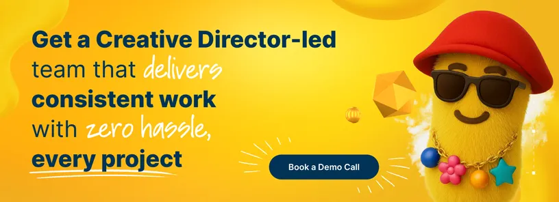
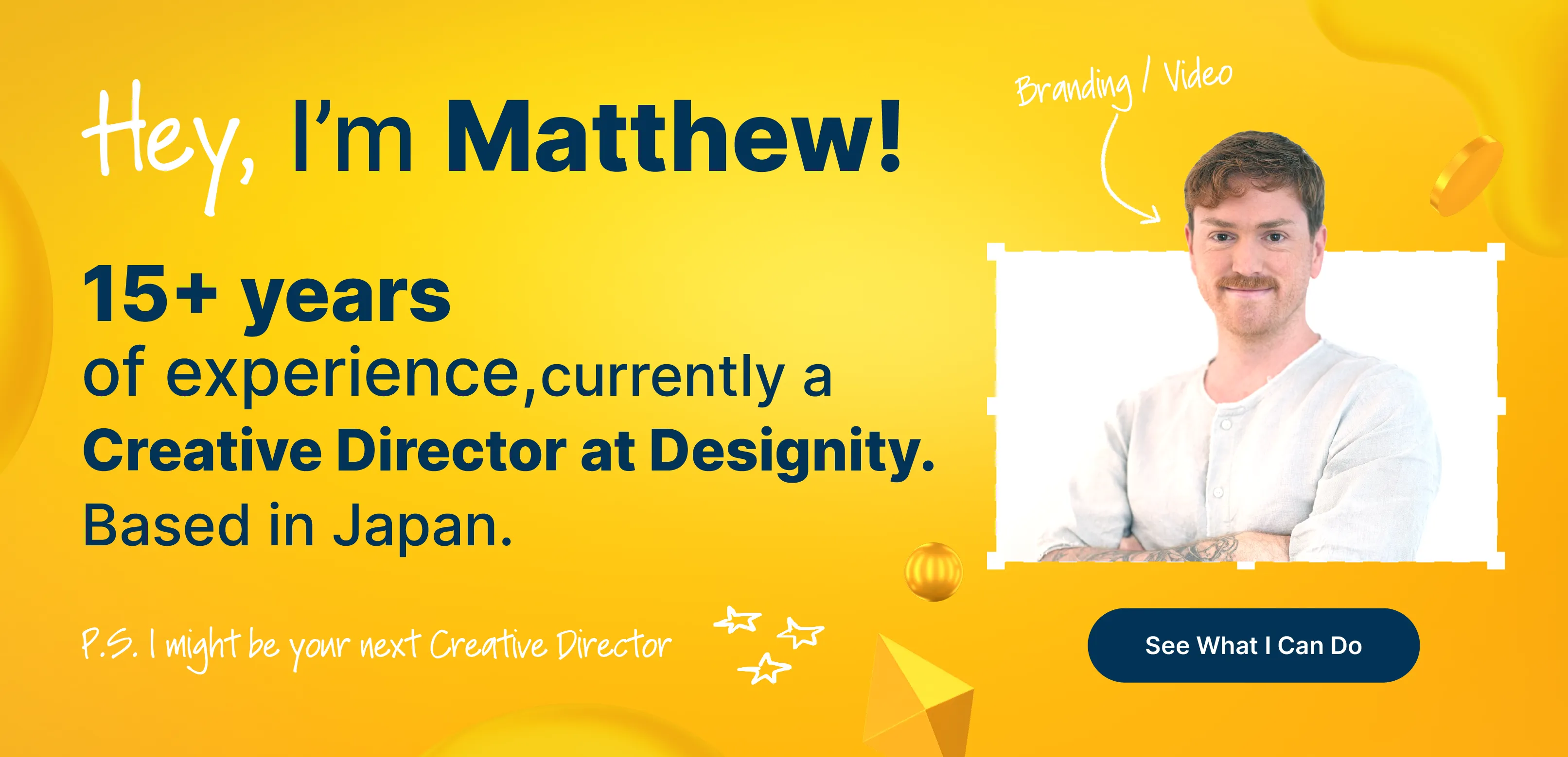
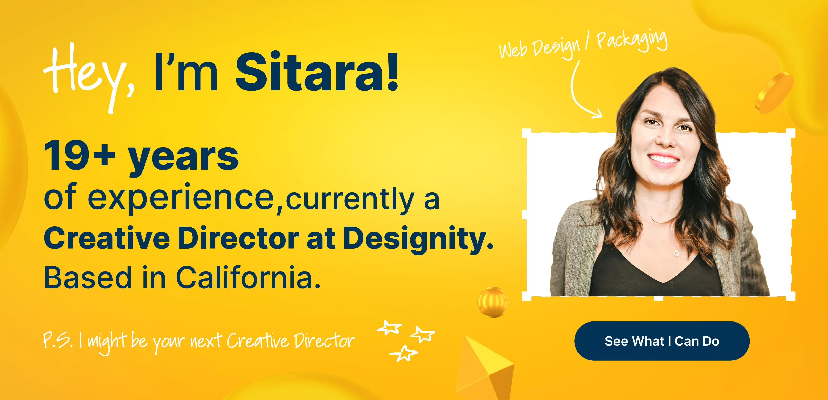
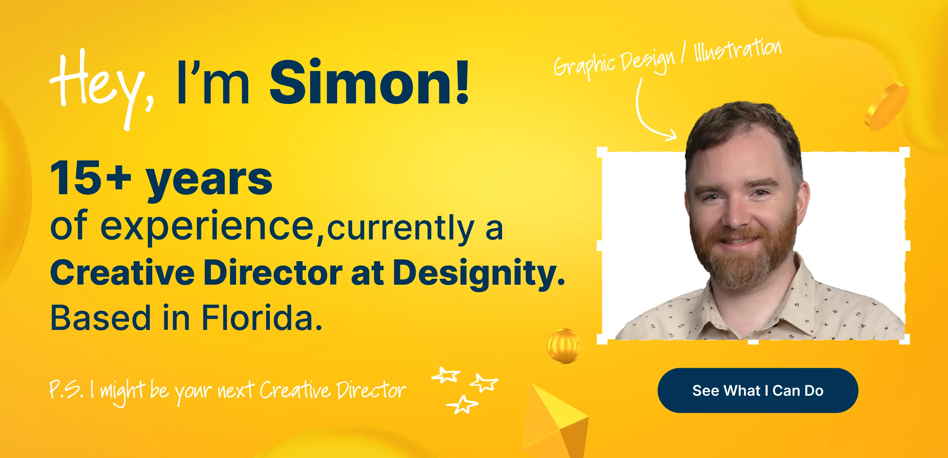
Designity is made up of the top 1% of global creative and marketing talent, including talented graphic designers, copywriters, coders, GIF animators, and more, all ready to write dynamic content and design the beautiful and compelling emails that your brand is looking for.
With your Creative Director at the helm of your project, all you’ll need to do is share your vision with us and then get back to your job, confident in the knowledge that your email design projects are being taken care of and you’ll soon have a final product that you and your customers will love!
Check out our email marketing and email design service pages to see what we’ve been able to do for businesses just like yours.
How do your emails keep your customers engaged?