Your logo isn’t just a symbol — it’s the face of your brand, the first thing people recognize and remember.
But here’s the thing: even the strongest logos can start to feel a little… tired.
Styles change, businesses evolve, and what once felt fresh might not match who you are today.
So, what’s the solution?
Not always a complete overhaul.
In fact, a thoughtful logo refresh can breathe new life into your brand while keeping the recognition you’ve worked so hard to build.
In this guide, we’ll walk you through 7 essential steps to pull off a logo refresh that feels modern, intentional, and true to your brand’s story.
Keep Exploring:
- Skip the hard work and hand off your logo refresh to one of these 15 best logo design companies.
- Spark your creativity with these inspiring logo design ideas and examples.
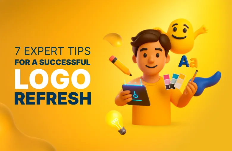
7 Essential Steps for a Successful Logo Refresh
Below are 7 proven ways to refresh your logo so it can stay relevant, recognizable, and future-ready.
We’ll also look at some of the best and worst redesigns to show what works, and what to avoid:
1. Keep What Works to Preserve Brand Recognition
When you refresh or redesign a logo, don’t toss out everything that’s working.
The goal isn’t to erase your brand identity but to refine it.
So, start by pinpointing the elements people already recognize — your color scheme, shapes, typography, or any iconic symbols tied to your brand.
This core “DNA” of your existing logo should remain intact so your target audience still feels connected, even as you modernize the look.
Ask yourself: what’s timeless about your original logo, and what feels dated?
Keeping what works ensures your refresh feels intentional, not confusing.
Examples:
Starbucks has updated its logo several times, from its original brown emblem in 1971 to the text-free green siren in 2011, but the siren has always remained its centerpiece.

Coca-Cola has kept its signature Spencerian script wordmark virtually unchanged since 1887, proving that refining small details over time, not reinventing the core, can keep a logo timeless.

2. Simplify Your Logo Without Sacrificing Personality
Simplifying your logo is one of the quickest ways to give it a modern edge, but it’s important not to lose your brand’s unique personality in the process.
Start by removing unnecessary details, refining shapes, and opting for cleaner lines to make your logo feel polished and versatile.
The trick is finding a balance between simplicity and distinctiveness — keeping those little quirks that make your brand memorable.
Examples:
Mastercard flattened its overlapping circles and removed its name from the logo in 2019, creating a clean, digital-friendly design while keeping its iconic red and yellow colors.

Dropbox simplified its box icon in 2013, moving from a detailed 3D design to a flatter, more geometric look.

3. Choose Modern Typography That Matches Your Brand Voice
Typography sets the tone for your entire brand.
For example, serif fonts often signal tradition, sans-serif feels modern, and script can add personality.
A logo refresh is the perfect time to swap outdated typefaces for cleaner, more readable options that align with your brand voice — whether that’s friendly, bold, or refined.
But remember:
Always test legibility at different sizes and across both print and digital platforms to ensure your logo looks sharp everywhere.
Examples:
In 2015, Google moved from a traditional serif wordmark to a geometric sans-serif, keeping its signature color palette but making the logo more readable and screen-friendly.

Netflix ditched the embossed, shadowed look in 2014, unveiling a flat red “Netflix” wordmark (in Gotham-based typography) that’s clean, bold, and instantly recognizable, which is perfect for screens big and small.

4. Refresh Colors While Maintaining Visual Equity
If your brand’s colors are working, don’t throw out the paint bucket — just mix a better shade.
In other words, keep the colors your audience already connects with, but refine them to feel fresh and modern.
Tweak tones, brighten hues, or simplify gradients for a cleaner look across every platform.
And don’t forget contrast: prioritizing accessibility ensures your updated palette not only looks great but works for every user.
Examples:
Spotify amped up its signature green to a more vibrant, screen-friendly shade in 2015, keeping its recognizable look while making it pop digitally.

Amazon introduced a custom tangerine hue called Smile Orange in 2024, giving its iconic arrow a fresher, more modern design while maintaining brand recognition.

5. Make Sure Your Logo Reflects Your Brand Strategy
A logo refresh should do more than just “look modern.” It needs to align with your brand’s current positioning, values, and target audience.
The right refresh communicates where your brand has been and where it’s going, all while staying recognizable.
So, avoid chasing design trends that won’t last and aim for a design that works seamlessly across every touchpoint, from social media icons to packaging.
Examples:
Instagram evolved from its detailed retro camera icon launched in 2010 to a bold, minimalist gradient glyph in May 2016, signaling its growth from a photo app to a global social platform

Johnson & Johnson replaced its 130-year-old script logo in 2023 with a modern sans-serif wordmark, uniting its business under one brand and signaling a sharper focus on healthcare innovation.

6. Learn From Failed Logo Refreshes
Sometimes the best lessons come from mistakes — and logo history has plenty.
Not every refresh is a win; some brands lose recognition or even alienate your loyal customer base by straying too far from their roots.
Examples:
In 2010, Gap swapped their classic serif wordmark for a bland redesigned logo, and the backlash was so fierce they reverted in just a week.

Then there’s Tropicana. In 2009, they created a logo that confused shoppers so much that sales dropped 20% in two months, forcing them to bring the old design back.

Key takeaways?
Don’t erase hard-earned brand equity or risk confusing your audience just for the sake of change.
7. Know When to Break the Rules
Logo refreshes usually follow tried-and-true best practices, but there are times when breaking the rules makes sense.
Complexity can be powerful when it highlights a brand’s heritage, while hand-drawn or intentionally imperfect logos can signal craftsmanship and authenticity.
Even bold, dramatic departures can succeed when a brand has enough recognition to carry them forward.
The secret is knowing your audience, your equity, and your story well enough to bend the rules without losing trust.
Examples:
Burberry’s dramatic 2018 rebrand and later reversion in 2023 proves bold moves can still spark conversation.

Versace has kept its intricate Medusa emblem, introduced in 1993, proving that detailed, ornate logos can be timeless when they reinforce heritage and luxury.

Refresh Your Logo the Right Way, Backed by Designity’s Experts
A successful logo refresh is about evolution, not revolution.
By preserving core identity, simplifying without losing personality, and aligning with your brand’s strategy, you can create a refreshed logo that feels both recognizable and new.
The best updates, like those from Google, Mastercard, and Instagram, prove how powerful this balance can be — while missteps from Gap and Tropicana remind us of the risks.
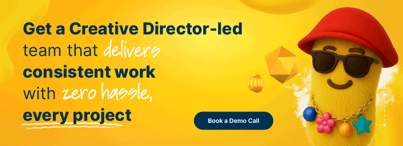
If you’re ready for a refresh but want to avoid those pitfalls, Designity makes it simple.
Our subscription-based Creative-as-a-Service (CaaS) model gives you access to the top 1% of vetted creatives and marketers and a dedicated Creative Director who guides every decision.
That means your logo evolves strategically, not by guesswork, and your brand identity stays strong while moving forward.
Want logo redesigns that feel intentional and future-proof?
Book a demo call today and explore over 100 creative services with a two-week free trial.
.webp)


.webp)