When a well-known celebrity gets a makeover or has a little “work” done … well, it can go one of a few ways.
Sometimes the new look works — they get noticed for all the right reasons and start landing all kinds of new roles. Other times, it’s so subtle that people can’t quite put their finger on what’s so different and fresh about them.
But, friends, when that makeover is bad? Oh, it’s bad.
And the same goes for brands. Logo or brand identity redesigns are always a huge deal and whether it's just a subtle refresh or a total overhaul, changing things up is like rolling the dice.
We’ve seen some companies pull off rebrands flawlessly, coming out looking smarter, sleeker, and better than ever. But we’ve also seen others try something bold only to instantly regret it and slink back to their old branding, pretending like nothing ever happened.
So, let’s take a walk down memory lane, shall we? Today’s blog is revising 10 of the most memorable logo designs, including five that absolutely nailed it … and 5 that did not.
Redesign Roulette: Why It’s a Risky Game
Changing up your brand’s logo might seem like just a simple facelift, but for many brands, it’s way more than that.
A logo isn’t just a pretty design on your merchandise, after all. For many brands, their logo design represents trust, recognition, and identity all rolled into one. So when companies decide to change something that’s worked for so long, the stakes are high.
And people will have opinions.
Here’s why logo redesigns are such a gamble:
- People get really attached to logos — Even if they complain about it, they’ll still be upset when it changes.
- Brand equity is on the line — A well-known logo carries years of recognition. One wrong move, and all that familiarity goes away (and people get upset).
- First impressions matter — New customers might meet your brand for the first time after the redesign and, possibly, because of the hype that comes with it. If it’s bad? Yikes.
- The internet is gonna internet — If a redesign flops, social media will let you know — loudly and with memes.
- Looks aren't everything — A logo might look cool on a mockup, but if it doesn’t scale well, print cleanly, or match the brand’s tone? It’s a miss, friend.
The Best and Worst Redesigns of All Time
And yet? Despite the risks, sometimes a good redesign pays off big time.
So, let’s see how redesigning their logos worked out great for some brands … and not so much for others.
Nailed It: Instagram (2016)
.png)
Ah, this rebrand was a glow-up if there ever was one.
In 2016, Instagram waved goodbye to its retro Polaroid-style camera logo in favor of the sleeker, more minimal gradient design we know today. And, sure, people hated it. At first.
But the redesign wasn’t totally about cosmetics. By 2016, Instagram had outgrown its simple beginnings as a photo-filter app and added features like video, direct messaging, and Stories. It had evolved into its own social platform and … well, the Polaroid logo just didn’t reflect that anymore.
The new design was made for the modern, smartphone era. It scaled better, stood out on home screens better, and just in general fit Instagram’s new vibe as a social platform.
People may have dragged it when it first came out, but fast forward 9 years and that gradient icon is now instantly recognizable and iconic itself!
Missed the Mark: Gap (2010)
.png)
Oh, Gap.
In 2010, clothing brand Gap surprised literally everyone by quietly rolling out a brand-new logo:
A plain Helvetic wordmark with a little blue gradient box hovering over the “P.” It was quite the departure from the iconic navy blue square and serif font they’d been rocking since the 80s (factcheck).
So, what the hell?
Reportedly, Gap was trying to modernize its image to better appeal to the younger audience and this new logo was meant to signal its innovation and a fresh new start!
But … they didn’t tell anyone. There was no campaign, no context, no build-up. The new logo appeared out of nowhere and people hated it. Designers, brand loyalists, and randos on the internet all joined forces to pile on the criticism; too generic, too unmemorable, a disgrace to the brand’s history.
Whatever the reason they hated it, the backlash was brutal. Within six days, Gap pulled the redesign and went back to the original.
Moral of the story? You can’t modernize your brand by erasing its whole identity. At least not overnight and without telling your customers, anyway.
Nailed It: Airbnb (2014)
.png)
Airbnb, the online marketplace for vacation rentals and short-term stays, started off as a smarter, more private alternative to hotels. But by 2014, it had grown into a huge hospitality brand of its own. And it needed an identity to match.
Before the redesign, Airbnb had the fairly generic wordmark you see above. It didn’t say much about who they were and, as the company expanded its offerings, it needed a logo to reflect that.
Which brings us to the “Belo.”
This abstract symbol was meant to represent belonging — the brand’s new mission — and also double as a stylized “A,” that, according to Airbnb, symbolized people, places, love, and community all at once.
It was a bold new look. And yes, the internet immediately pointed out its resemblance to … well, certain body parts. But, all that aside: the logo stuck!
It was simple, scalable, and better in tune with the brand’s change from tech startup to global hospitality. So, laughs aside, the rebrand worked wonders. It gave Airbnb a recognizable identity and helped cement its status as a big player in the travel industry.
Missed the Mark: Tropicana (2009)
.png)
Tropicana is one of the most recognizable juice brands in America, famous for its bright cartons, vibrant green logo, and that iconic orange with the straw poking out of it.
Yeah, you know the one.
But in 2009, PepsiCo (then owner of the Tropicana brand) made the bold (and baffling) decision to scrap Tropicana’s signature look and swap it out for a sterile, text-heavy redesign that ditched everyone’s favorite orange and straw combo and replaced it with a vertical label and weird orange cap.
Why such a huge departure from their previous identity?
Apparently, they wanted a cleaner and more contemporary look. But unfortunately, what they got instead was a bunch of confused consumers and a 20% drop in sales in the weeks that followed.
The backlash was immediate. Loyal Tropicana drinkers couldn’t find their OJ on the shelves as easily and when they did, they didn’t recognize it anymore. Tropicana scrambled to stop the bleed and reverted back to their old branding almost instantly.
Moral of the story? Don’t squeeze the soul out of your brand in the name of looking sleek and clean.
Nailed It: Mastercard (2016)
.png)
Mastercard, one of the world’s largest credit card companies, has been happily charging, swiping, and tapping its way into our hearts since the 1960s.
And for decades, its logo was just as recognizable as its name.
But by 2016, Mastercard decided that its branding was starting to feel a little too bulky. You had the overlapping red and yellow circles and the word “Mastercard” in the middle and a bunch of gradients and shadows. It worked, yeah, but it wasn’t exactly modern and wasn’t exactly working as an app icon on smartphones and tablets.
The redesign fixed all that.
The new logo simplified all of the busy design choices, moved the brand name underneath, and flattened everything out into a more minimalist, digital-friendly mark. Then, since that worked so well, they dropped the wordmark completely in 2019, leaving just two circles.
And, thanks to their brand recognition, it still worked!
This was a textbook example of a naturally evolving logo that didn’t reinvent the wheel. Instead, it kept the essence of its identity and just adapted it for a mobile-first world.
Good job, Mastercard.
Missed the Mark: Animal Planet (2008)
.png)
Animal Planet, the TV network that gave us The Crocodile Hunter, serene nature documentaries, and River Monsters, used to have a logo that made sense:
An elephant and a globe. That pretty much told you exactly what kind of ride you were in for.
But then, in 2008, they decided to try something different.
The beloved elephant disappeared and in its place came a clunky, text-only logo with the “M” toppled over, as if mid-fall.
A bold choice, sure. Like Tropicana, the goal was to modernize the brand and appeal to a broader, more adult demographic that lined up with their edgier programming.
Unfortunately, it didn’t work. Fans were confused. Designers hated it. Even the elephants were offended (Editor’s note: citation needed).
But Animal Planet stuck to its guns. Luckily, though, 10 years later, they reintroduced a sleeker logo (far right) with the elephant back in its rightful place.
And all was right on the (animal) planet again.
Nailed It: Burger King (2021)
.png)
Burger King, the fast-food chain known for flame-grilled Whoppers and that deeply unhinged King mascot, has gone through a lot of changes over the years.
But in 2021, it finally did what more should do and it went back to its roots.
After using the shiny plastic-looking logo above since 1999, Burger King decided to unveil a redesign that felt… oddly familiar to their patrons. That’s because it was inspired by the brand’s old logo from the 70s and this time, they nailed it.
And the new look wasn’t all about style. Their redesign was part of a bigger strategy to reflect Burger King’s other changes too: updated recipes, cleaner ingredients, and a commitment to avoiding artificial additives. And since the logo needed to match that shift, they went full retro, baby —rounded typography, flat design, warm colors, kicking out the blue swoosh —something that felt more honest and more in touch with where the brand was going.
It also happened to look great across digital platforms, packaging, and signage. It was everything a logo should be; nostalgic without being outdated, friendly without being overly cheesy, and most importantly? It honored the brand’s long history.
And guess what? The fans loved it! Which just goes to prove that sometimes, the best way forward means taking an intentional and stylish step back.
Missed the Mark: Yahoo! (2013 & 2019)
.png)
Yahoo, the pre-Google king of early internet search engines and email has been trying to figure out its identity since the mid-2000s.
In 2013, after 18 years of using the serif purple logo people knew and loved (or liked, whatever), Yahoo rolled out a new design.
It kept the purple and the exclamation point, but took away the quirky font, replacing it with a new sans-serif wordmark that looked like it was trying to be serious, techy, and modern, but …didn’t quite get there. The reception ranged from “we hate it,” to “meh.”
But, undeterred, Yahoo stuck with its new logo and then, in 2019, tried again. Another sans-serif. This time lowercase, with a slight italic lean and quite a dramatic exclamation mark tilt. It was cleaner, yes. But still wasn’t doing it.
So what happened?
Well, Yahoo was trying very hard to rebrand itself as a tech company in an industry that had changed dramatically since its inception. It was trying to modernize itself, shifting away from its bright, Geocities-like chaotic, early-internet roots and into something sleeker and cleaner.
Unfortunately, the problem was that they were erasing too much of their personality, as many of their customers and critics were quick to point out. Instead of standing out, Yahoo just looked like every other tech company out there.
Two rebrands later, and the exclamation point is still there—but the brand recognition? Not so much.
Maybe one day, Yahoo!
Moral of the story: if you're going to rebrand, don't strip away the personality that made people love you in the first place.
Nailed It: Pringles (2016)
.png)
Pringles, the stackable chips we loved to see in our lunchboxes growing up, has always leaned into an offbeat, cartoony vibe what with its bright red and yellow colors, its sometimes bizarre flavors, and, of course, the mustachioed face of Mr. Pringle himself.
For decades, Mr. Pringles graced every can of Pringles chips, with his fluffy brown hair, glorious ‘stache, rosy cheeks, and that adorable bow tie.
But in 2020, Pringles gave their mascot a makeover.
They took out his detailed shading, 3D effects, and facial features, and replaced them with a flat, minimalist version of Mr. Pringles complete with simplified mustache, dot eyes, and a completely bald head. And while the internet had jokes, of course, the redesign was actually pretty smart.
The old logo wasn’t working well with digital platforms. It had too much detail, which made it too hard to scale and be used on apps or social media. The rebrand not only modernized Pringles without losing their personality or beloved mascot, but gave them a more flexible, scalable, and digital-friendly look; as in it looked just as good on TikTok as it did on a can on a convenience store shelf.
And most importantly, it still felt like Pringles. Mr. P may have lost his hair, but the brand gained a fresher, bolder, and more modern identity.
Missed the Mark: Mozilla (2017)
.png)
Mozilla, best known as the nonprofit behind the Firefox browser, has always positioned itself as the internet’s open-source champion.
So, in 2017, when it was time for a rebrand, they decided to really dig into their tech roots to match their “activist spirit” as well as distinguish the company from its Firefox browser. The result was a logo of their name, but stylized as “Moz://a”— a little nod to URL structure and coding.
And it was a cool idea on paper… very clever and creative.
But their issue wasn’t creativity; it was the execution. The new logo was hard to read at a glance, confusing to non-techy folks, and felt like it was made more as a wink to developers than as a public-facing logo meant for their audience.
While the colons and slashes were meant to symbolize Mozilla’s mission of keeping the internet open and accessible, the actual result was a logo that wasn’t … very open or accessible at all.
And unlike some of the other entries in our “Missed the Mark” sections, Mozilla didn’t even have a dated logo to begin with—the old one was clean, recognizable, and working perfectly fine. This just felt like change for the sake of change.
The tech world may have appreciated the concept, but the general public? Not so much.
The moral of the story? Sometimes, being too niche has its downsides.
<div class="c-blog_comp-cta cc-component-1"><div class="c-blog_comp-cta-left"><div class="c-blog_comp-cta-left-wrap"><img src="https://global-uploads.webflow.com/61cdf3c5e0b8155f19e0105b/6369722e59155470b6840033_Potential-clients.png" loading="lazy" alt="" class="c-blog_comp-cta-left-img"></div></div><div class="c-blog_comp-cta-right"><div class="c-blog_comp-content"><div class="c-text-wrapper cc-mb-32"><div class="c-title-4 cc-bold"><strong>Want to save money without sacrificing the quality?</strong></div></div><div class="c-text-wrapper"><div class="c-text-2">Say goodbye to traditional, expensive agencies and unreliable marketplaces. Say hello to Designity.<br></div></div></div><div class="c-blog_comp-wrapper"><a href="/pricing" target="_blank" class="c-button cc-primary cc-inverted w-button"><strong>Get Your 2-Week Trial</strong></a></div></div></div>
Looking for Your Brand’s Next New Look?
Logo redesigns, right?
They can go very right or they can go spectacularly wrong.
But that’s the risk you take. Whether it’s a subtle refresh or a total overhaul, changing your brand’s visual identity is a risky move.
There are, however, ways to minimize the risk. Use intentional design, understand your brand story, your audience and how they connect to it, and really think about where you want your brand’s future to take it.
So, are you looking for your brand’s next new look?
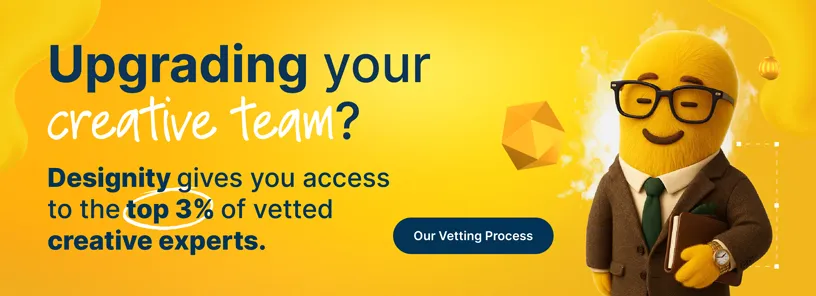
Designity is an innovative Creative as a Service platform that connects brands with top-tier creatives and marketers—designers, illustrators, strategists, digital marketers, and more—to make sure every design decision you make for your brand is informed, sharp, and built to last!
Take a peek at our logo and branding service page and portfolio to see how Designity has been able to help other brands just like yours. If our vibe vibes with you, go ahead and book your demo call today!
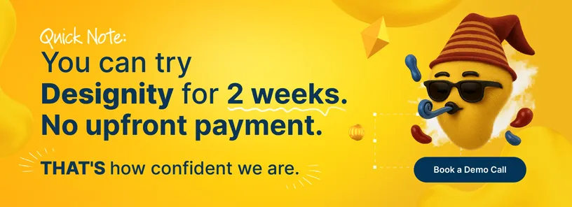
We’ll get you started with a two-week, no-obligation trial so you can test drive our 100+ design and marketing services and see why Designity has the brand guidance you’re looking for!
Are you ready for your best look yet?

.webp)