
Color isn’t just decoration — it’s the heartbeat of your brand.
The right palette can spark emotion, set the tone, and make your brand instantly recognizable.
And don’t worry — you don’t need to be a color theory expert to pull it off.
With a few smart tips and a little strategy, you can create harmony, balance, and visual impact that sticks.
Let’s break down expert-backed ways to build a palette that speaks your brand’s language and captivates your audience.
Keep Exploring:
- Take a look at the 15 best B2B branding agencies to find the right partner to handle everything from color harmony to full-scale brand strategy.
- Or dive into our branding design guide for a breakdown of the essential elements behind a strong brand identity, from logos and typography to color palettes and voice.
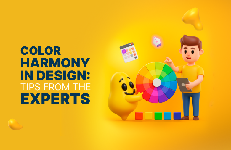
5 Expert Tips for Mastering Color Harmony in Design
These five expert tips will help you create color harmony:
1. Start With a Core Hue and Its Partners
.png)
Start your palette with a single hue that truly reflects your brand’s personality.
Think: vibrant orange for energy, calming blue for trust, or a bold red for passion.
From there, get strategic: rotate 137.5° on the color wheel (the golden ratio in action) to select a contrasting color that grabs attention without clashing.
Finally, tone down your hero color by about 60% saturation to create a softer shade perfect for backgrounds or text.
This simple formula gives you a versatile trio — a primary brand color, an eye-catching accent, and a muted companion.
2. Build a Complete Palette
.png)
Your palette isn’t complete with just a hero color — it needs a whole supporting cast. To do this:
- Anchor with neutrals: White, beige, gray, or black create a calm foundation that won’t compete with your core hues.
- Add personality with “pop” colors:
- Cool tones (blue, green) feel calm and professional
- Warm tones (red, orange) feel bold and energetic
- Choose a standout CTA color:
- Choose one shade that contrasts your palette yet feels cohesive
- Use sparingly so buttons and key actions grab attention
3. Consider Color Psychology and Audience
Color isn’t just visual — it’s emotional. Each hue sends a message:
%252520(1).png)
But context matters.
Color perception shifts by age, gender, and culture, so research your audience before finalizing your palette. For example, red symbolizes luck and celebration in many Asian cultures but may feel aggressive or signal danger in Western contexts.
Aligning colors with your brand’s message and audience expectations creates stronger emotional connections and avoids mixed signals.
4. Keep Structure and Contrast in Mind
A well-structured palette keeps your design clean, professional, and easy to navigate.
Start with one dominant color that represents your brand, add a few accent shades to create variety, and choose a neutral text color like black or dark gray for maximum readability.
When selecting colors, keep these principles in mind:
- Analogous colors (next to each other on the color wheel) create a soft, cohesive feel.
- Complementary colors (opposite each other) deliver bold contrast and visual impact.
- High contrast should be reserved for CTAs and key links to guide attention.
And always stick to conventions like dark text on light backgrounds to ensure accessibility and a polished, user-friendly experience.
5. Document and Test Your Palette
Once your palette feels right, lock it down like a pro.
Save exact HEX or RGB codes and spell out where each color belongs so there’s no guesswork later.
Include references to color models (like RGB for digital or CMYK for print) to ensure your brand colors look consistent across platforms.
Next, put it through the wringer: convert your palette to grayscale to check contrast and accessibility, especially for color-blind users.
Then, test it with real people: Do your colors spark the right emotions and feel easy to read everywhere?
A well-documented, battle-tested palette keeps your brand looking sharp and consistent across every platform.
What Is Color Harmony?
.png)
Color harmony is the design principle that makes your visuals feel intentional, balanced, and easy on the eyes.
It’s about arranging colors so they work together, creating a polished and cohesive look rather than visual chaos.
Designers achieve this using color schemes or structured combinations from the color wheel that help set tone, guide attention, and build brand identity.
Here are some of the most common approaches:
- Monochromatic: Focuses on a single color and its variations in tint, tone, and shade, creating a simple and consistent look.
- Analogous: Uses colors side by side on the wheel, adding subtle depth and harmony without dramatic contrast.
- Complementary: Pairs colors opposite each other for bold contrast that instantly draws attention to key elements.
- Split-Complementary: Combines a base color with the two next to its opposite, offering contrast with a softer, more balanced feel.
- Triadic: Evenly spaces three colors on the wheel, creating vibrant, energetic palettes that feel playful and dynamic.
When applied well, these schemes bring clarity and emotional impact to a design. Without them, your visuals risk feeling cluttered or confusing, driving users away before they engage.
5 Reasons Why Color Harmony Matters
Color harmony isn’t just a design principle — it’s a strategic tool that impacts user experience, engagement, and brand perception.
Let’s break down five key reasons why it matters:
1. Aesthetics and Emotion
Harmonious color combinations are naturally pleasing to the eye, creating a calm, organized experience that instantly elevates your brand.
Colors evoke feelings, and when they work together, they shape how users see and trust your business.
2. Guidance and Focus
A well-chosen palette is like a map for your audience.
Strategic pops of color draw attention to buttons, forms, and key messages, while neutral or muted tones keep distractions at bay.
3. Brand Identity
Your brand’s personality isn’t just in your logo or tagline — it’s in your colors.
A balanced palette creates a distinct visual language, making your brand feel consistent, memorable, and easy to recognize anywhere.
4. User Engagement
Color harmony keeps users comfortable and focused, even during long browsing sessions.
For example, platforms like online courses often use soft, monochromatic palettes with strategic highlights to reduce fatigue and keep learners engaged.
5. Usability and Accessibility
Strong contrast and thoughtful color placement make content easy to read and navigate.
Designers test palettes in grayscale and on multiple devices to ensure every user, including those with color blindness, gets an enjoyable experience.
Designity’s Palette Power: Turning Colors Into Conversions
A strong color palette is built on thoughtful planning, emotional insight, and real-world testing.
By choosing a balanced base, designing with intention, and refining through feedback, you create visuals that look stunning and genuinely connect with your audience.
But achieving that level of precision on your own often takes time, expertise, and endless experimentation.
At Designity, a subscription-based Creative-as-a-Service (CaaS) platform, we simplify the process by connecting you with the top 1% of vetted creatives and marketers and seasoned Creative Directors who apply proven design principles to every project.
From brand identity and web design to marketing collateral and motion graphics, we deliver visuals that resonate, convert, and elevate your brand.
Ready to see how expert color harmony and design can transform your brand?
Book a demo call and we’ll set you up with a two-week free trial to explore our 100+ creative services risk-free.