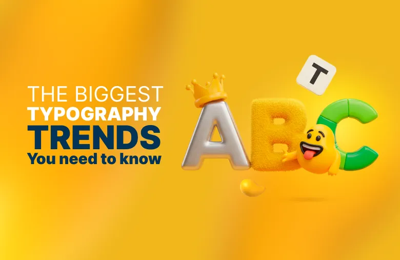
Typography in 2025 is at a fascinating crossroads, where technology and AI meet nostalgia and handcraft.
Designers are embracing tools that push creative boundaries while looking back to classic styles and human touch for warmth and authenticity.
The result?
Fonts that feel more alive than ever — whether they’re bold and rule-breaking or elegant and timeless.
In this article, we’ll dive into five typography trends shaping 2025, giving you the insight you need to keep your designs fresh and impactful.
Keep exploring:
- Discover more about Color Harmony in Design to create color palettes that perfectly complement your typography.
- Master Font Pairing Formulas to create stunning combinations with your color choices.
5 Biggest Typography Trends to Watch in 2025
From rebellious anti-design to motion-powered lettering, these are the typography or font trends shaping how brands connect, stand out, and tell their stories in 2025:
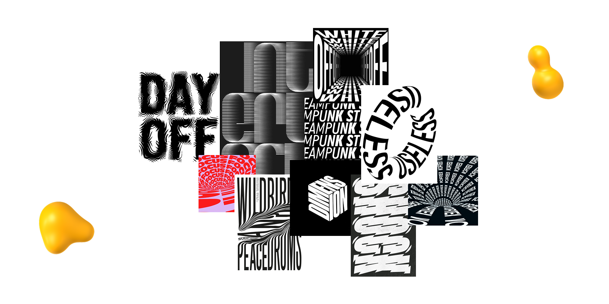
1. Anti-Design
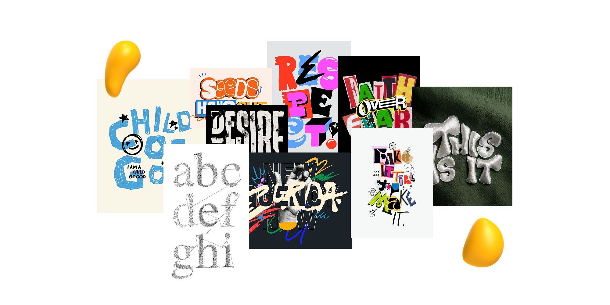
Bold, unconventional letterforms — distorted, chaotic, playful, or rule-breaking — are at the heart of this graphic design trend.
Prioritizing visual impact over legibility, these fonts embrace collage-inspired layouts, handmade aesthetics, and even craft-like textures, such as knitting.
Anti-design rebels against the slick, modern typefaces that defined the past decade, instead celebrating rawness and individuality.
Why It’s Trending:
Anti-design reflects a broader cultural rejection of perfection. As digital design grows increasingly polished, this trend taps into audiences’ craving for authenticity and creative freedom.
Its rule-breaking nature allows brands to break away from corporate sameness and invite personality into their visuals.
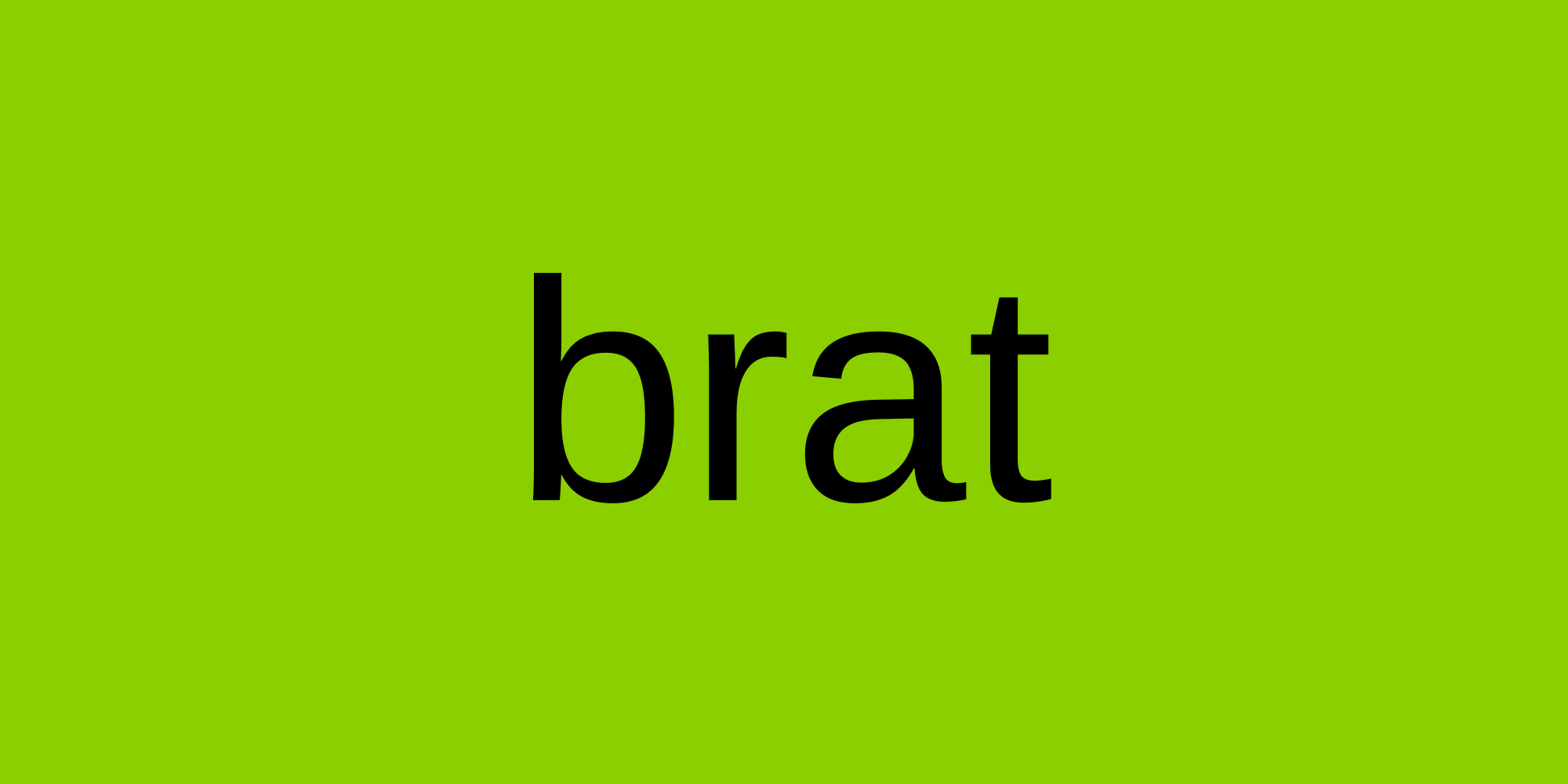
Example:
Charli XCX’s Brat album cover is a standout example, with its scrappy, DIY typography inspiring a wave of experimental designs across music and fashion:
2. Heritage
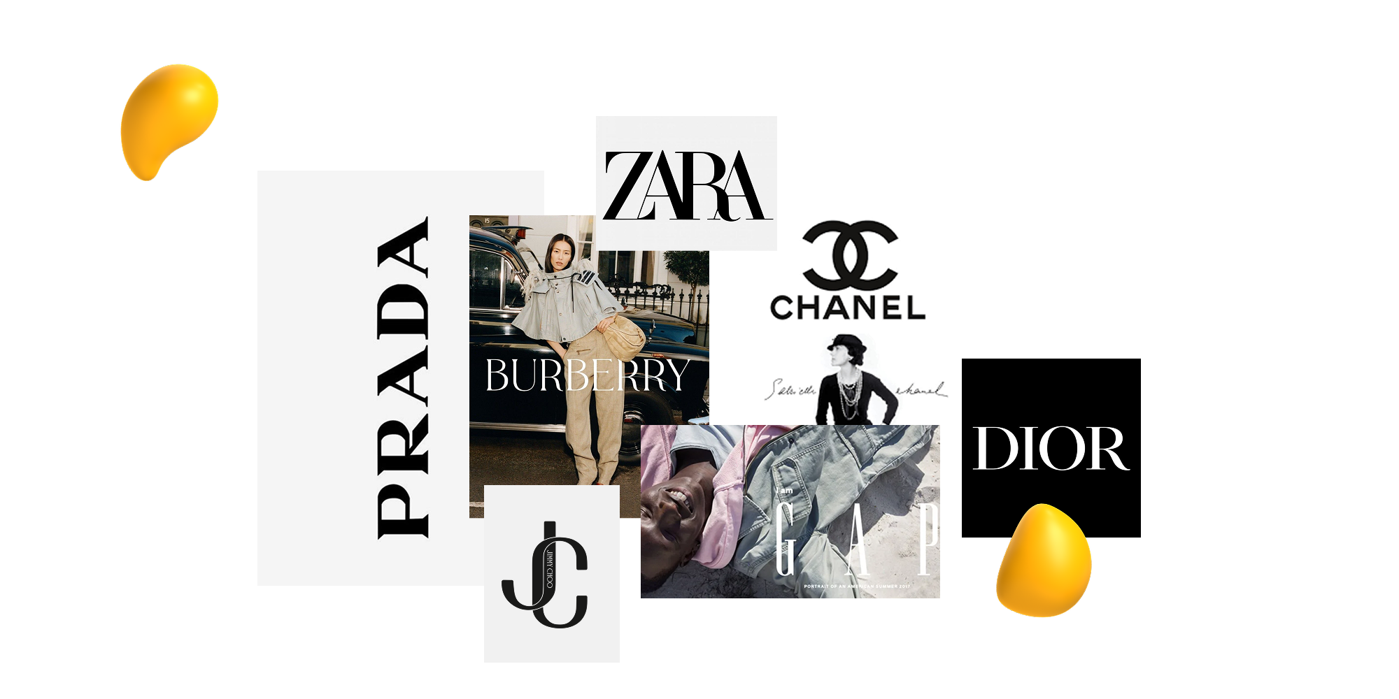
Inspired by iconic brands like Prada, Chanel, and Burberry, heritage fonts are making a strong comeback in 2025.
This style leans on ornamental, hand-drawn lettering and stamped insignias, often scaled up dramatically to disrupt traditional margins and layouts.
These fonts evoke a sense of familiarity and timelessness, becoming instant brand identifiers that feel both prestigious and enduring.
Why It’s Trending:
As AI-driven design grows more common, many brands are gravitating toward heritage-inspired typography to signal authenticity, craftsmanship, and legacy.
These fonts act as visual anchors, connecting modern branding with history and tradition.
The deliberate use of ornate letterforms and oversized placement helps luxury and boutique brands differentiate themselves in a market saturated with minimalism.
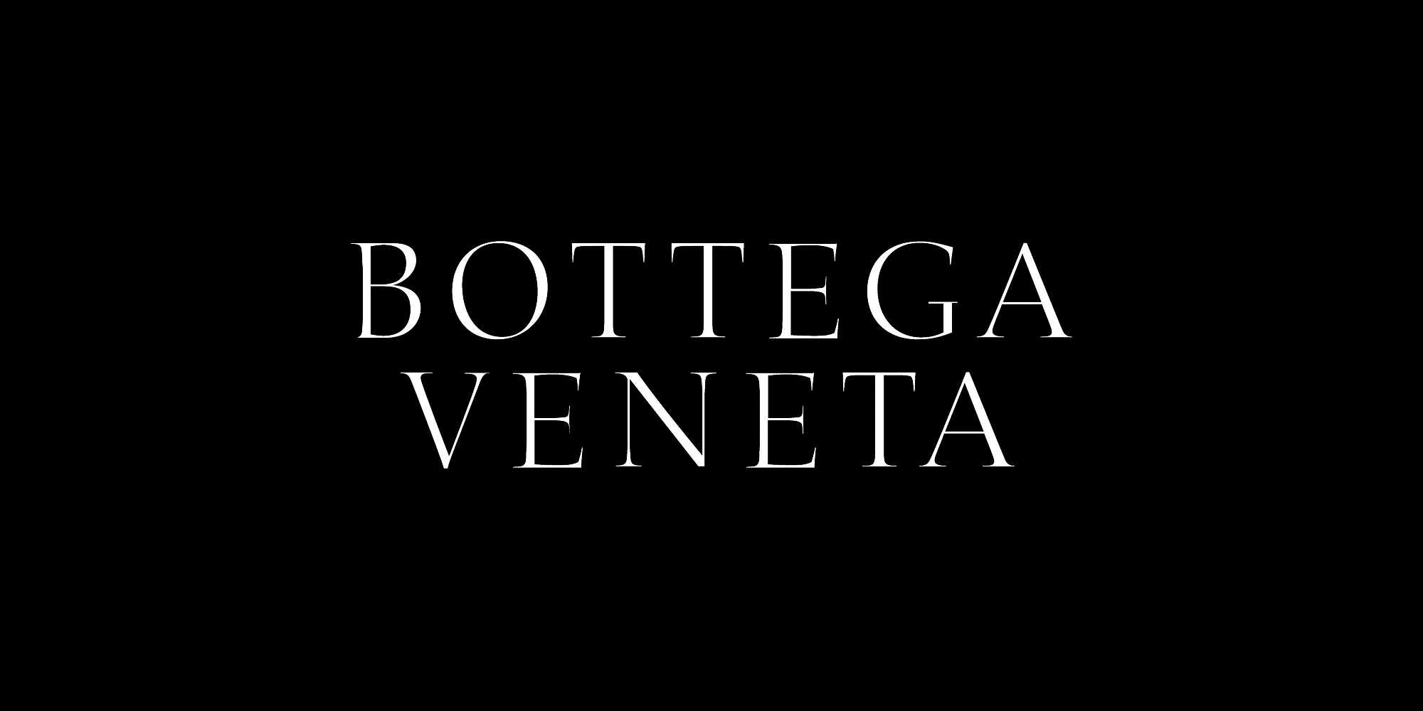
Example:
Bottega Veneta’s bespoke serif font logo design has seen only subtle refinements since 1966, reinforcing its heritage roots while keeping a modern twist and luxurious feel:
3. Y2K
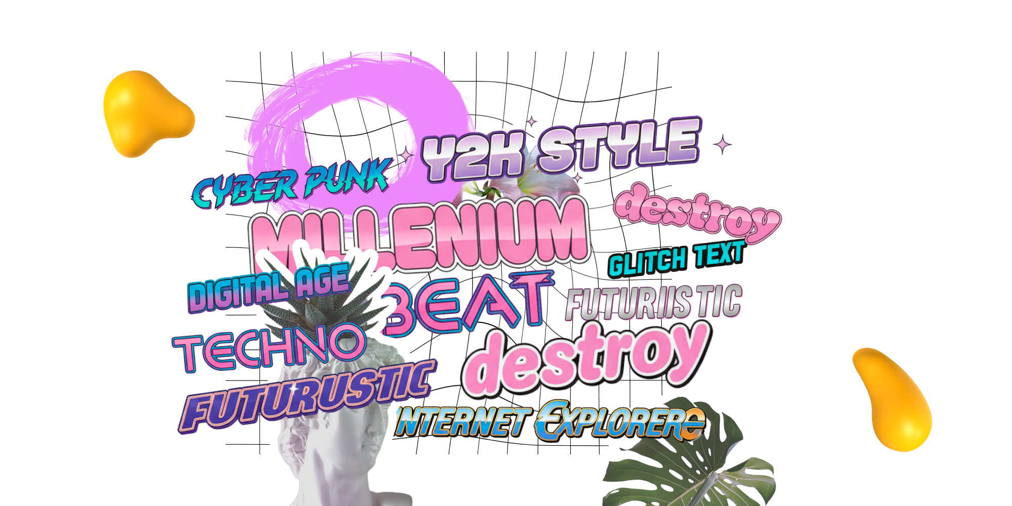
You didn’t add me to your top 8? The year is 2025, but have you noticed some fonts look like they’ve stepped straight out of a Myspace page?
Yep, the Y2K aesthetic is back, and it’s bringing all the early-internet drama with it.
The resurgence of Y2K in fashion, entertainment, and cinema is trickling down into design, bringing back the bold and playful energy of the early 2000s.
Nostalgia feels comforting and lends authenticity, with chrome detailing, bubbly outlines, and vibrant colors tapping into the emotional core of viewers dreaming of the internet’s early days.
Why It’s Trending:
As brands fight to stand out in an overly sleek digital world, Y2K design offers warmth and personality.
Designers are embracing this aesthetic as a way to spark emotion and connect audiences to a cultural moment that feels both vintage and futuristic.
Example:
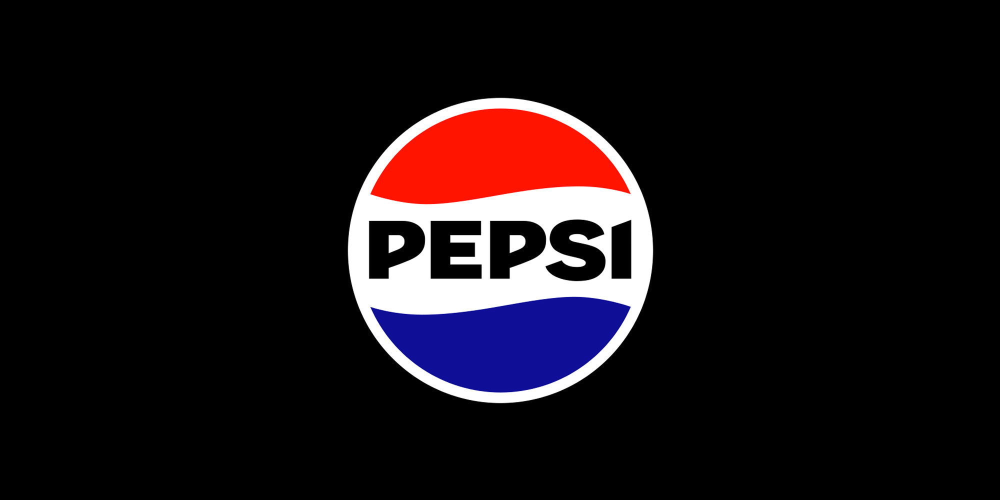
Pepsi’s 2025 rebrand brings back its bold, all-caps wordmark and globe design, echoing its iconic 1990s logo. This nostalgia-driven refresh taps into Y2K-era typography to spark familiarity while feeling fresh for a new generation:
4. Hand-Written
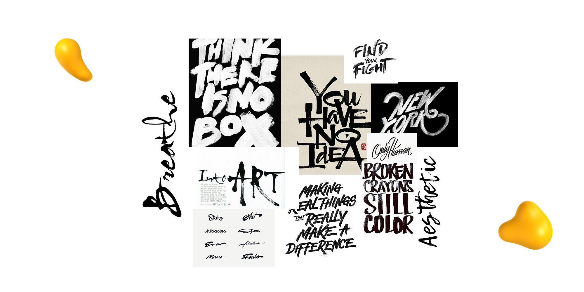
In a world where AI can crank out flawless fonts in seconds, nothing stands out more than a beautifully imperfect, hand-drawn letter.
Fonts that feel personal, like handwritten scripts, brush-style lettering, and typefaces with organic quirks, are on the rise.
These elongated, elegant letters bring warmth and personality, giving brands a handmade edge that feels inviting rather than sterile.
Why It's Trending:
As design becomes increasingly digital and automated, audiences are craving a sense of humanity and authenticity.
Handwritten fonts tap into that need, helping brands feel approachable and unique.
For millennial-driven and artisanal brands, these styles create a signature look that feels crafted and trustworthy. This also helps these brands stand out from the hyper-polished, cookie-cutter aesthetics flooding the market.
Example:
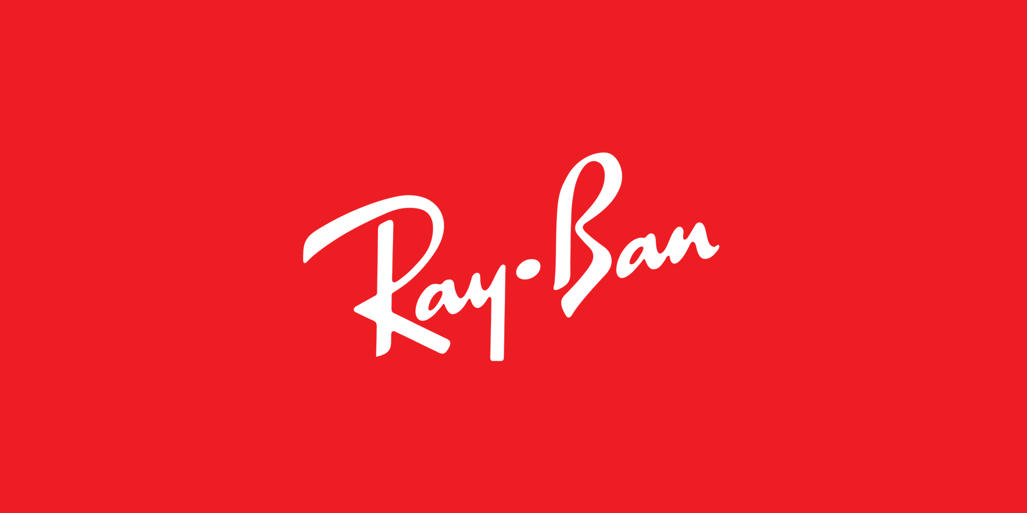
One of the most iconic handwritten logos is Ray-Ban’s signature cursive wordmark, a flowing, confident script that perfectly captures the warmth, personality, and timeless style at the heart of the brand:
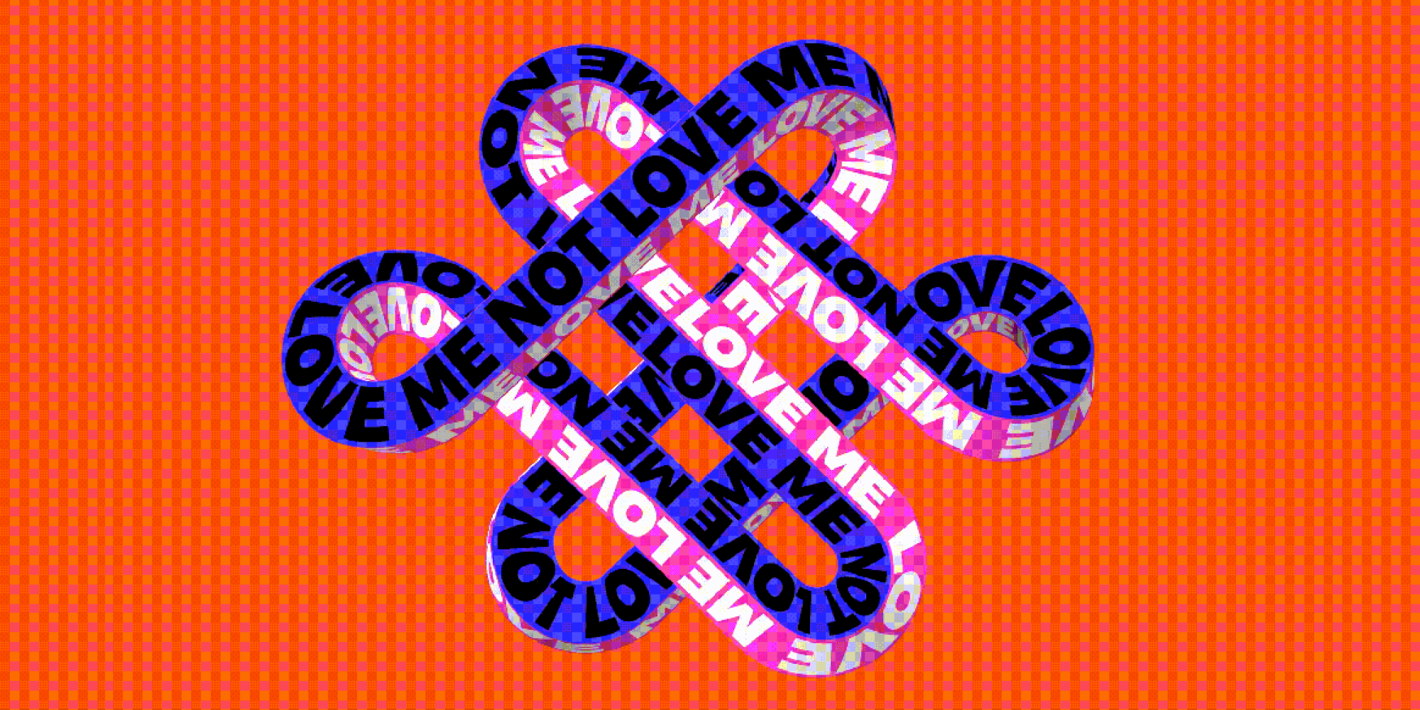
5. Movement
In 2025, typography is moving — literally.
Animated or kinetic typography is all about bringing letters to life, shifting, morphing, and even reacting to things like time, gaze, or ambient movement.
This trend turns ordinary words into living, breathing design elements, adding energy and depth that static text could never pull off.
Why It's Trending:
As brands live more online, motion has become a powerful storytelling technique.
Animated typography engages audiences in ways static text can’t, creating memorable interactions across websites, ads, and social platforms.
Example:
Tina Touli’s Shifting Symphonies turns typography into a fluid, artistic performance, using motion to transform letters into living, expressive visuals that blur the line between type and art:
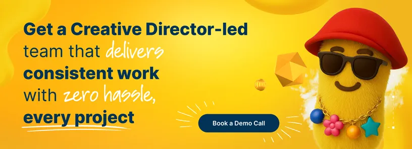
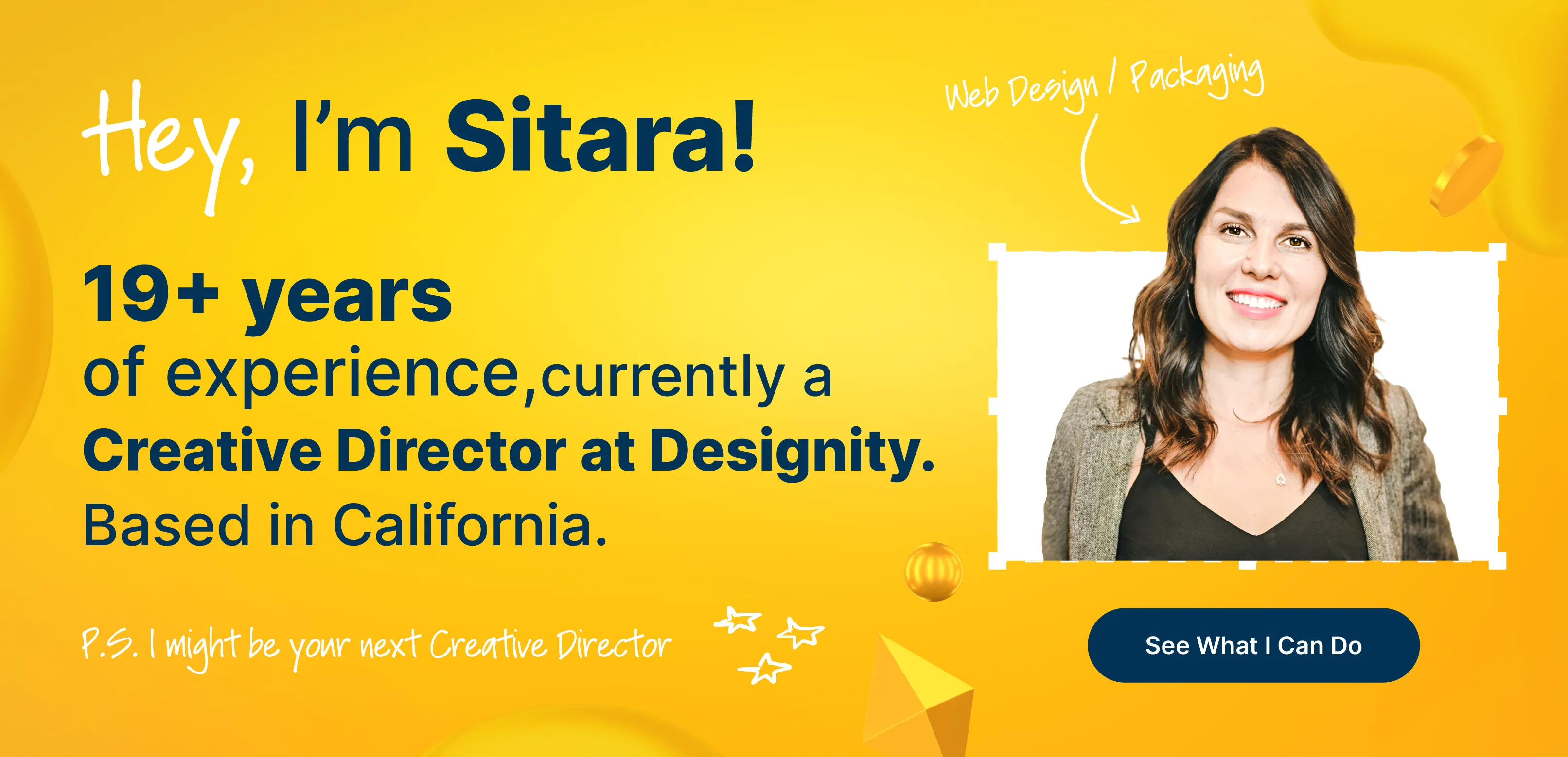
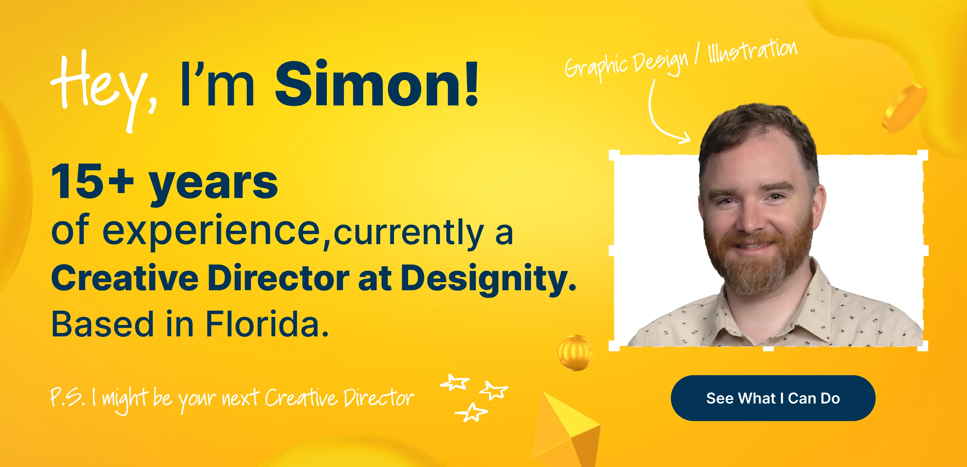
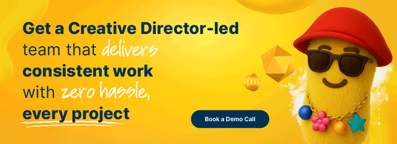
Great Typography Starts with Great Creative Direction
Typography trends are exciting, but great design is about more than just chasing what’s new.
Experiment boldly, but always keep legibility, brand clarity, and purpose at the heart of every choice.
When fonts tell your story with intention, they create a connection that lasts far beyond any trend cycle.
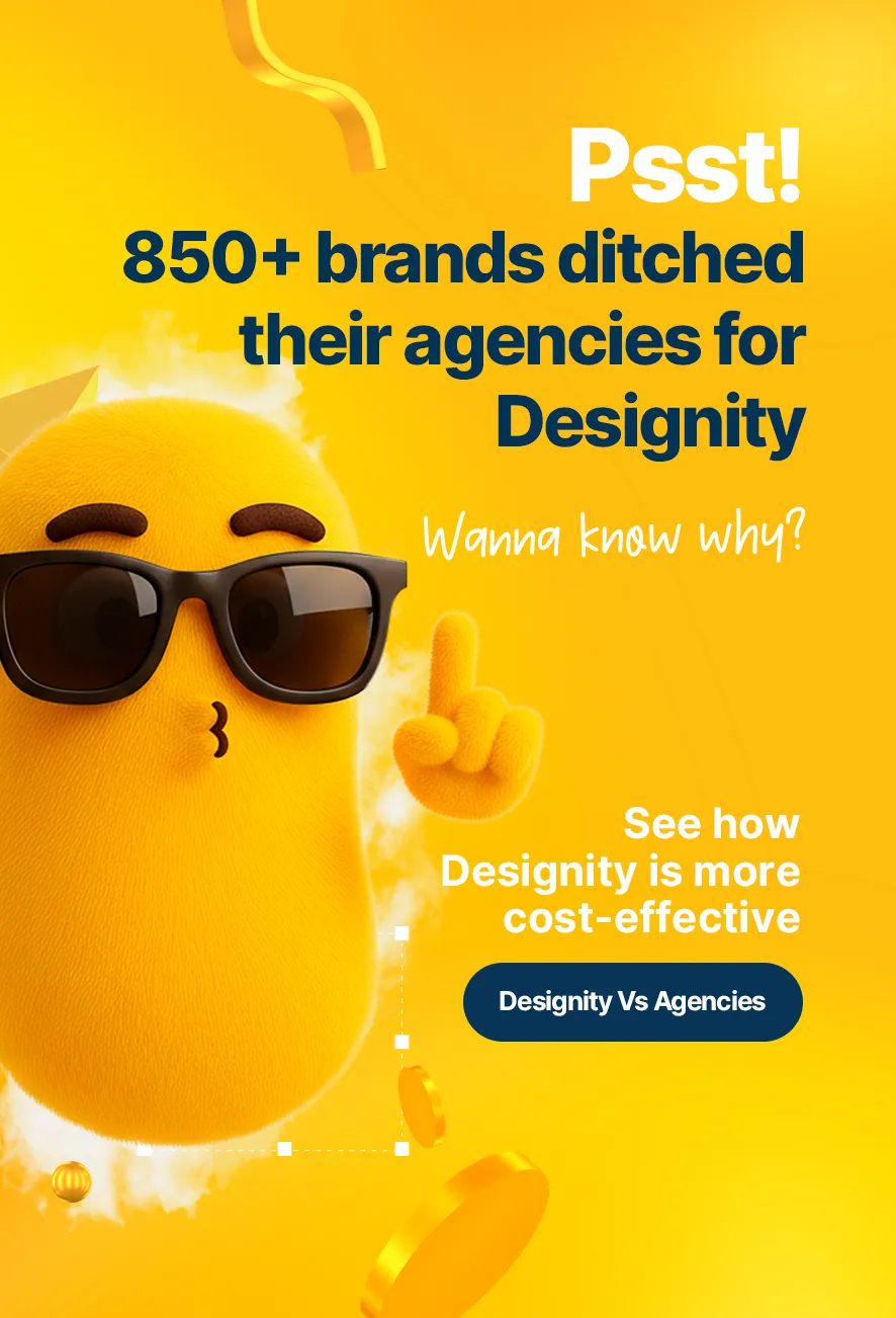
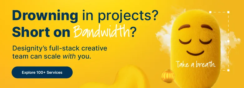
That’s where Designity comes in.
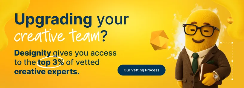
With our subscription-based Creative-as-a-Service (CaaS) model, you get on-demand access to the top 1% of vetted creatives and marketers and a dedicated Creative Director to keep every project intentional and on-brand.
From typography and branding to web design and marketing campaigns, we make it easy to stay ahead of trends without losing your brand’s voice.
Ready to see how strategic typography can transform your brand?
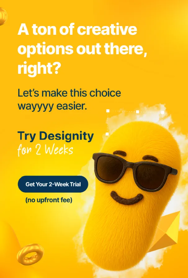
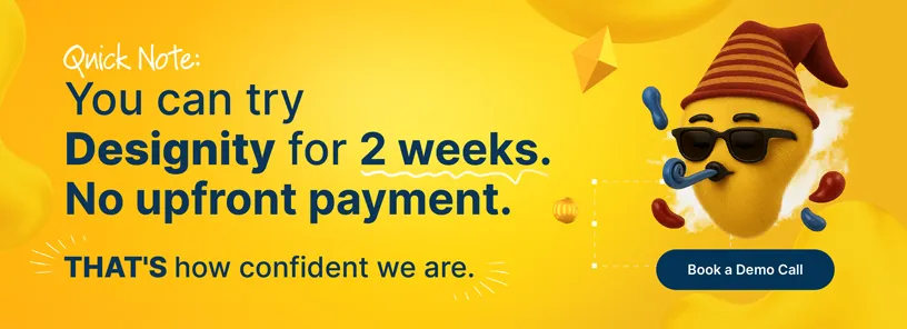
Book a demo call today and get a two-week free trial to explore over 100 creative services risk-free.