Ever recognize a brand before you see its logo?
Maybe it's Tiffany's unmistakable teal or Harley-Davidson's signature orange.
That's graphic design for brand identity at work. It's the process of creating visual cues so powerful that a single color can trigger instant recognition.
The best brand identities feel effortless.
The worst feel disjointed, with mismatched fonts, inconsistent visuals, and logos that never quite fit.
The difference isn't luck; it's a deliberate system of design choices working together.
In this guide, I'll break down the key elements of graphic design for brand identity, the process behind it, and the common mistakes that keep brands from standing out.
What Is Graphic Design for Brand Identity? (Hint: It's Not Just a Logo)
Most people start their brand identity journey by asking:
"What should my logo look like?"
And that's the wrong first question.
A logo is an output.
It's the end of a thinking process, not the beginning of one.
Your brand identity is the full visual and emotional language your business speaks, every color, every font, every illustration style, every brand image you choose and every one you don't.
The logo just happens to be the most compressed version of all that.
Think of it this way:
Your logo is the headline. Your brand identity is the whole article.
The reason this distinction matters is simple:
If you design a logo first and figure out the rest later, you'll end up with a brand that looks like it was built backward, because it was.
The visual design elements won't feel like they belong together.
Your Instagram grid won't match your website. Your packaging will look like it came from a completely different company than your email newsletters.
Graphic design for brand identity is about building a system, not just a mark.
Before the Logo: The First Thing I Look For (As a Senior Creative)
One thing I've learned as a Senior Creative at Designity: the best brand identities rarely start with a logo.
They start with a brand book.
Not a brief. Not a mood board. Not a folder full of screenshots from Pinterest.
The brand book.
Every logo, color palette, typeface, and visual decision has to come from somewhere. And that somewhere should be the brand itself:
- Its values
- Its personality
- Its target audience
- Its goals
- Its existing visual language
That's the non-negotiable.
I've seen too many companies jump straight into designing a logo before they've figured out who they are.
That's a bit like picking out curtains before you've built the house.
But, What Happens When There's No Brand Book?
This is where things get interesting.
When a company is starting from scratch or planning a rebrand, the temptation is usually the same: open Canva, browse Envato, scroll Pinterest, and see what sparks an idea.
Understandable impulse.
Wrong direction.
Branding doesn't have templates. At least, not good branding.
Templates are designed to work for everyone. A brand identity should feel like it could only belong to one company.
Starting a branding project with a template is a bit like writing your autobiography using someone else's diary.
You'll end up with something polished, but it won't feel like you.
The strongest brand identities come from research, strategy, and understanding a business deeply enough to translate it into a visual language that's unmistakably its own.
5 Core Elements of a Successful Brand Identity
Let's go through the building blocks. Each one sounds straightforward. Each one has about twenty ways to get it wrong.
1. Logo (The One Everyone Talks About)
Yes, the logo matters.
But not in the way most people think.
A logo doesn't have to be clever or complex to work — it has to be recognizable.
Apple's logo is a bitten apple. Nike's is a checkmark. FedEx hides an arrow between letters that most people have never noticed.
The best logos have a few things in common:
- They're simple enough to work at tiny sizes
- They're versatile enough to work in black and white
- They're distinctive enough to stand out in a crowded industry
What trips people up?
- Drop shadows
- Gradient overload
- Tiny details that disappear when scaled down
If your logo only looks good at full size on a white background, it's going to cause headaches every time you try to use it somewhere else.
A quick test: Print it at the size of a postage stamp. If you can still tell what it is, you're probably on the right track.
2. Color Palette
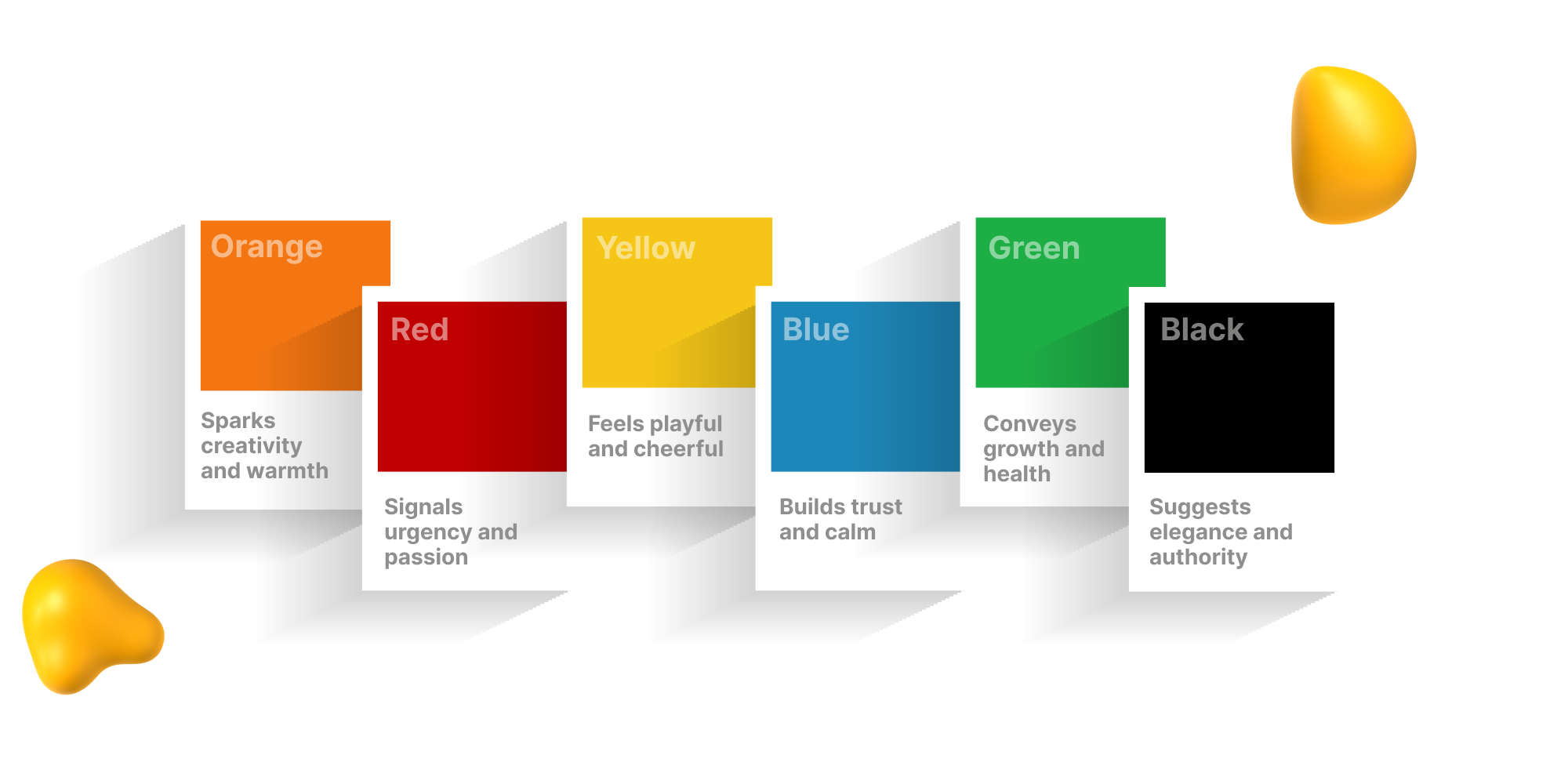
If logos get the attention, colors do the heavy lifting.
Color is one of the biggest drivers of brand recognition, yet it's often chosen casually because someone "likes the color."
That's not enough.
Colors carry meaning:
- Blue = trust and stability
- Yellow = energy and optimism
- Green = freshness and sustainability
- Red = attention, urgency, or excitement
None of these rules are absolute, but they're worth understanding before making decisions.
More importantly, your palette needs to function as a system.
A strong palette usually includes:
- A primary color
- A secondary color
- One or two neutral colors
- Clear rules for when each should be used
Without those rules, every person on your team starts making different choices, and before long your brand looks like it was designed by a committee that never met.
My rule of thumb: Three to five colors is usually enough.
3. Typography
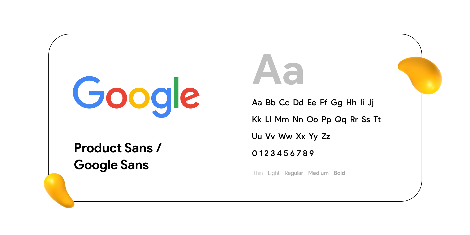
Fonts are not interchangeable.
I know that sounds obvious, but the number of brands defaulting to system fonts or whatever Canva recommends is genuinely alarming.
Before someone reads a single word, typography is already communicating personality.
Different font styles create different impressions:
- Serif = established and trustworthy
- Sans-serif = modern and approachable
- Script = personal and handcrafted
- Display = expressive but often difficult to scale
Most strong brand identity systems use:
- One typeface for headlines
- One typeface for body copy
- Occasionally a third fallback font
The goal isn't variety. It's harmony.
One thing I explain to clients all the time: the font that works in your logo may not work in emails, presentations, social posts, or marketing materials. A strong typography system accounts for all of those touchpoints.
4. Imagery and Visual Style
This is often the last thing brands think about.
It's also one of the first things customers notice.
Whether you're using photography, illustration, iconography, or a combination of all three, your visual identity and style needs to feel connected.
For example:
- A warm, approachable brand shouldn't rely on cold, editorial photography
- A creative company shouldn't hide behind generic stock photos
- Illustrations should match the brand's personality, whether that's playful, sophisticated, hand-drawn, or geometric
The goal?
Create a visual style so recognizable that someone could identify your content even if your logo and company name were removed.
That's when you know you've built a real brand identity.
“After working with Designity for almost 5 months, the Designity team has helped us to accelerate the development of our visual brand story. As a VP of Marketing having a creative director who understands our brand and is a trusted partner in strategy and execution is invaluable.”
Shash Cates
Vice President, Marketing
CORE
5. Brand Guidelines
Here's the reality:
Everything above falls apart if it only exists in someone's head.
Brand guidelines (sometimes called a brand book or style guide) document:
- Logo usage rules
- Color codes
- Typography standards
- Imagery guidelines
- Brand do's and don'ts
Many companies treat brand guidelines as paperwork.
They're not.
They're what allows your brand to scale.
Every new employee, freelancer, designer, agency partner, or marketer needs to know the rules.
Without them, entropy takes over and your brand slowly becomes inconsistent in ways that are difficult to pinpoint but easy to feel.
And once that happens, fixing it becomes a lot harder than preventing it.
5 Key Steps to Create a Strong Brand Identity
There are templates and frameworks everywhere for this.
Here's the version that reflects what actually happens in practice:
Step 1: Dig Into the Brand Before You Touch Anything Visual
Before any sketches, before any mood boards, before anyone opens Illustrator, there needs to be a serious conversation about the brand itself.
What does it stand for?
Who is the audience?
What do you want people to feel when they encounter this brand?
This is where a lot of projects go sideways early.
Clients want to jump to "what should it look like" before anyone's answered "what should it mean."
The visual direction can only be as strong as the strategic foundation underneath it.
Ask hard questions:
Who are your competitors?
Where do they live visually, and do you want to fit in or stand out?
What's one word you want people to associate with you?
Step 2: Research and Reference
This is where you look at the competitive landscape.
Not to copy, but to understand the visual identity and language of your space and figure out how to differentiate.
If every brand in your industry uses dark blues and clean sans-serifs, that's information.
You can either lean into category conventions (which builds familiarity) or deliberately break them (which creates distinctiveness, but requires more work to earn trust).
Look at what's working. Look at what's dated. Build a picture of the space before you start filling it.
Step 3: Concept Development
This is the creative leap. Taking all the strategic input and reference work and distilling it into design concepts.
In practice, most good designers develop two or three concepts that are meaningfully different from each other, not just color variations on the same theme.
The traditional sequence is logo first, then the rest of the system.
But more and more, experienced designers develop the whole system together because the logo doesn't exist in isolation.
It needs to work within a palette and a type system, and those relationships affect the design decisions.
Step 4: Testing and Refinement
Here's the part that people often skip: testing the work in context.
Not just looking at the logo on a white background, but seeing how it looks on a business card, in a social media profile thumbnail, on a dark background, on a tote bag.
Context reveals problems that isolated review misses.
A logo that looks beautiful at large scale might become unreadable at small sizes.
Colors that look great on screen might shift in print. This is the stage where you catch those things before they become expensive problems.
Step 5: Documentation and Handoff
The work isn't done when the design is "done."
It's done when the system is documented and the people who need to use it can actually use it.
This means brand guidelines that are clear enough for a non-designer to follow. File formats that cover all likely use cases.
Color codes in every format needed (Pantone, CMYK, RGB, HEX, yes, all of them).
A beautiful brand identity that no one knows how to implement correctly is only half a job done.
{{cd-led-team-an}}
5 Common Brand Identity Mistakes (and How to Avoid Them)
After years of building and refining brand identities, I've noticed a few mistakes come up again and again:
- Being inconsistent across platforms. One color on the website. A slightly different one on Instagram. An email template that looks like it belongs to another company. It happens more often than you'd think, and it slowly chips away at brand recognition.
- Underestimating typography. Fonts aren't interchangeable. Choosing a random Google Font because it's free or convenient can come back to haunt you. Typography plays a huge role in how a brand feels and deserves more attention than it usually gets.
- Skipping brand guidelines. You can create a beautiful brand identity and still watch it fall apart in execution if no one documents the rules. Guidelines don't need to be 60 pages long. They just need to be clear, accessible, and shared with the people who use them.
- Changing too much, too fast. Jaguar's 2024 rebrand is a useful cautionary tale. The issue wasn't that the brand evolved. It was that the shift felt so dramatic that many customers no longer recognized it. The strongest brands move forward while keeping a connection to what made them recognizable in the first place.

What 20+ Years of Brand Identity Work Has Taught Me
After more than two decades of building brands, there are a handful of principles I keep coming back to:
- Start with strategy, not aesthetics. The design should come from a clear articulation of what the brand stands for, who it's for, and how it should make people feel. If you can't answer those questions first, the visual choices will feel arbitrary, because they are.
- Test your logo at thumbnail size. If it works at 32x32 pixels, it'll work everywhere. If it doesn't, that's a problem you need to solve before you move forward.
- Limit your palette intentionally. Three to five colors with clear usage rules will serve you better than eight colors that "technically work together." Constraints create cohesion.
- Think about motion. A lot of brand interactions now happen in digital environments
where logos and brand elements can animate. Static design that wasn't built with motion in mind often looks awkward when someone tries to animate it later. Worth thinking about early. - Build your guidelines before you think you need them. Most brands wait until they're scaling to document their identity standards. By that point, inconsistency is already baked in and harder to fix. Even a simple one-page brand guide is better than nothing.
- Update, but don't overhaul for the sake of it. Brands evolve. That's healthy. But the strongest brands do it gradually, maintaining the threads that people already recognize and associate with them. The instinct to refresh everything when something feels stale often does more damage than good.
From Logo to Legacy With Designity
Graphic design for brand identity is about more than creating a logo. It's about building a visual system that helps people recognize, trust, and remember your brand across every touchpoint.
If your brand feels inconsistent, forgettable, or too similar to everyone else in your industry, it may be time for a stronger identity.
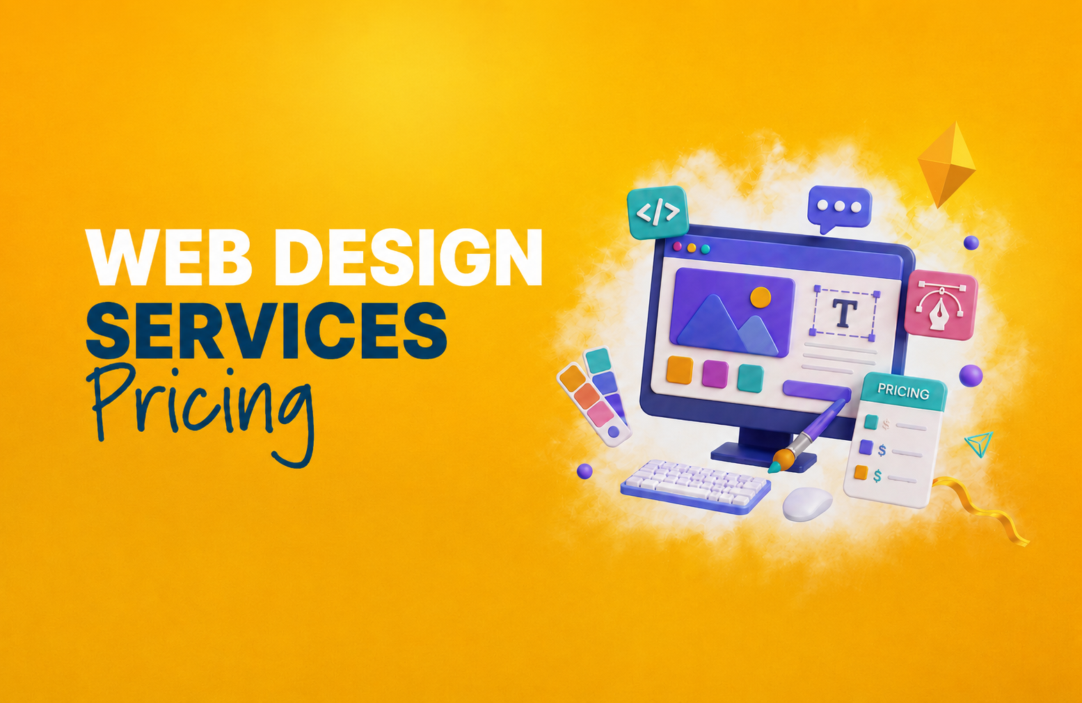
Starting at $5,995/month, Designity gives you:
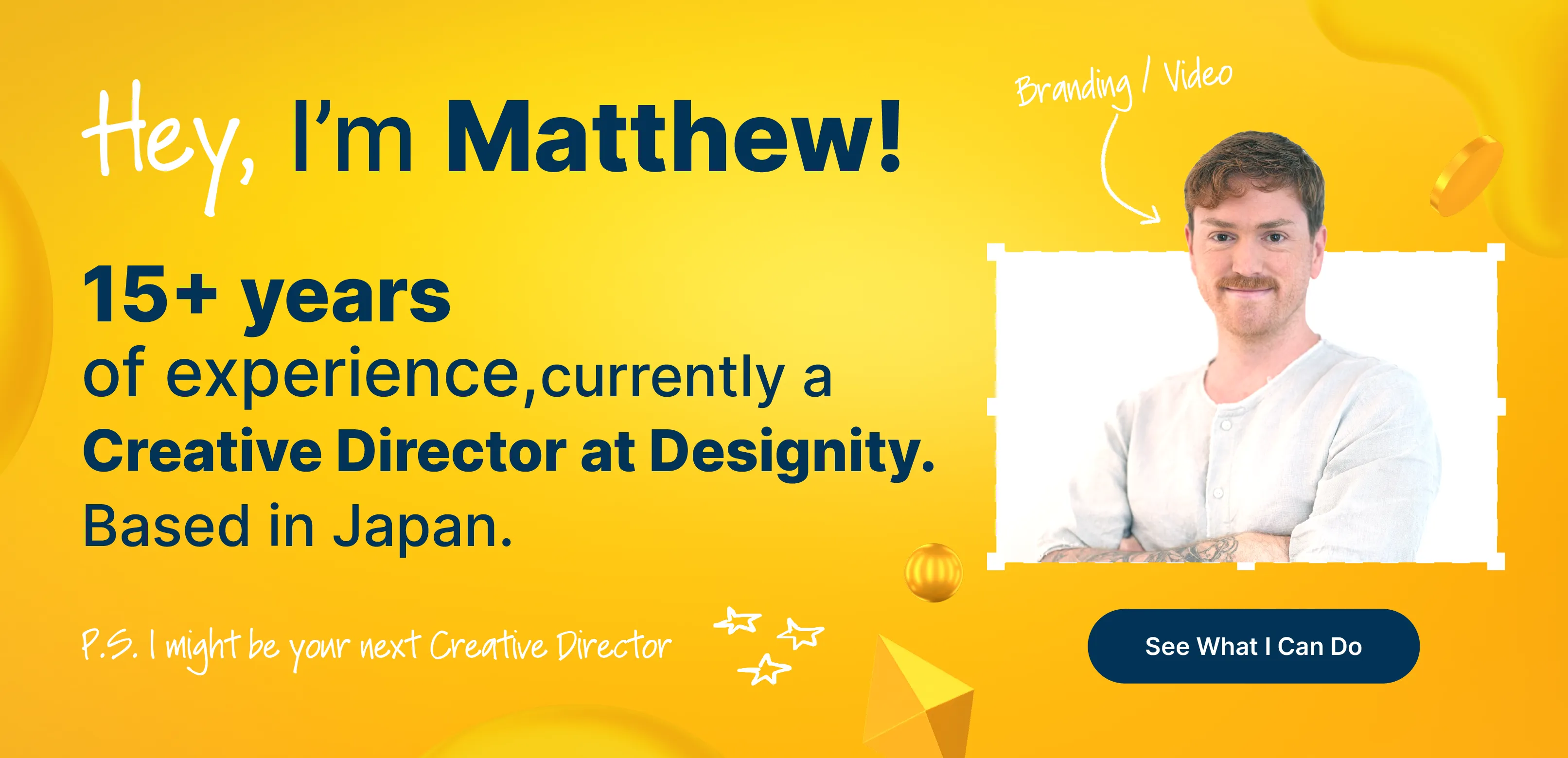
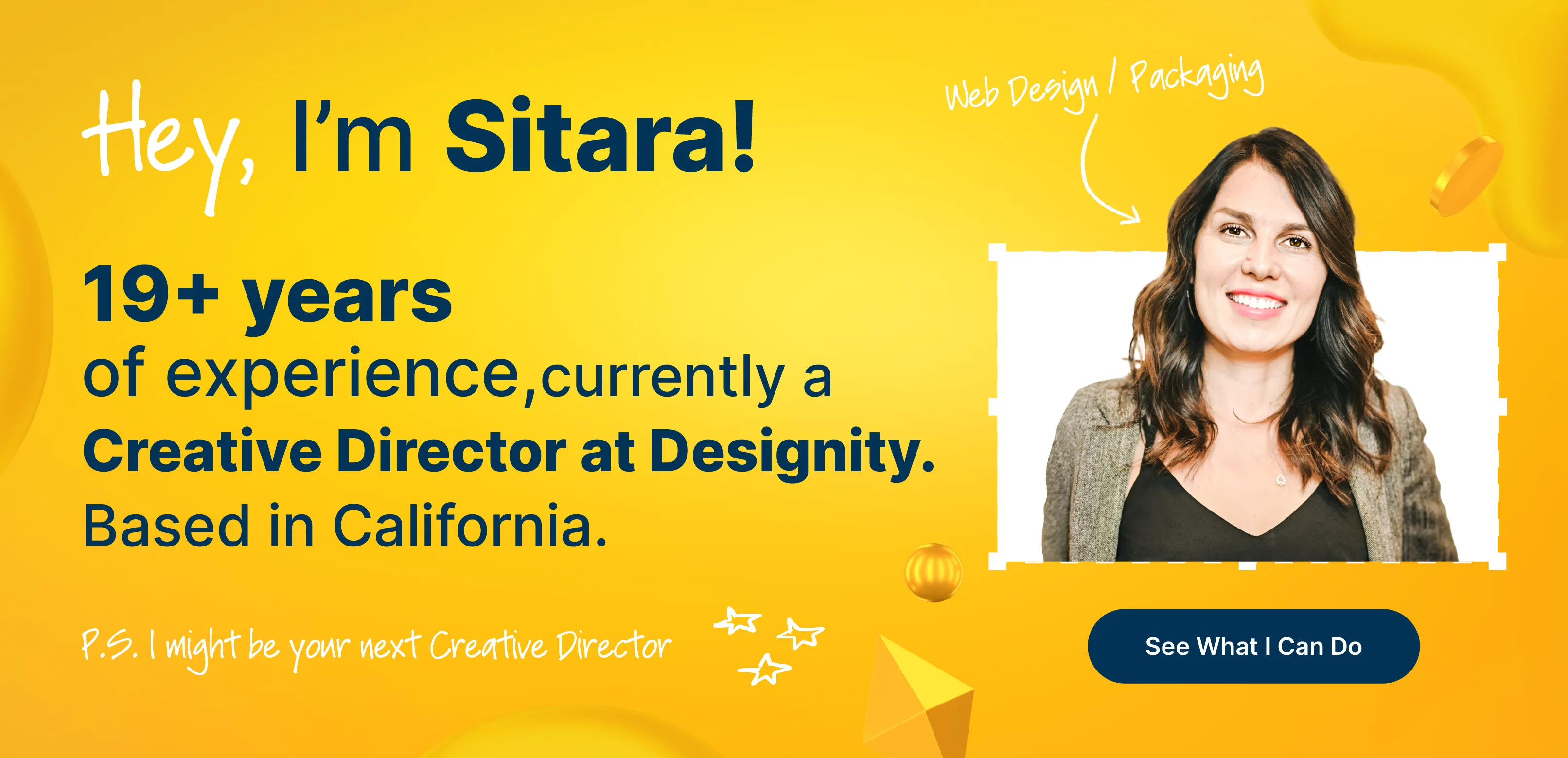
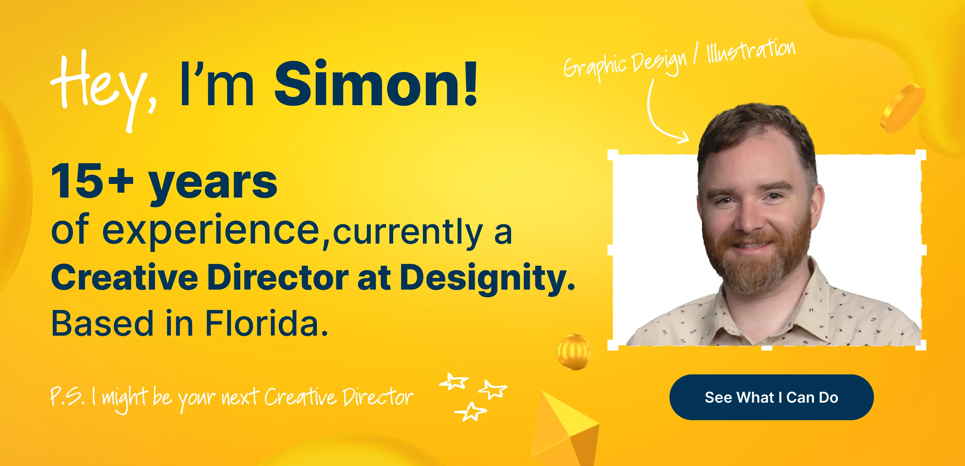
- A dedicated Creative Director to lead brand strategy, creative direction, and quality
- Creative Project Manager support to keep projects organized and on schedule
- Access to specialized talent across 100+ creative and marketing services
- Flexible monthly plans that scale with your needs
- The top 1% of global creatives and marketers
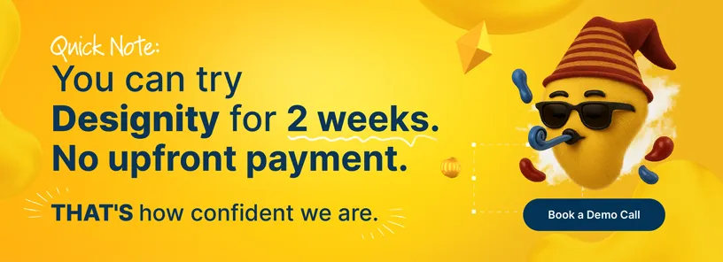
- A 2-week trial with no upfront payment required
Book a demo and test-drive Designity's graphic design for brand identity services to build a brand that's impossible to confuse with anyone else's.