




Looking for graphic design portfolios that are actually worth bookmarking?
You’re in the right place.
The best portfolios do more than display polished logos, layouts, and illustrations.
They show how a designer thinks, solves problems, communicates ideas, and brings a brand to life.
Whether you’re refreshing an established portfolio or building your first one, the right examples can help you rethink your layout, case studies, and personal style.
Below, we’ve rounded up 10 standout graphic design portfolios packed with smart storytelling, bold ideas, and plenty of inspiration to borrow, adapt, and make your own.
10 Graphic Design Portfolios You’ll Wish You’d Bookmarked Sooner
Ready for a little portfolio inspiration?
Let’s take a closer look at what makes each of these sites work, from the visual style and storytelling to the clever details you might want to borrow for your own:
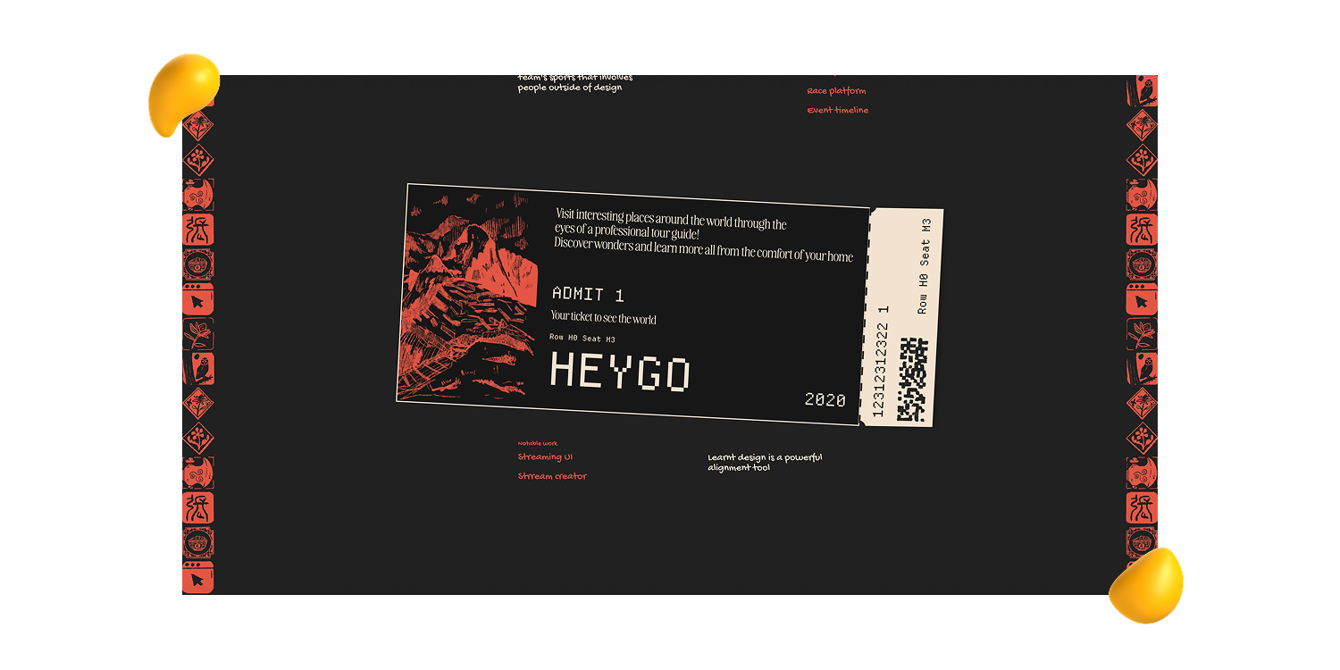
1. Jackie Zhang: A Scrapbook-Style Portfolio Full of Personality
View Jackie Zhang’s portfolio
The first impression:
Jackie Zhang’s portfolio feels less like browsing a website and more like stepping inside someone’s creative world. The scrapbook-inspired design is playful, tactile, and immediately memorable.
What stands out:
Layered textures, draggable elements, subtle animations, and unexpected interactions keep the experience engaging. Her projects are woven naturally into the site rather than placed into a predictable project-by-project grid.
Why it works:
Despite all that personality, the portfolio never becomes confusing. The navigation stays clear, while the visuals, movement, and layout handle much of the storytelling without relying on lengthy project descriptions.
The takeaway:
Your portfolio doesn’t need to follow a rigid template to feel professional. When interaction and personality are used intentionally, they can become part of your creative story rather than a distraction from the work.
2. Mike Kus: A Masterclass in Stylish Restraint
View Mike Kus’s portfolio
The first impression:
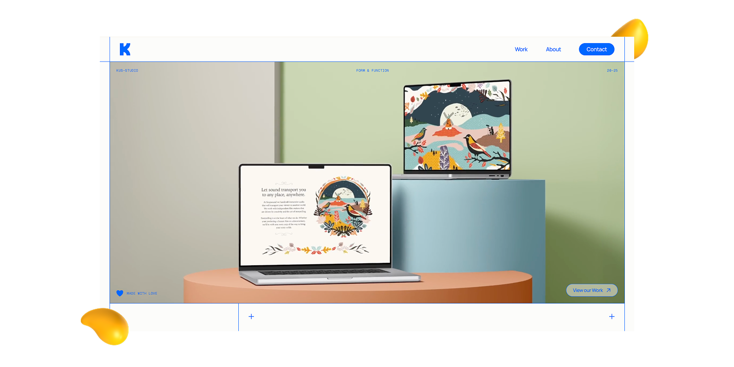
Mike Kus’s portfolio proves that minimal doesn’t have to mean forgettable. The site feels polished, elevated, and confidently simple, without slipping into overly corporate territory.
What stands out:
Clean layouts, strong typography, generous spacing, and thoughtful pacing give every project room to breathe. Subtle motion and transitions add sophistication, but never compete with the work itself.
Why it works:
The portfolio avoids unnecessary visual noise and lets strong imagery, presentation, and art direction do the talking. Everything feels cohesive from one project to the next, making the browsing experience feel effortless.
The takeaway:
You don’t need an overly complicated website to make an impression. Sometimes, restraint is the boldest design choice, especially when the work and creative point of view are strong enough to carry the experience.
3. Jessica Hische: A Portfolio With an Unmistakable Creative Voice
View Jessica Hische’s portfolio
The first impression:
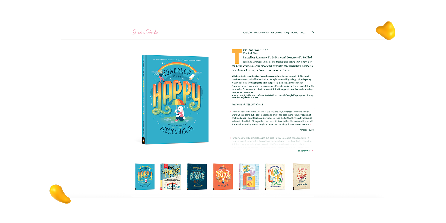
Jessica Hische’s portfolio feels instantly recognizable. Her distinctive lettering, illustration style, and personal branding make it clear whose creative world you’ve stepped into before you’ve even explored the projects.
What stands out:
The site brings together client work, lettering, illustration, and personal projects without ever feeling scattered. Thoughtful typography, clear organization, and confident pacing help a substantial body of work feel approachable rather than overwhelming.
Why it works:
There’s a strong sense of personality throughout, but the portfolio still feels polished and professional. It doesn’t rely on flashy effects or trendy interactions. The work, presentation, and consistency of her visual style are more than enough to hold your attention.
The takeaway:
A recognizable creative voice can become one of your biggest advantages. Show range, absolutely, but give people something consistent enough to remember you by.
4. Sania Saleh: A Polished Portfolio for the Multidisciplinary Creative
The first impression:
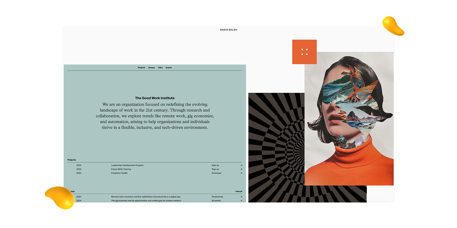
Sania Saleh’s portfolio feels polished, modern, and strategically put together. The collage-inspired homepage adds immediate visual interest, but the overall experience still feels clear and professional.
What stands out:
The site showcases work across branding, web design, and product development without turning into a creative free-for-all. Clean structure, thoughtful project organization, and subtle interactions make a wide range of skills feel connected.
Why it works:
There’s plenty of information and experience packed into the portfolio, yet it never feels overwhelming. The work flows naturally from one project to the next, while the presentation gives you a strong sense of Sania’s process, perspective, and creative approach.
The takeaway:
Multidisciplinary creatives don’t need to squeeze themselves into one tiny box. Strong organization and a clear personal brand can help varied skills feel intentional rather than scattered.
5. Gabrielle Adam: Cutting edge and User Friendly Designed Portfolio
View Gabrielle Adam’s portfolio
The first impression:
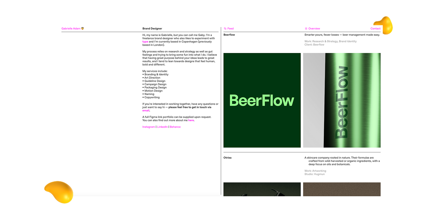
Gabrielle Adam’s portfolio feels more like flipping through a beautifully art-directed design magazine than browsing a traditional website. It’s minimal, fashionable, and immediately memorable.
What stands out:
The grid-based layout gives the site structure, while bold typography, generous spacing, and intriguing project thumbnails bring plenty of personality. Once you click into the case studies, the presentation goes beyond polished final images to reveal more of her process and creative thinking.
Why it works:
The portfolio feels visually distinctive without becoming difficult to use. Clear navigation and thoughtful pacing keep the experience approachable, proving that a site can be design-forward without making visitors work for it.
The takeaway:
You don’t need excessive animation or complicated interactions to make an impact. Strong layout, typography, and art direction can give a simple portfolio serious main-character energy.
6. Charlotte Blunarova: Branding and Strategy Specialist (& It Shows)
View Charlotte Blunarova’s portfolio
The first impression:
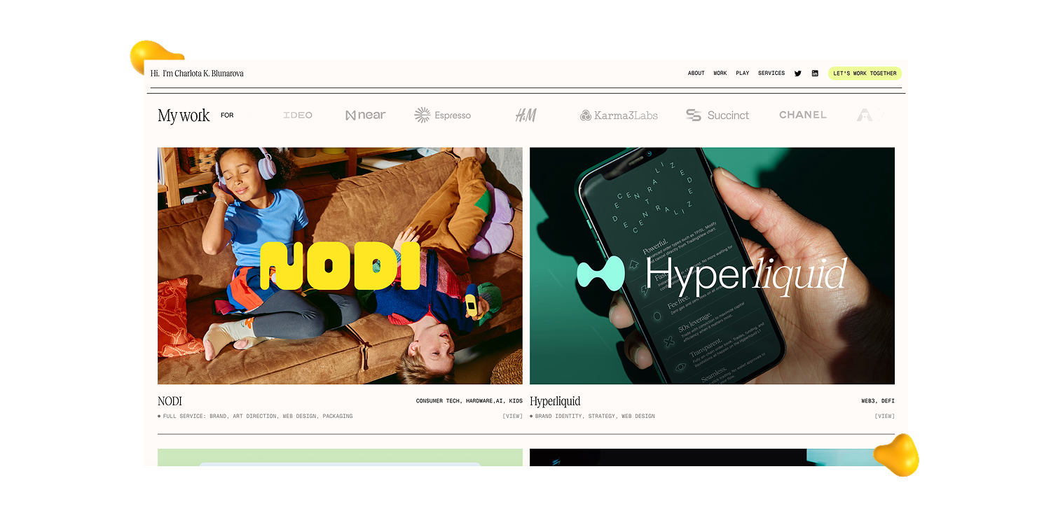
Charlotte Blunarova’s portfolio gets straight to the point. Within seconds, you understand who she is, what she does, and the kind of work she creates, without having to decode a cryptic headline or scroll through three screens of mood-setting.
What stands out:
The clean layout gives each project plenty of room to breathe, while strong thumbnails communicate the work before you even open a case study. Her “Experiments” section adds a more playful layer, showing curiosity and creativity beyond polished client projects.
Why it works:
Charlotte balances branding, web design, and creative leadership without making the portfolio feel scattered. Thoughtful pacing, subtle interactions, and clear organization keep the experience modern, cohesive, and easy to navigate.
The takeaway:
Simple doesn’t have to mean forgettable. When the structure is strong and the creative point of view is clear, the work can do most of the talking.
7. Justine Soulié: Motion That Makes You Want to Keep Scrolling
View Justine Soulié’s portfolio
The first impression:
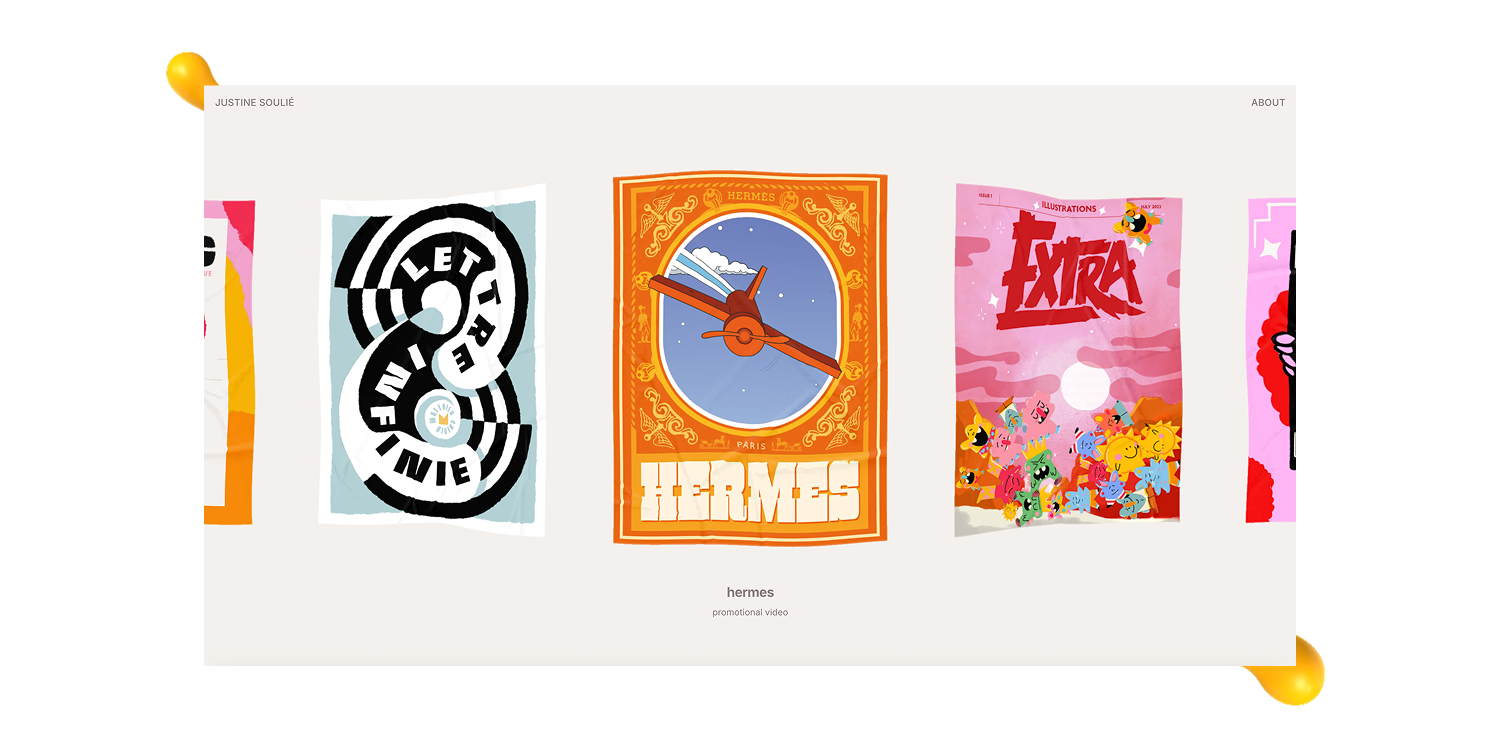
Justine Soulié’s portfolio feels alive from the first scroll. Animated project thumbnails immediately pull you in and give each piece its own personality before you even open the case study.
What stands out:
The work spans branding, motion, layout, and visual storytelling, yet the portfolio never loses its identity. Strong art direction ties everything together, while polished movement adds energy without stealing attention from the projects.
Why it works:
The presentation feels confident, immersive, and easy to explore. Each project gets room to shine, and the interactions naturally guide you from one piece to the next without turning the site into an obstacle course.
The takeaway:
Great work deserves a great entrance. Thoughtful motion and presentation can make a versatile portfolio feel more cohesive, memorable, and impossible to leave after just one project.
8. Josh Newtown: A Portfolio That Feels Like a Full Brand Experience
The first impression:
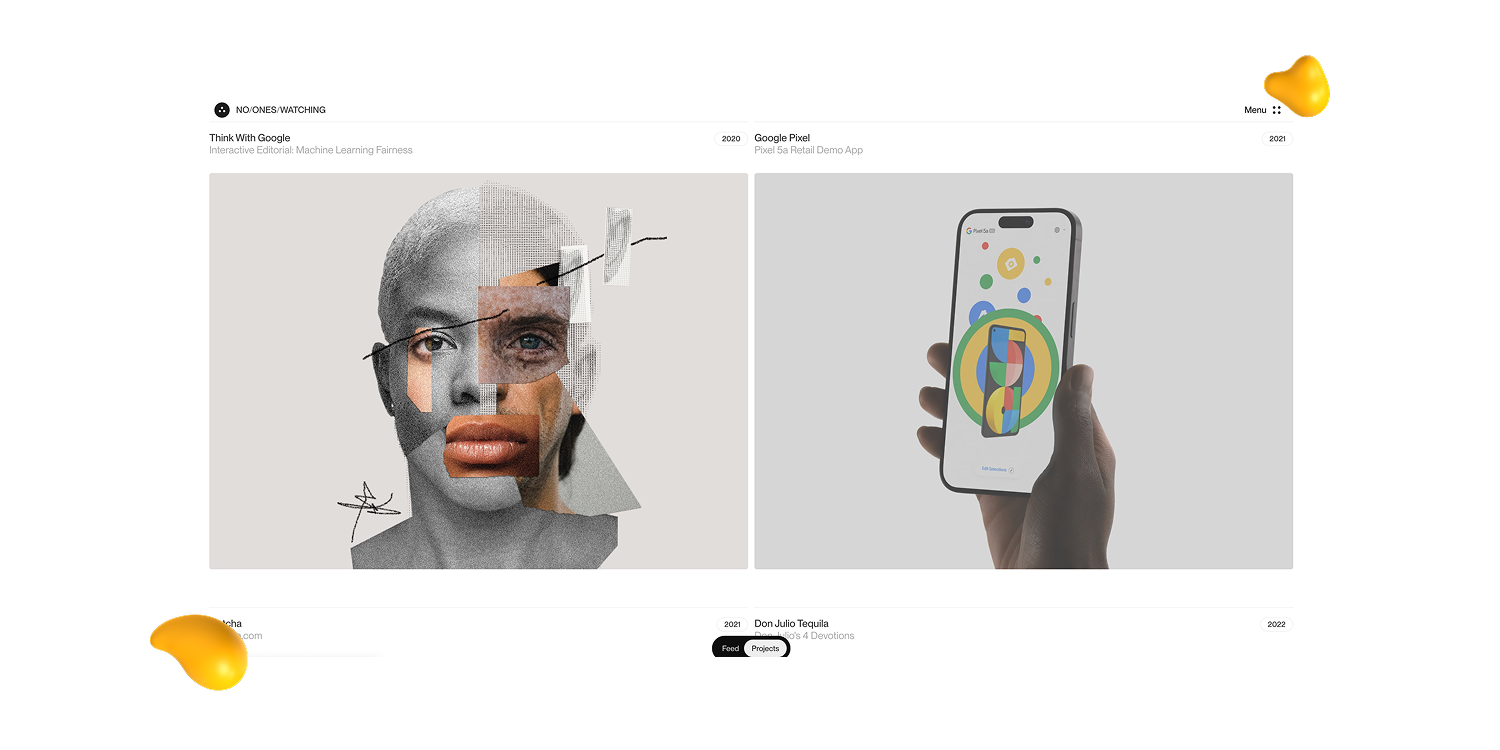
Josh Newtown’s portfolio feels more like entering a cinematic creative world than opening another project gallery. It’s modern, immersive, and slightly mysterious in a way that makes you want to keep exploring.
What stands out:
Typography, imagery, motion, and pacing work together to create a strong emotional atmosphere. Every project feels carefully curated, while polished transitions give the site a smooth sense of movement from one section to the next.
Why it works:
The portfolio leans heavily into mood and experimentation without losing sight of the actual work. The navigation remains clear enough to follow, and the strong art direction makes the entire experience feel intentional rather than decorative.
The takeaway:
Your portfolio can communicate much more than your technical skills. With confident creative direction and thoughtful presentation, it can become a complete expression of your brand, personality, and point of view.
9. Craig Wright: Clean Structure With Plenty of Creative Personality

View Craig Wright’s portfolio
The first impression:
Former Designity Lead Creative Craig Wright’s portfolio feels polished and professional without drifting into corporate wallpaper territory. The work takes center stage immediately, so you quickly understand his style, range, and creative strengths.
What stands out:
Strong project thumbnails, clear visual hierarchy, thoughtful typography, and generous spacing make the site feel easy to explore. His work spans a range of creative disciplines, but a consistent design perspective keeps everything connected.
Why it works:
The portfolio has a natural flow that guides you from project to project without unnecessary distractions. It feels refined but still approachable, giving visitors a sense of both Craig’s creative capabilities and the person behind the work.
The takeaway:
A portfolio doesn’t need to shout to hold attention. Clear structure, confident presentation, and a little personality can make strong work feel even stronger.
10. Inés Felix: Refined Art Direction With a Clear Creative Voice
The first impression:
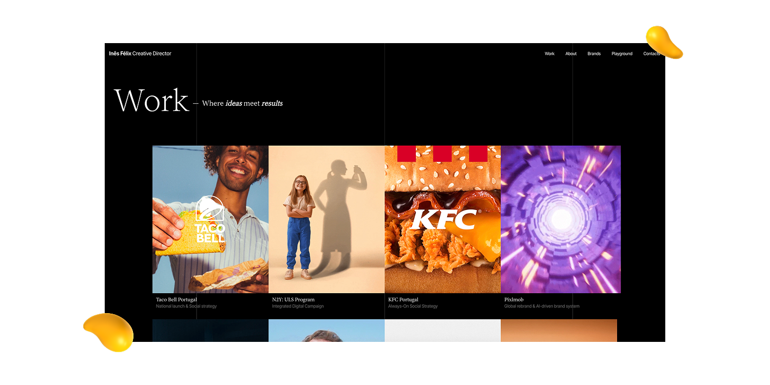
Designity Creative Director Inés Felix’s portfolio feels polished, editorial, and carefully art directed from the very first scroll. Every detail feels considered, but the experience never becomes cold or overly formal.
What stands out:
Typography, imagery, spacing, and pacing work together to give the site a sophisticated visual rhythm. Each case study feels immersive and thoughtfully curated, while the clean navigation keeps the experience smooth and easy to explore.
Why it works:
The projects vary in style and scope, but a consistent creative point of view ties everything together. The restrained design choices give the work room to shine and make the portfolio feel confident, cohesive, and timeless.
The takeaway:
Strong work becomes even more memorable when the presentation feels just as intentional. A clear creative voice, thoughtful pacing, and a little restraint can turn a portfolio into a fully curated experience.
3 Benefits of a Strong Graphic Design Portfolio (Besides Looking Good)
At its core, your portfolio is a snapshot of your design voice, creative thinking, and potential.
Think of it as your own carefully curated gallery, built to convince someone to hire you, collaborate with you, or at least remember your name when the right project comes along.
Get it right, and your portfolio can do much more than collect compliments.
1. It Proves You Can Solve More Than a Blank Canvas
Clients and hiring managers aren’t choosing designers based on a cool color palette alone.
They want to understand how you think, what problem you were solving, and how you worked within real-world constraints.
By including context, early ideas, and the reasoning behind your decisions, you show that your work isn’t just visually appealing.
There’s a brain behind all those beautiful pixels.
2. It Shows People What You’re Like to Work With
Your portfolio should showcase your personality as well as your projects.
That doesn’t mean turning your website into a meme museum, unless that happens to be very on-brand.
A friendly “About” page, thoughtful project descriptions, and a little personality in your writing can help visitors understand who you are and what collaborating with you might feel like.
3. It Helps You Figure Out Your Next Creative Move
Building a portfolio forces you to take a good look at your own work.
Which projects still excite you?
What kind of clients do you want more of?
Which project would you happily never open again?
Those answers can help you identify the direction you want your career to take.
Your portfolio doesn’t just show where you’ve been. It can help decide where you go next.
{{drowning-in-projects}}
How to Build a Graphic Design Portfolio Without Overthinking It
Here are 10 practical tips to help you showcase your strongest work with the right mix of strategy, personality, and context, without overthinking every pixel:
- Curate for quality, not quantity. Show enough variety to prove your range, but leave the “pretty good” projects behind. Four excellent projects will work harder than ten forgettable ones.
- Build for the work you want next. Your portfolio should point toward your ideal role or client. Want more branding projects? Lead with branding. Dreaming of web design? Make sure visitors don’t have to hunt for it.
- Show how your brain works. Don’t stop at the polished final product. Add context about the problem, your role, your decisions, and how the design developed along the way.
- Choose a platform you’ll actually maintain. Behance, Adobe Portfolio, Squarespace, Wix, Webflow, or a well-designed PDF can all work. Pick the option that suits your skills, goals, and patience level.
- Let AI handle some of the busywork. Use AI to shape rough case study notes, brainstorm layouts, create mockups, or polish images. Just make sure the finished portfolio still sounds and looks unmistakably like you.
- Make the portfolio easy to use. Keep navigation simple, pages quick to load, layouts mobile-friendly, and typography readable. Your work should be the star, not an animation that takes eight seconds to reveal a button.
- Ask other people to review it. Fresh eyes can spot confusing navigation, weak projects, or missing context you’ve stopped noticing. Ask specific questions to get feedback you can actually use.
- Apply feedback without losing your voice. Look for repeated comments and prioritize changes that improve clarity or usability. One person disliking your favorite color doesn’t automatically call for a full rebrand.
- Review it like a stranger would. Revisit your portfolio regularly and ask whether it still reflects your current skills, style, and ambitions. If an old project makes you cringe, congratulations. You’ve grown. Now replace it.
- Know when it’s ready enough. A portfolio can always be tweaked, refreshed, reorganized, and fussed over until the sun burns out. Fix the major issues, publish it, and improve it as your work evolves.
Built a Portfolio You’re Proud Of? Bring It to Designity
A strong graphic design portfolio does more than earn an “Ooh, nice.”
It shows how you think, solve problems, and turn a rough brief into work worth remembering.
At Designity, you’ll work fully remotely alongside the top 1% of global creatives and marketers, guided by seasoned Creative Directors on projects across branding, web, motion, campaigns, and more.
You focus on the creative work.
No chasing clients. No awkward invoice follow-ups. No wondering where the next project is coming from.
You’ll also get to explore how AI can support stronger, faster creative workflows without replacing the human thinking behind the work.
Think your portfolio is ready for its next chapter?