-2025-12-24%2520at%252010.31.02.webp)
If you’ve ever dropped two random colors next to each other on your artboard and thought, “Wait… why does that actually look good?” — welcome, you’re in the right place.
As designers, we love to pretend color lives inside neat, orderly rules, but the truth is far more interesting.
Some of the most compelling palettes come from the unexpected.
When you pair hues that feel a little rebellious, like dusty teal with mustard or lavender with rust, something clicks.
The result feels fresh, emotional, and quietly magical.
In this post, we’ll explore six unusual color combinations (and why they work) and how you can use them intentionally to build a brand palette that feels distinctive rather than safe.
The Psychology Behind Unusual Pairings: A Quick Overview
Before we dive into six unusual color combos, let’s first talk about why they work.
Here’s the thing: color is emotional, cultural, and deeply contextual.
We don’t see it objectively, we feel it, shaped by memory and experience.
And this is where unexpected color combinations shine.
They interrupt familiar patterns and make our brains sit up and pay attention. That moment of surprise creates tension, and tension creates memorability.
But don’t get it twisted, this isn’t about randomness.
Contrast brings clarity. Temperature play adds energy or calm. Saturation keeps colors from fighting each other.
Get those right, and suddenly even the boldest pairings feel intentional, balanced, and undeniably powerful.
6 Unusual Color Combinations That Feel Wrong… Until They Don’t
Here are six color pairings that raise an eyebrow first, then earn a second look:
Combo #1: Mustard Yellow + Dusty Teal

At first glance, this pairing feels like it’s breaking the rules.
Mustard is warm, bold, and rooted in vintage palettes, while dusty teal leans cool, muted, and modern.
They sit on opposite ends of the temperature spectrum, which is exactly why they create tension.
And here’s the payoff: that tension feels intentional.
The palette comes across as nostalgic but refined, expressive without being loud, and timeless with a modern edge.
Why it works: Earthy warmth meets cool balance. Mustard adds depth and character, while dusty teal calms and elevates the palette, keeping it from feeling dated.
Best uses: Lifestyle brands, packaging, editorial layouts, and boutique clothing brands looking for personality, warmth, and understated confidence.
Combo #2: Coral + Forest Green

This pairing feels unexpected because it pulls from two different seasons.
Coral is bright, warm, and full of spring energy, while forest green feels deep, cool, and rooted in winter.
On their own, they live in different worlds. Together, though, they strike a surprising balance.
Coral brings vibrancy and approachability, while forest green grounds the palette with depth and stability.
The result feels energetic without being playful, bold without being harsh. It’s fresh, but still grown.
Why it works: High-energy warmth is anchored by grounded richness. Coral draws the eye, and forest green creates calm and credibility.
Best uses: Wellness brands, tech startups tired of default blues, and female-led brands looking for mature warmth and confidence.
Combo #3: Lavender + Rust

Not all color clashes are loud. This one is quiet, subtle, and still completely unexpected.
Lavender feels light, airy, and almost ethereal, while rust is bold, warm, and rooted in the earth.
Instead of competing, they challenge each other in the best way.
Lavender softens the overall look, preventing rust from feeling too heavy, while rust gives the palette structure and confidence.
The combo feels modern, expressive, and unexpectedly sophisticated without trying too hard.
Why it works: Soft tones are balanced by earthy intensity. Lavender lightens the palette, and rust anchors it with warmth and strength.
Best uses: Beauty brands, modern wellness, artisanal products, and elevated e-commerce looking for calm, confidence, and a refined edge.
Combo #4: Electric Blue + Ochre

Electric blue demands attention. Ochre, on the other hand, feels muted, earthy, and intentionally imperfect.
Putting them side by side sounds risky. One is loud and modern, the other grounded and almost raw.
But that friction is exactly the point.
Electric blue injects energy and urgency, while ochre slows things down and adds weight.
The contrast feels sharp, editorial, and confidently styled, like a fashion spread that knows exactly what it’s doing.
Why it works: Extreme contrast creates instant visual tension. Bright intensity is balanced by earthy restraint, giving the palette edge without chaos.
Best uses: Fashion brands, design platforms (ahem, Designity), and advertising that needs to stop the scroll and make a statement.
Combo #5: Nude Beige + Neon Anything

What happens when you put the quietest color next to the loudest one in the room?
Surprisingly, magic.
Nude beige keeps things soft, grounded, and minimal, while neon brings pure, unapologetic energy.
Instead of competing, the neutral acts as a calm backdrop, letting the neon pop with intention rather than chaos.
The contrast feels sharp, modern, and playful without tipping into visual overload.
Why it works: A neutral base creates structure. Beige keeps the palette grounded, letting neon shine as an accent rather than take over.
Best uses: Streetwear brands, Gen Z marketing, and social media content that needs instant impact.
Combo #6: Mint Green + Burnt Orange

This pairing feels like it’s pulling from two different eras.
Mint green leans cool, sweet, and almost candy-like, while burnt orange brings warmth and an unmistakable autumn richness.
Side by side, they shouldn’t click. But they do.
Mint adds freshness and approachability, while burnt orange grounds the palette with depth and nostalgia.
The mix feels playful without being juvenile and warm without feeling heavy, with a subtle nod to mid-century design.
Why it works: Cool freshness is balanced by earthy warmth. Mint lightens the mood, and burnt orange adds structure and character.
Best uses: Hospitality brands, events, home goods, and mid-century–inspired brands looking for charm, balance, and personality.
How to Test Unexpected Palettes Like a Pro
Loving an unusual color combo is one thing. Making sure it actually works in the real world is another.
Before you lock anything in, run your palette through this quick, practical test. It’ll save you from pretty-but-problematic choices later:
- Start with one “safe” color, then push the other: Anchor your palette with a neutral or familiar brand color, then experiment by pushing the second shade further than you normally would. Brighter, muddier, warmer, cooler. The contrast is where the interest lives.
- Test large blocks first. Small swatches lie: Colors behave differently at scale. A combo that looks subtle in a tiny square can feel overpowering or flat when applied full-width. Always test with big shapes and backgrounds.
- Check accessibility contrast: Make sure text remains readable and key elements meet contrast guidelines. Unexpected doesn’t mean unusable.
- Apply it to real brand elements: Drop the palette into hero graphics, packaging, UI cards, or social posts. Context reveals problems fast.
- Create a desaturated version: If it still works with the color turned down, you’ve got a strong, flexible palette.
{{cd-led-team-an}}
When Unexpected Color Doesn’t Work
Not every bold color choice is a good one. Sometimes a palette feels off not because it’s unusual, but because it’s doing too much or saying the wrong thing.
Here’s when unexpected color combinations start to fall apart:
- There’s no balance: When every color is loud, nothing stands out. Too many highly saturated tones competing for attention creates visual noise instead of contrast. One color should lead, the others should support.
- Cultural meaning gets ignored: Colors carry different associations across cultures. What feels playful or luxurious in one context may signal danger, mourning, or distrust in another. Skipping this step can send the wrong message fast.
- The audience or industry doesn’t match: A rebellious palette might shine in fashion or lifestyle, but feel out of place in finance, healthcare, or legal spaces. Context always matters.
- Shock becomes the point: If the color choice screams louder than the brand story, it stops supporting the message and starts distracting from it.
Coloring Outside the Lines, the Designity Way
Unexpected color combinations aren’t just a trend. They’re proof that great design lives between intuition and experimentation.
Bold palettes work when they’re intentional, tested, and applied consistently across real brand touchpoints.
But that’s also often the hardest part.
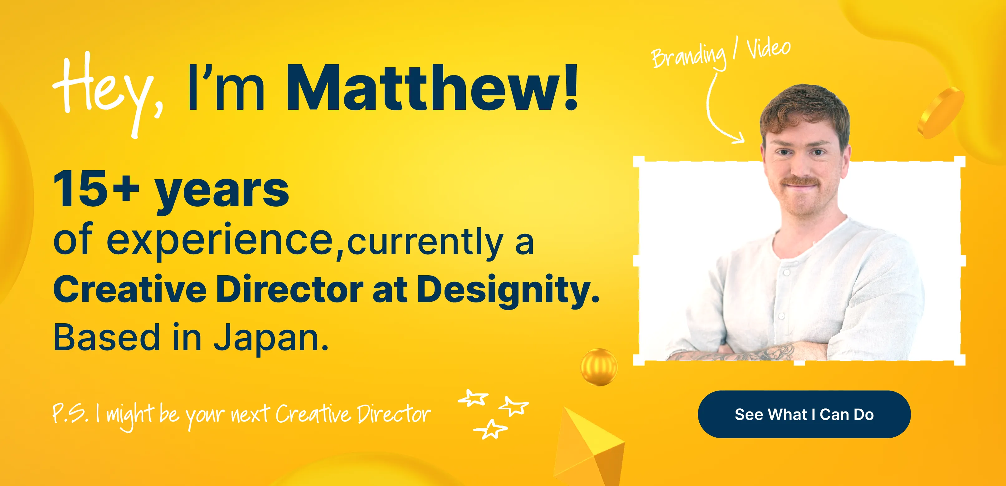
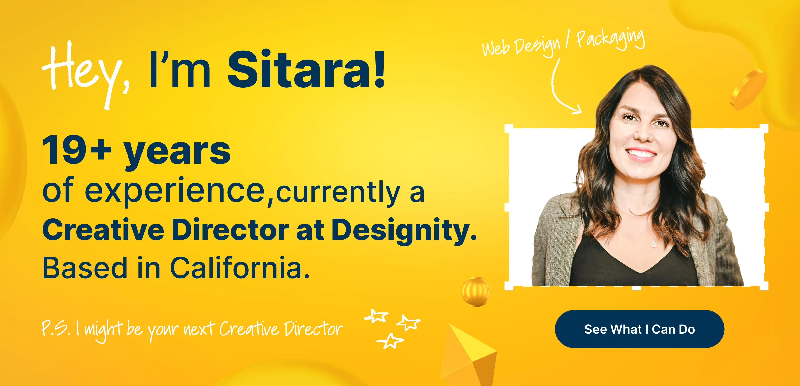
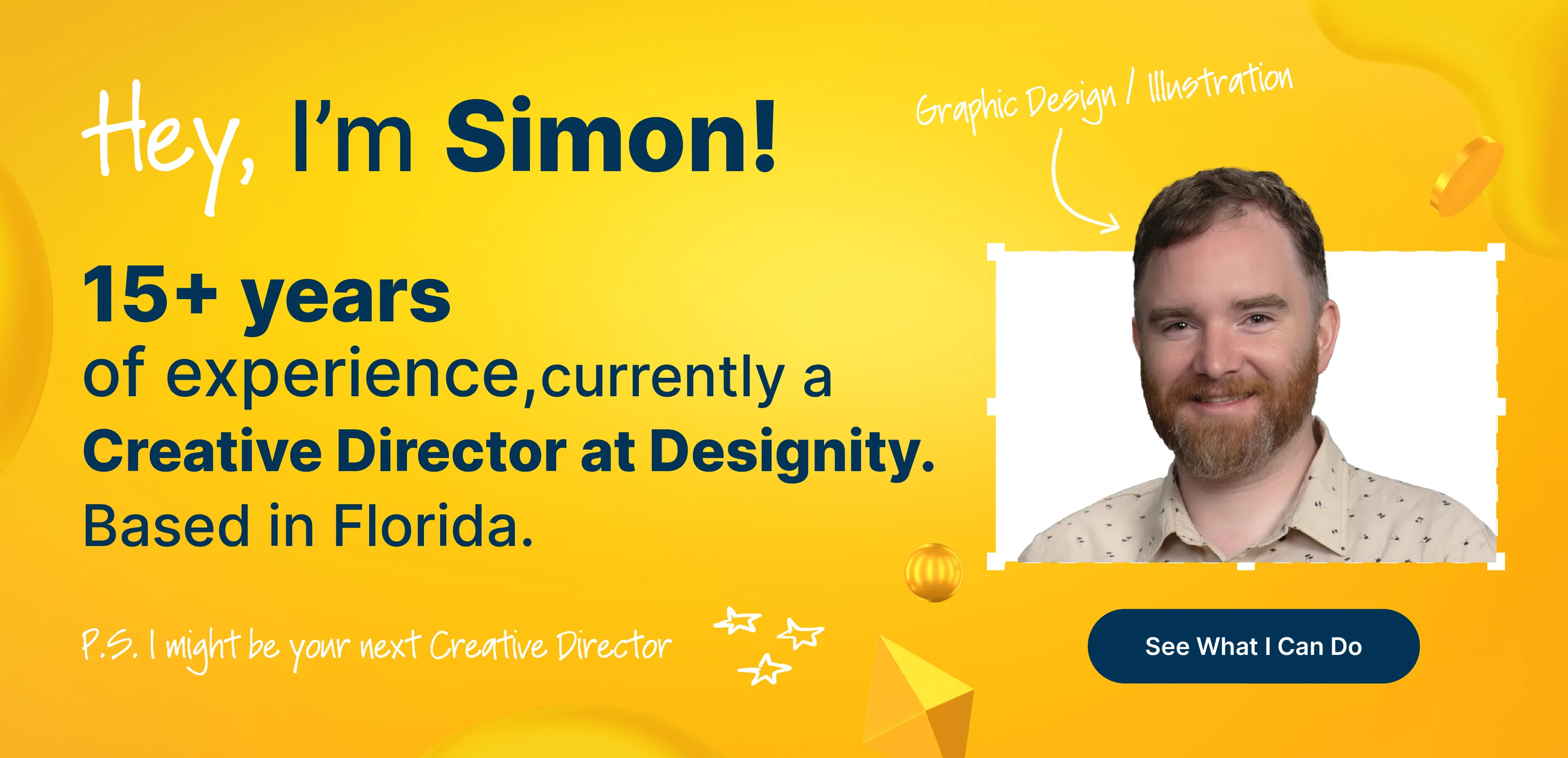
For teams without time to overthink every color decision, Designity helps bridge the gap between exploration and execution.
With dedicated Creative Directors and access to the top 1% of creatives and marketers, brands can confidently test, refine, and roll out distinctive palettes across 100+ design and marketing services.
Ready to move beyond safe choices?
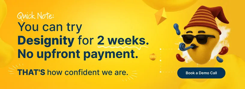
Book a demo and try Designity for 2 weeks. No upfront payment required.
Keep Exploring:
- Discover 10 real-world sources of logo inspiration that go beyond Pinterest and Behance, and spark more original brand ideas.
- Looking for a creative partner? See the ROI behind Designity’s flexible pricing and how it helps brands scale smarter.