

Ever thrown a few colors together because they “look good,” only to realize the result feels… off? It happens to everyone.
That’s because color isn’t just about personal taste — it’s about psychology, balance, and how the brain responds.
The right color scheme can set a mood, tell a story, and build trust, while the wrong one makes a design fall flat.
So, what actually makes a great color combination? It’s part art and part science.
Designers rely on timeless principles like contrast, harmony, balance, and accessibility, but intuition and practice matter too.
In this post, we’ll share a few expert insights that turn good color choices into unforgettable combinations.
Keep Exploring:
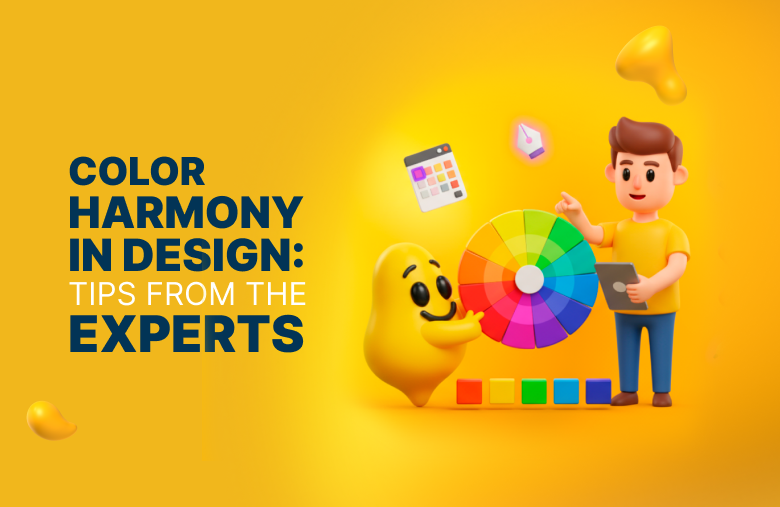
- Curious about how designers achieve balance in their palettes? Dive into our guide on color harmony in design for practical insights you can apply right away.
- If you’re considering a brand update, don’t miss our tips for a successful logo refresh and refine your brand without losing consistency.
Why Color Combinations Matter More Than You Think
Color is one of the fastest ways to spark an emotional response.
Long before someone reads a headline or tagline, color has already shaped their first impression.
That’s the power of color psychology: shades influence mood, trigger associations, and even affect how much people trust a brand.
Here are a few quick examples:
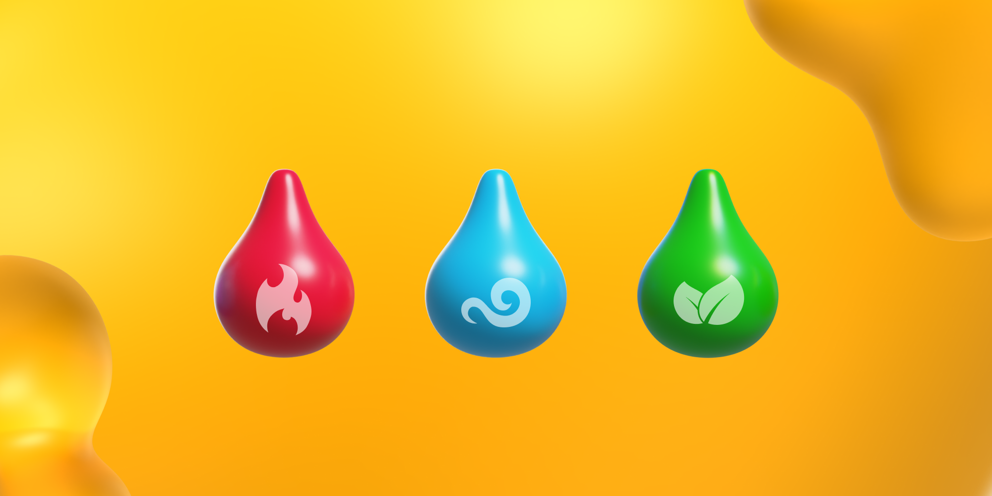
- Red: Energizing and urgent, but too much can feel aggressive.
- Light Blue: Calm and trustworthy, yet in the wrong setting can seem cold or distant.
- Green: Strongly tied to nature, health, and anything organic or eco-friendly.
A color combination in design isn’t just decoration — it’s a strategic choice that shapes mood, message, and impact.
The Core Principles Behind Strong Color Combinations
Great palettes don’t happen by accident. Behind every “wow, that looks amazing” moment, there are a few timeless design principles doing the heavy lifting:
A. Contrast vs. Harmony
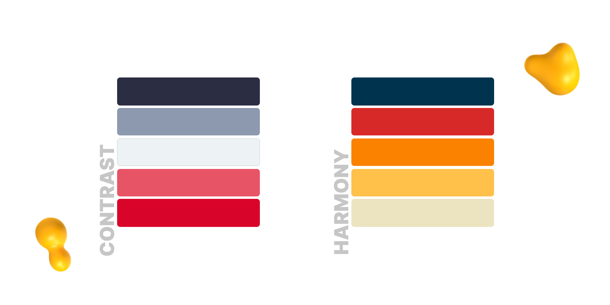
Every palette needs both high contrast and harmony:
- Contrast makes elements stand out. It ensures text is readable, CTAs grab attention, and key visuals don’t get lost.
- Harmony creates cohesion. It ties colors together so the design feels unified rather than scattered.
Applied well: Use contrast to highlight what matters most, then balance it with harmony to keep the overall composition comfortable to look at. Too much contrast overwhelms; too much harmony bores. The principle is balance.
B. Color Wheel Basics
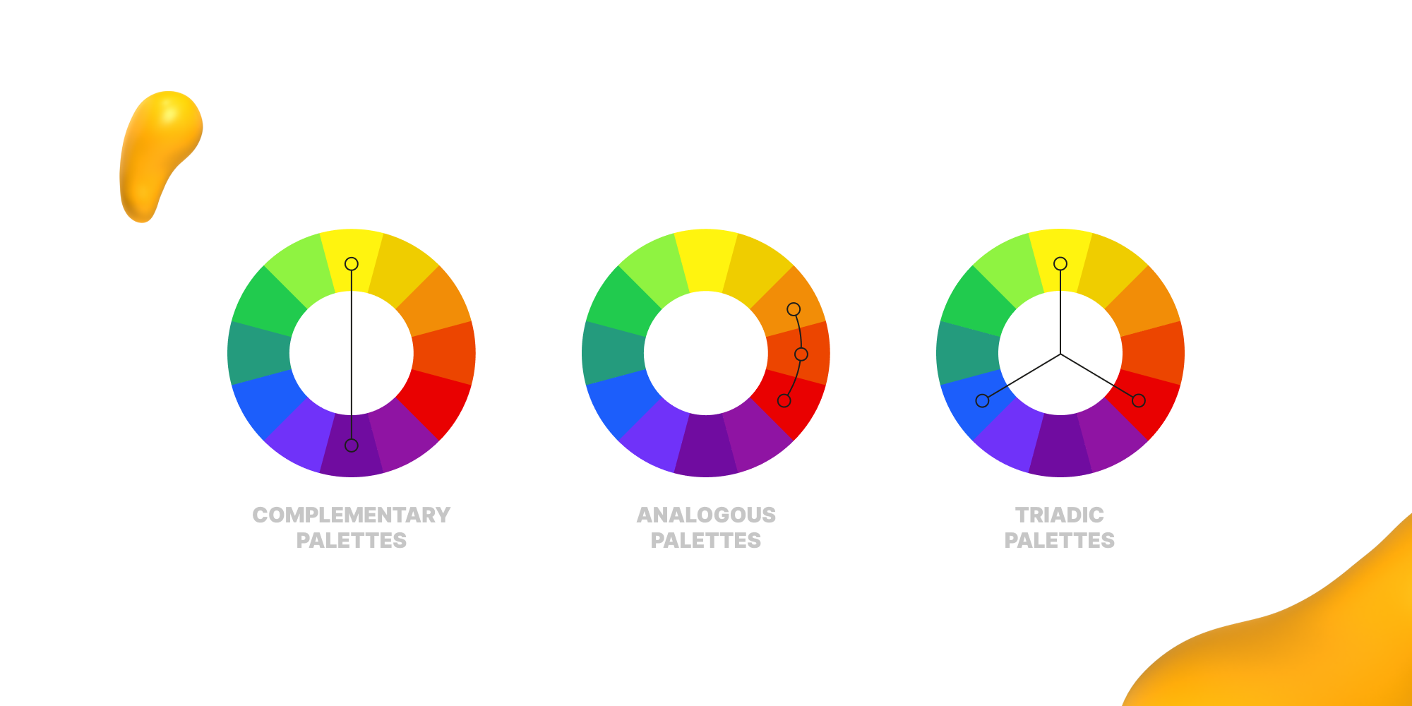
The color wheel provides a proven system for pairing colors. Three foundational approaches work across all types of design:
- Complementary palettes (opposite sides of color the wheel) deliver maximum contrast and energy. Complementary colors are best for bold, high-impact branding and attention-grabbing visuals.
- Analogous palettes (neighbors on the wheel) feel smooth and cohesive. Ideal for calm, welcoming designs where subtlety matters.
- Triadic palettes (three evenly spaced colors) create variety while maintaining balance. Useful for playful, modern brands that want vibrancy without chaos.
Applied well: Choose the palette type that matches the mood and purpose of your project. Don’t guess — the color wheel gives you a reliable foundation for decision-making.
C. Balancing Warm and Cool
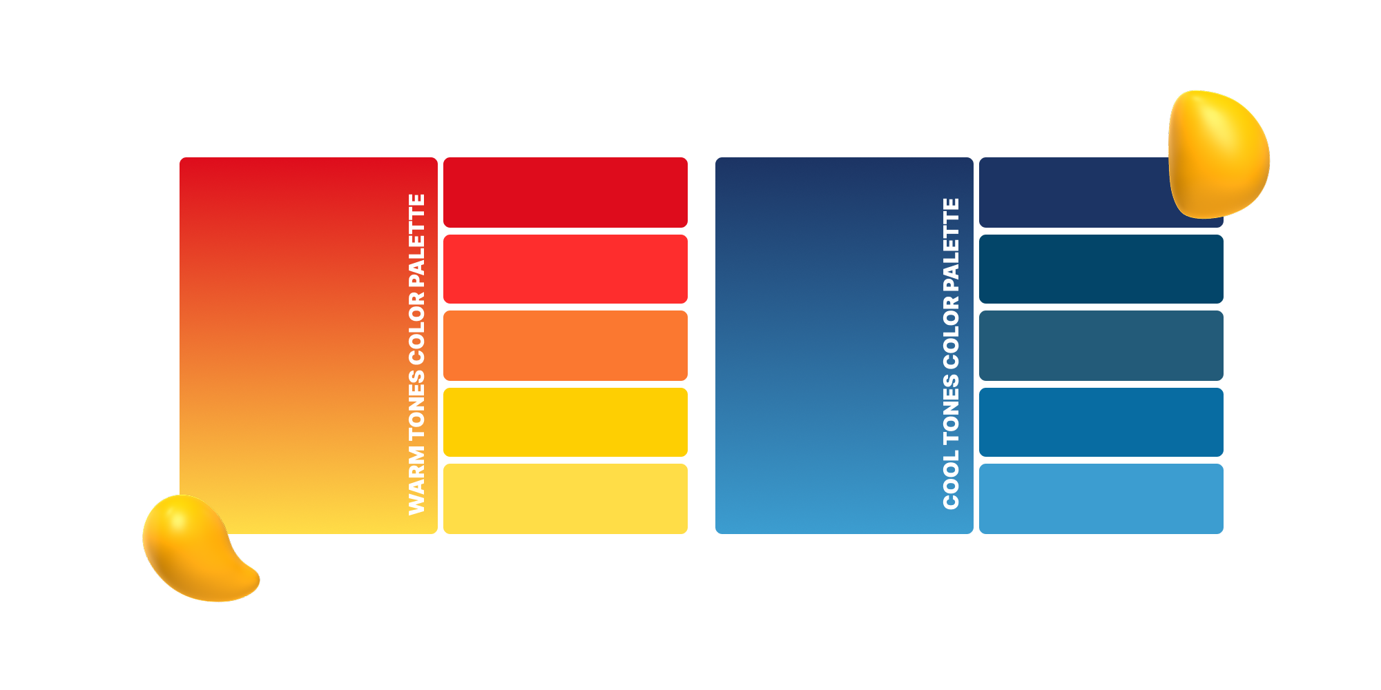
Warm and cool tones shape the emotional temperature of a design.
- Warm colors (reds, oranges, yellows) evoke energy, passion, and urgency. They naturally draw the eye and push elements forward.
- Cool colors (blues, greens, purples) communicate calm, trust, and stability. They recede in space, grounding the design.
Applied well: Overuse of warm tones overwhelms; overuse of cool tones flattens. Balance the two by pairing dominant cool palettes with warm accents to add life, or grounding warm palettes with cool tones to provide stability. This principle ensures designs feel complete and evoke the right response.
How Design Experts Judge a Palette
Once the basics are in place, designers look beyond color theory and ask whether a palette can actually work in the real world.
Here are a few of the key questions they use to judge if a combination is strong:
- Is it legible? Colors need enough contrast so text stands out clearly against the background.
- Does it match the brand voice? A playful brand might lean on bright, bold tones, while a luxury brand calls for rich, sophisticated hues.
- Can it scale? A good palette should look just as strong across print, web, and social media without losing impact.
3 Common Mistakes That Ruin Color Combinations
Even the best intentions can go sideways if color choices aren’t handled carefully.
Here are three mistakes that trip up designers and non-designers alike:
- Using too many colors: A crowded palette creates visual chaos and leaves the eye with nowhere to rest. Simplicity almost always leads to stronger impact.
- Ignoring accessibility and contrast: If text blends into the background or fails color-contrast standards, the design becomes hard to read and your message gets lost.
- Chasing trends too hard: Following color fads without thinking about longevity can make your design feel dated fast. A timeless palette keeps your work relevant long after the trend fades.
5 Ways to Discover Winning Color Palettes
Finding the right palette doesn’t have to be complicated.
Here are five tried-and-true ways designers uncover different types of color combinations that just work:
- Adobe Color: A go-to tool for experimenting with harmonies and testing out color relationships.
- Coolors: Quick, one-click palette generation that’s perfect for brainstorming and iteration.
- Pinterest: Endless boards packed with curated palettes and design inspiration.
- Pull from real life: Photography, nature, or even vintage posters can reveal color pairings you might not think of on your own.
- Look in unexpected places: Everyday objects can be full of inspiration. For example, children’s books and toys are packed with vibrant, playful palettes that translate beautifully into design.
Find Your Brand’s True Colors with Designity
Mastering color takes practice, not just theory. When a combination works, you don’t just see it — you feel it.
Strong palettes aren’t about memorizing rules, they’re about understanding how colors interact and trusting yourself to experiment.
Look at color through the lens of balance, contrast, and emotion, and you’ll start spotting great palettes everywhere — in nature, architecture, and the brands around you.
The more you train your eye, the easier it becomes to create combinations that feel purposeful and memorable.
That’s the same approach we bring to every project at Designity. With vetted US-based creatives and dedicated Creative Directors, we turn color choices into brand identities, campaigns, and designs that resonate.
Book a demo today and explore Designity with a two-week free trial, giving you access to 100+ creative services.


.png)