




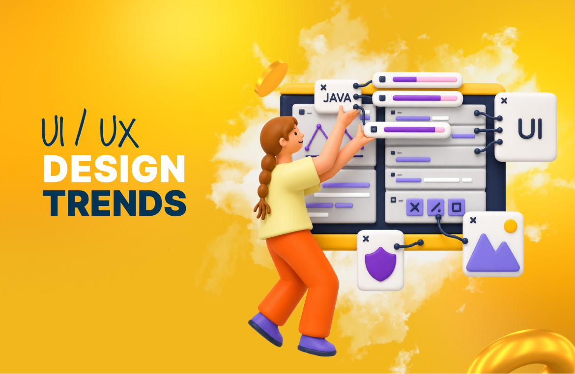
Think of a design trend as a clue, not a crystal-ball prediction.
It’s something visible on the surface that points to a bigger shift happening underneath, whether that is how designers work, what users expect, or how people interact with the tools around them.
The 10 trends below are worth watching in 2026, but none of them appeared overnight.
Most have been building for years and are now becoming harder to ignore.
So, if you are tracking the latest UI/UX design trends for 2026, here’s where to start.
How These UI/UX Design Trends Were Chosen
The final list was narrowed down using four key criteria:
- A senior creative at Designity drew on her day-to-day experience working across UI/UX and digital projects, including the patterns she sees in tools, workflows, feedback, and user expectations.
- The trends were cross-checked against current research and guidance from sources such as Google, Figma, UXPin, the UX Design Institute, and W3C.
- Each trend was chosen for its practical impact on how designers work or how people experience digital products, not simply because it looks new.
- Priority was given to shifts that have been developing over time and are becoming more influential in 2026.
Top 10 UI/UX Design Trends Every Designer Should Watch
Here are the UI/UX design trends set to shape more intuitive, immersive, and engaging digital experiences in 2026 and beyond:
1. AI as a Partner for Thinking
.png)
AI has been part of the design conversation for a while. What’s changing is how designers use it day to day.
Instead of replacing designers, AI design tools create room for ideas that tight timelines and lean teams might otherwise cut.
It helps teams:
- Move beyond the blank page
- Explore more directions
- Test concepts earlier
- Discard weak ideas faster
That makes exploration cheaper and shifts more value toward human judgment.
The designer’s role becomes knowing what deserves development, what needs refining, and what never should have made it past the first draft.
2. The Shrinking Gap Between Design and Code
.png)
Design has traditionally relied on representations.
Wireframes stood in for structure, mockups showed appearance, and developers rebuilt everything later.
Something always got lost in the handoff.
According to UXPin, the divide between design and engineering continues to shrink in 2026.
Prototypes now behave more like finished products, helping stakeholders react to something tangible instead of imagining the outcome.
That leads to:
- More specific feedback
- Fewer misunderstandings
- Less rebuilding
- Closer collaboration
Design and development are becoming part of one shared process rather than two separate stages.
3. Design Systems That Can Scale
.png)
Design systems have always helped teams create consistent work.
What’s changing is who, or what, needs to understand them.
Experienced team members can often interpret missing rules and unwritten context. New production tools cannot.
They need clear documentation covering:
- Which components to use
- What variations are allowed
- When each rule applies
- Why certain decisions were made
It’s no longer enough to document what exists. Teams also need to explain how and when to use it.
Otherwise, components drift, output becomes inconsistent, and the system becomes harder to scale.
{{drowning-in-projects-an}}
4. Interfaces That Respond to What You Mean
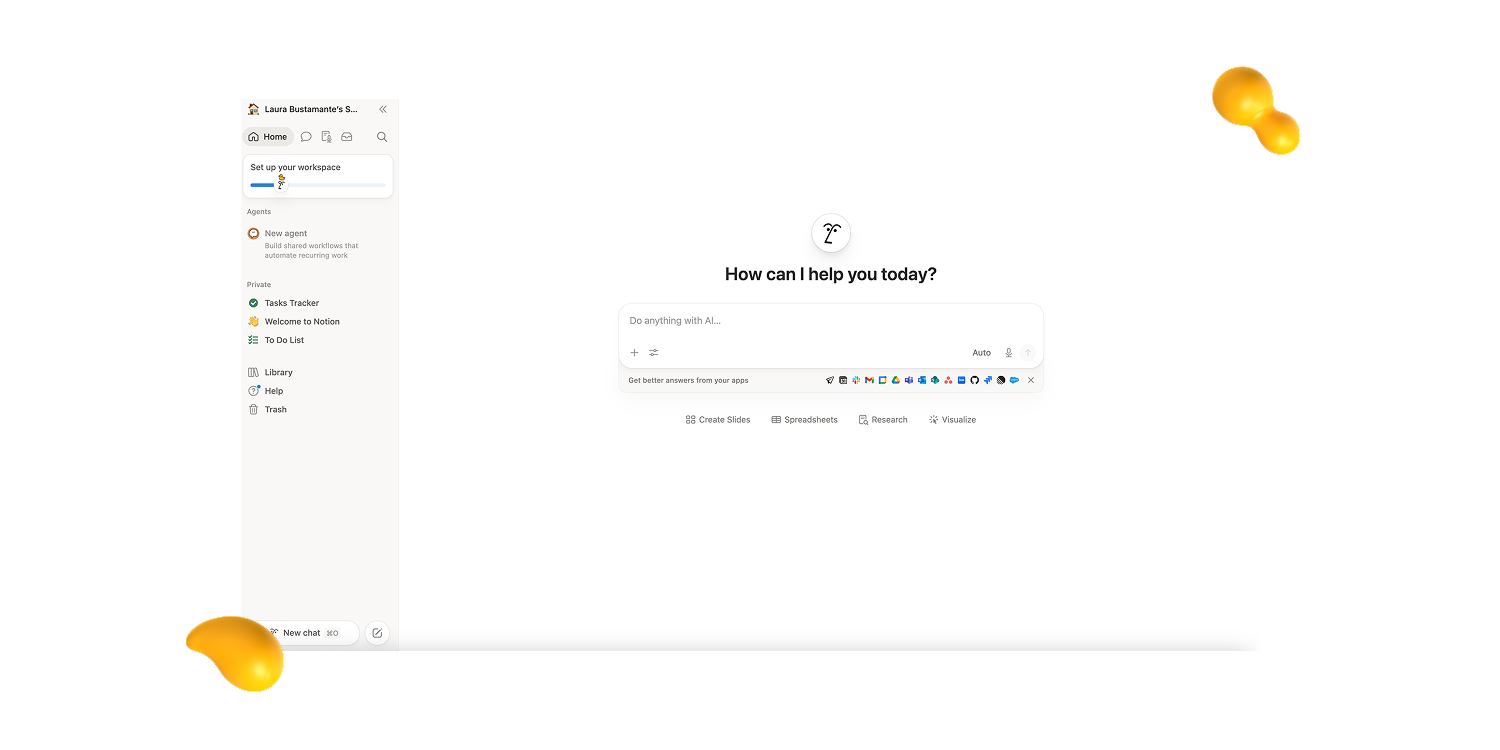
Nobody should have to navigate three menus to do something they already know how to describe.
Natural language shortens that distance. The user explains what they need, and the product works out the path.
That changes the interface from something people navigate into something that listens.
Designers must now consider:
- What users might ask
- How intent should be interpreted
- What happens when requests are unclear
- How much visible control users still need
The strongest interfaces will support both approaches. Some users will prefer to type what they want, while others will still want to click and explore.
5. Personalization That Goes Deeper
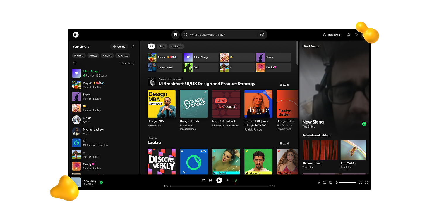
Personalization used to mean recommended articles, customized feeds, or a first name in an email.
Now, it’s moving deeper into the product.
The UX Design Institute identifies real-time contextual adaptation as a defining UX direction for 2026.
That could include:
- Dashboards that prioritize relevant information
- Onboarding flows that adapt to user behavior
- Navigation that surfaces frequent actions
- Interfaces that respond to changing needs
The risk is unpredictability.
Change too much without explaining why, and users lose trust.
Get the balance right, and the product starts feeling designed for the individual rather than a general audience.
6. Visual Expressiveness After Years of Neutrality
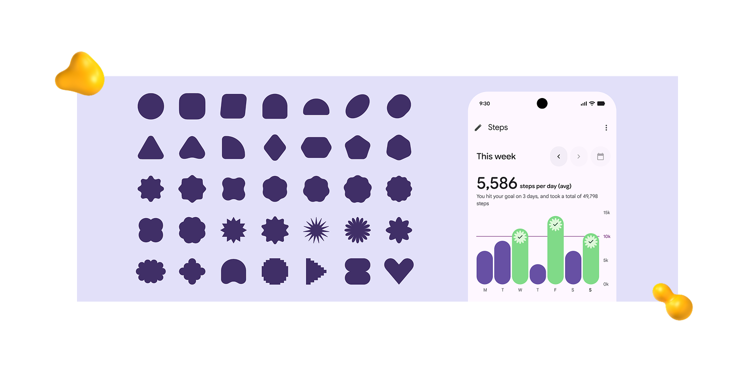
For years, digital interfaces followed the same quiet formula: fewer details, safer colors, and predictable layouts.
That supported clarity and consistency.
But when every product follows the same rules, neutrality stops communicating anything.
Expressiveness is returning as a functional tool.
Research behind Google Material 3 Expressive found that participants identified key interface elements up to four times faster in expressive designs.
Strong visual weight can:
- Direct attention
- Clarify hierarchy
- Improve recognition
- Create differentiation
Used deliberately, expressive design can make their purpose easier to understand.
7. Imperfection as a Design Choice
A technically perfect finish no longer signals effort the way it once did. Often, it simply signals access to the right tools.
That makes clearly human decisions more valuable.
Think:
- Textures that feel handmade
- Illustrations with visible character
- Photography that captures real moments
- Typefaces with personality
- Details that resist generic polish
These choices stand out because they suggest intention.
In a digital landscape where many products feel generated by the same process, specificity becomes useful.
When used with purpose, imperfection stops looking like a flaw.
It becomes a signature that makes the work feel distinct, considered, and human.
8. Depth, Texture, and the Return of the Physical
.png)
Flat design dominated for so long that depth began to feel unnecessary.
Now, physical qualities are returning to digital interfaces.
That includes:
- Layering and volume
- Purposeful shadows
- Translucent surfaces
- Tactile-looking buttons
- Interactive 3D products
Figma identifies 3D and immersive elements as a clear web design direction for 2026.
But materiality should do more than make a screen look interesting.
Its most useful role is helping users understand what they are seeing, where elements sit, and how they respond.
Depth works best when it adds meaning, not when it becomes another layer of visual noise.
9. Motion That Explains Rather Than Decorates
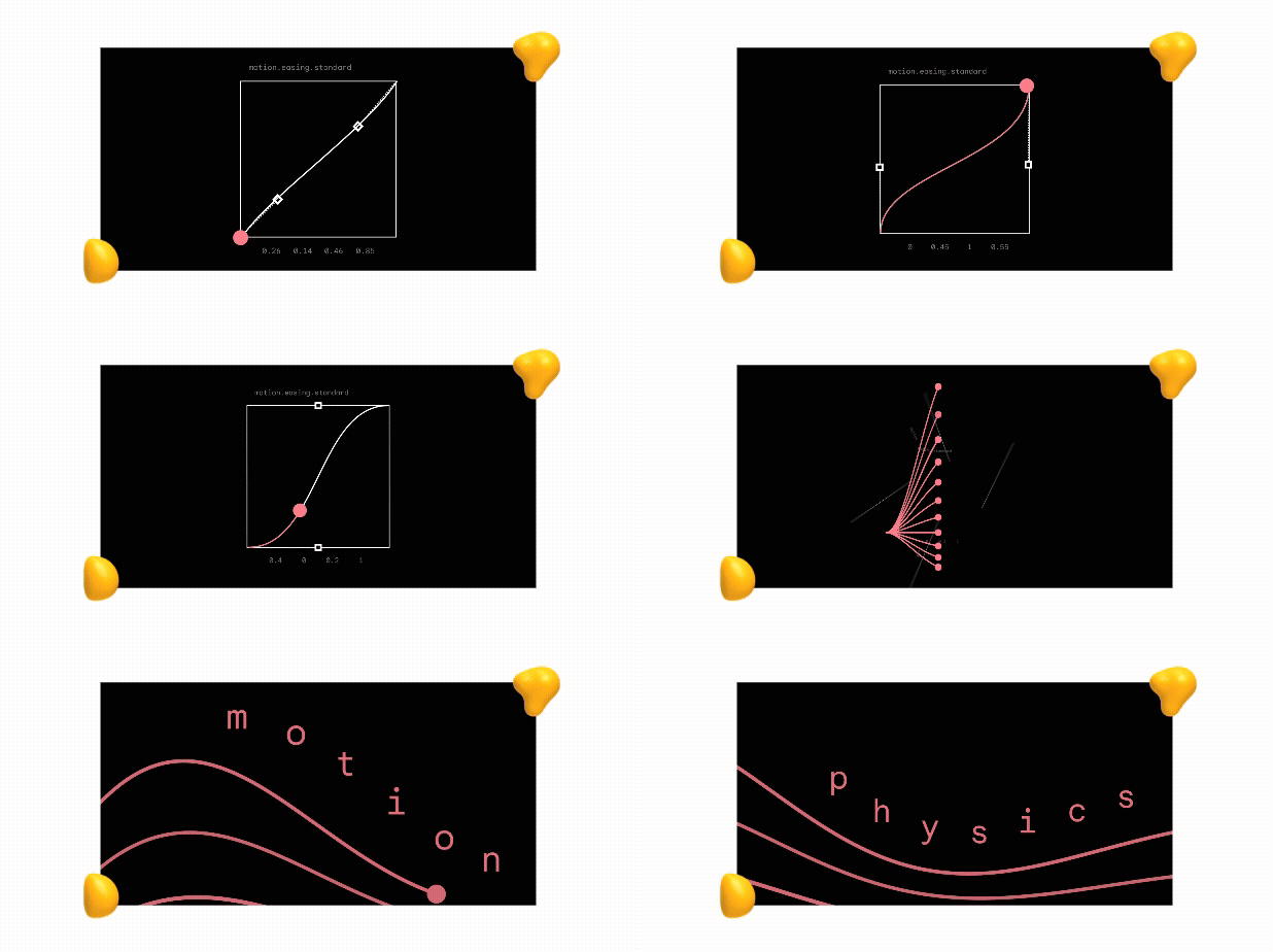
Animation has been part of interface design for years. What’s changing is why designers use it.
The most effective motion helps users understand what happened.
For example:
- A transition shows where an element moved
- An expanding section reveals hidden information
- A loading state confirms that the system is responding
- A subtle animation directs attention to the next step
Used this way, motion carries information rather than atmosphere.
The best interface animation often works quietly in the background.
Users may not notice it directly, but they notice when it’s missing and the experience becomes harder to follow.
10. Designing for Less Effort
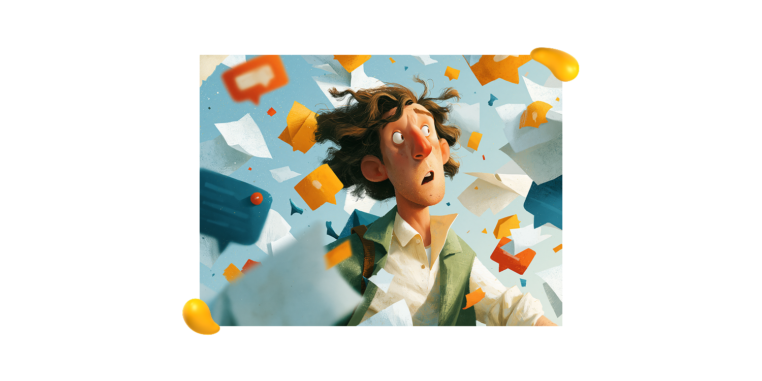
Digital fatigue isn’t only caused by time spent on screens. It also comes from interfaces that make simple tasks unnecessarily difficult.
Common sources of friction include:
- Text that buries the action
- Flows that forget user progress
- Confusing navigation
- Error messages that offer no solution
In 2026, effort reduction is becoming a quality standard.
That means clearer language, stronger visual hierarchy, and flows that help users continue where they left off.
W3C guidance treats cognitive accessibility as foundational.
And the benefit extends to everyone: less effort usually creates more confidence, trust, and satisfaction.
The Designity Take: Don’t Just Follow the Trend. Make It Better.
UI/UX design moves fast, but great creatives do more than keep up.
They know which ideas improve the experience, which ones need more work, and which ones belong back on the mood board.
That judgment is what turns a passing trend into thoughtful, effective design.
At Designity, you can work fully remotely on real projects with experienced Creative Directors, without chasing clients, pitching for every job, or following up on unpaid invoices.
Ready to sharpen your skills, grow your portfolio, and focus on the work you actually enjoy?
Join Designity’s creative community today.
3 FAQs About UI/UX Design Trends
Here are the answers to a few commonly asked questions related to UI/UX design trends:
1. What Are the Biggest UI/UX Design Trends in 2026?
The biggest UI/UX design trends in 2026 include:
- AI-assisted workflows
- Design-to-code convergence
- Deeper personalization
- Expressive interfaces
- More purposeful motion
- Greater focus on cognitive accessibility
2. How Is AI Changing UI/UX Design?
AI is helping designers explore ideas, build prototypes, and test directions faster.
It can speed up production, but human judgment is still essential for strategy, usability, brand consistency, and knowing which ideas are worth pursuing.
3. Should Designers Follow Every New UI/UX Trend?
No. Trends are most useful when they solve a real user problem or improve the experience.
The goal isn’t to use every new style or tool, but to understand what’s changing and apply it with purpose.