
Would you buy anything in a brick-and-mortar store that was unappealing, poorly laid out, and made it impossible to find what you were looking for?
We didn’t think so.
And if you have an online store, then you know that your eCommerce website design acts just like a physical storefront and can make or break a sale in the first few seconds of visiting! So, does your eCommerce store have what it takes to keep your customers coming back for more? Or are you unintentionally creating a confusing or subpar customer experience?
If you aren’t sure, then today’s blog is here to help.
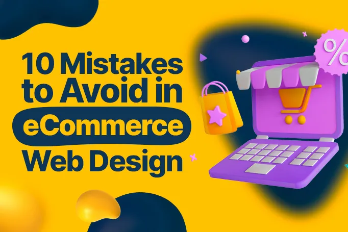
We’re taking you through the top 10 mistakes to avoid in your eCommerce UX/UI design to ensure that your online store looks great, provides an enjoyable shopping experience, and keeps bringing in those customers!
Why Your eCommerce Website Design is Crucial for Your Business
So, what could mistakes in your web design be costing you and your business?
Quite a bit, honestly!
Here are a few reasons why you want to create a custom eCommerce website with a user-friendly design that works to attract more customers and strengthen your online presence:
- First Impressions Matter — The design of your eCommerce site is usually the first interaction potential customers have with your brand. A well-designed website creates a positive first impression, which establishes trust and professionalism right off the bat. In contrast, a poorly designed site can turn customers away before they even explore your products.
- User Experience (UX) — A seamless and intuitive user experience encourages visitors to stay longer on your site, browse through more products, and stick around long enough to make a purchase. Good design simplifies navigation, makes searching for products easier, and enhances the overall shopping experience, directly impacting conversion rates and reducing cart abandonment.
- Brand Identity and Consistency — Your website is a powerful tool for expressing your brand identity. A strong, consistent design across your website reinforces your brand, making it more memorable and recognizable to customers. This consistency extends to colors, fonts, imagery, and the overall aesthetic, which should align with your brand values and message.
- Mobile Responsiveness — With an increasing number of consumers shopping on their mobile devices, a responsive web design is non-negotiable. Your site must look and function well on a variety of screen sizes and devices to accommodate mobile shoppers, improve their shopping experience, and capitalize on mobile commerce trends.
- SEO and Visibility — Good web design also contains the technical aspects that improve search engine optimization (SEO). A well-designed site with fast load times, optimized images, and proper HTML structure will rank better in search engine results, leading to increased visibility, more organic traffic, and higher potential for sales.
- Competitive Edge — In a crowded online marketplace, a superior web design can be a differentiator for your brand. A visually appealing, user-friendly site can set you apart from competitors, attract more customers, and build up brand loyalty.
- Customer Trust and Credibility — A professional and aesthetically pleasing eCommerce site conveys credibility and trustworthiness. Customers are more likely to purchase from a site that looks secure and well-crafted, as it reflects the quality and reliability of the products or services offered.
10 Common Mistakes to Avoid with Your eCommerce Web Design

Now that we’ve discussed all of the benefits of an optimized site with clean and user-friendly design, it’s time to learn what not to do.
The following are the 10 most common mistakes we see with eCommerce website design and what steps you can take to overcome them!
1. Poor Image Quality
Website visitors are a visually discerning bunch.
If your product images are pixelated, fuzzy, or too small to see without making an effort, you can expect your newest visitor to get frustrated and click away.
And even if your images look fine, take care to make sure that the images you have posted are accurate to the product pages that your customers are reading about. You don’t want to accidentally use the wrong image or use one blanket image for multiple products either.
The Simple Solution: Use only high-quality images on your website. This goes for product images as well as every other graphic on your page, whether it’s a photo of your team on your About Us section or the accompanying images to your blog content.
If it’s visual, it needs to be sharp! And don’t limit yourself to one image, either! Your customers can’t pick up your product in their hands, so use multiple images at different angles, especially with clothing and furniture, to help them get a better feel for what they’re buying.
2. No Contact Info
Nothing frustrates a potential customer more than needing to get in touch with a member of your team and not being able to because your contact information is hard to find.
This could lead to a frustrated customer, a loss of a sale, or a potentially bad review on your business page.
The Simple Solution: Your contact info should be front and center and easy to find. Display your contact info prominently on the footer, the header, or a dedicated contact page to keep things easy for your target audience. Give your customers everything they need, whether it’s a phone number or an email so that they can reach out with ease.
3. Inadequate Customer Support
If you walked into a physical store, spent thirty minutes looking for an employee to answer a question, and then couldn’t find one, what would you do?
If you didn’t say, “Leave like the place was on fire,” then we commend you on your unwavering patience.
For most people, not getting help when they need it is a surefire way to reconsider giving these businesses their hard-earned money.
Your eCommerce website operates the same way. If you have a customer who needs help finding, returning, or getting information about a product, a timely response is what you need to give to make sure they don’t take their business elsewhere.
The Simple Solution: If you don’t have a big enough staff to cover 24/7 customer service, why not use AI chat boxes?
Incorporating AI chat boxes into your eCommerce website offers 24/7 support to your customers and eases the burden on your customer service team. This is also extremely helpful for customers in other countries or time zones that don’t work with your normal office hours, allowing them to receive immediate assistance at any time of day and be more likely to stick with your brand and make a purchase.
4. Pop-Ups!

We’ll just come right out and say it.
Pop-ups are obnoxious.
And we’re not the only ones that think so. Excessive use of pop-ups quickly becomes a source of frustration for your website visitors, interrupting their experience with your site and leading to higher bounce rates as your visitors click away in disgust.
However, …
The Simple Solution: If you absolutely must use pop-ups, make sure that they are easy to close. You don’t want an annoying pop-up disrupting your visitor’s shopping process or covering up important content right when they’re about to make a purchase.
A pop-up can sometimes be an effective tool for capturing leads or delivering discounts and other offers. For instance, a well-placed pop-up offering a discount for a first-time purchase could be an effective tool for converting a visitor.
5. Overly Complicated Checkout
There’s nothing like a customer getting ready to make a special purchase … only to give up right at the finish line and leave their cart abandoned forever.
How does that happen?
Often, the culprit is your checkout process. A checkout process that is too long, full of confusing navigation, or website glitches is one that is going to cost you sales.
The Simple Solution: Streamline the process by minimizing the number of steps between clicking “Checkout” and finishing the purchase. You can even include some helpful numbered steps or a progress indicator in your design to minimize confusion and let your customers know what to expect.
You should also avoid barriers that could cause unnecessary frustration during your checkout process, like getting to the very end and requiring an account or having a shopping cart that takes users away from your page, which could potentially distract them and lose a sale.
Also be sure your design is responsive and optimized for mobile devices. More and more consumers are shopping via smartphone and a lengthy or confusing checkout process could be deterring sales from your mobile users!
6. Ineffective Presentation of Product Descriptions
Online shoppers often are buying at their own risk.
With a shopping medium where a buyer cannot pick up a product in their hands or immediately flag down an employee to ask a question, poorly presented or vague product descriptions just aren’t going to cut it.
Your product subscriptions should be laid out in a way that effectively communicates the product's features and benefits through visual hierarchy instead of one boring block of text. They should also be snappy and not overly long but still include all of the necessary details about the product’s features, benefits, and any other information a customer might need to make an informed decision.
The Simple Solution: Prioritize the visual hierarchy and design of your product pages, using icons or bullet points to quickly draw attention to key features and benefits. You can also use different font sizes, colors, and strategic placement of text and other design elements to guide your viewer’s eyes to what’s most important, like CTAs and purchase buttons!
It would also be a good idea to hire a copywriter to write engaging and informative product descriptions that give your customers everything they need to know about your product in a way that's easy to read. A copywriter will also know how to use your brand’s tone of voice to keep all of your website copy on brand and speak to your target audience in a way that resonates with them and encourages repeat purchases.
7. Confusing Navigation
If you’ve ever been to a physical store where you couldn’t find what you were looking for, you know how frustrating the feeling is.
Well-laid-out stores have their products grouped by category and aid their shoppers with prominently placed signs to make everything easy to find. Your website should be no different.
Confusing navigation is one of the biggest reasons that potential customers click out of your page, costing you revenue, your good reputation, and loyal customers.
The Simple Solution: Your website should be intuitive with easy-to-follow navigation to help visitors find products or information they need without any hassle.
Use category pages to organize your products, have a navigation bar on one side of your site, and use visual hierarchy in your website copy to guide your visitors to where they need to go. You should also consider adding a search feature to your website so that your visitors can just type up what they’re looking for and quickly find what they need.
Again, be sure that these fixes are optimized for mobile devices as well so smartphone users can find everything just as easily as desktop users!
8. Hidden CTAs

There’s nothing more infuriating than wanting to purchase something online and not being able to find a button that allows you to do so.
Just like physical stores often have signs leading customers toward the checkout counter, the assistance desk, or the bathrooms, your website needs to guide your visitors to where you want them to go.
An easily overlooked, lackluster, or missing CTA button is a common oversight in eCommerce website design but, luckily, one that is easily fixed.
The Simple Solution: CTAs are the guideposts that direct your visitors toward a conversion, so you want them to stick out!
Effective CTAs are visually striking, contrast with the colors around them, use action-oriented language, and are strategically placed to capture attention at just the right moment.
Making sure your website has well-defined and can’t-miss-it CTAs can increase customer engagement and dramatically improve your site’s conversions.
9. Inconsistency
Inconsistency in design is something we encounter quite a bit with our eCommerce clients.
What is inconsistency? Inconsistency in web design is like making your visitors step into a different store on every page they click.
It’s a jumble of color schemes for each page or a wildly different tone of voice in each bit of copy that tells the reader you have 10 people writing for you. It can also be differing typography or a visual hierarchy that makes no sense and does nothing but distract your visitor.
Inconsistency also makes your site appear less credible, unprofessional, and less appealing to your target audience, so it’s something you want to avoid.
The Simple Solution: It’s extremely important to establish a brand guideline from the get-go. Your guideline will include a defined color palette, typography, tone of voice, and the design elements that you want to reflect your brand.
Use these standards on all of your visuals, from your eCommerce platform to your emails to your social media accounts for consistency, professionalism, and to build trust in your audience.
If you need some help establishing your brand guidelines, visit our Branding Guidelines service page. We’d love to get your brand the consistency it needs!
10. Cluttered or Boring Design
This is a big one.
Some eCommerce websites are too far too busy.
The design is cluttered, with too many colors, too many multimedia elements, and too many distractions, making it hard for customers to focus on what they're there for: shopping for your products.
A cluttered design can overwhelm your visitor, leading them to click away in search of a website that doesn’t hurt their eyes or raise their blood pressure.
But the reverse is also true.
Often, in an attempt to make their eCommerce website as simple and user-friendly as possible, online store owners unknowingly veer into the dreaded “blah.”
What we mean by that is boring design, websites without engaging layouts, appealing color schemes, and captivating visuals.
They function, of course, but websites lacking that extra something will struggle as much as overly cluttered sites to keep visitors around long enough to make a sale and definitely won’t make a big enough impression to stay top-of-mind for long to potential customers. This makes it hard to stay memorable or to differentiate your store from your competitors.
It’s a delicate balance to find that middle ground, but it can be done.
The Simple Solution: A pro web designer can be your best friend here.
They have the skills and expertise to give your website that dose of creativity and brand personality it needs to be memorable without overdoing it and can transform a negative shopping experience into one that’s just the right amount of exciting and engaging.
By strategically using the right colors, fonts, and imagery, a pro designer can make your site stand out in a crowded marketplace and encourage new visitors and more conversions.
Where You Can Go for Good Web Design
So, how many mistakes is your web design making?
If you’ve decided your site is ready for an overhaul, there are places you can go to get it done. We’ll list the most common eCommerce solutions here:
eCommerce Web Design Agencies
A web design agency is a common solution. eCommerce design agencies employ professional eCommerce web developers and designers who have plenty of experience making sites both functional and visually pleasing.
However, this solution works best for larger companies with bigger budgets. Web design agencies can be costly, often requiring expensive retainers and extra charges for additional revisions or specialized features.
If you’re a startup or smaller business, these eCommerce web design companies can incur costs that quickly add up.
Freelancers
Freelancers are often much more affordable options for eCommerce businesses.
They can be found by networking on platforms like LinkedIn or Indeed, or by posting jobs on marketplaces like Fiverr, Upwork, or Creative Circle.
However, as with hiring any new employee, you’ve got to do your research and check out their portfolio to make sure they have the skills custom eCommerce web design would require. You also have to manage them on top of your other duties and keep in constant communication to make sure your website is finished on time.
Creative as a Service Platforms
Creative as a Service (CaaS) platforms have been gaining traction lately as more and more businesses look to their flexible model over more traditional design agencies.
If you’re looking for eCommerce web design services, a CaaS platform is a great choice, since they usually operate on monthly subscription-based pricing and allow you to scale up and down as needed.
Like web design agencies, they also employ talented and experienced web designers and developers to get your site up and running as soon as possible.
<div class="c-blog_comp-cta cc-component-1"><div class="c-blog_comp-cta-left"><div class="c-blog_comp-cta-left-wrap"><img src="https://global-uploads.webflow.com/61cdf3c5e0b8155f19e0105b/6369722e59155470b6840033_Potential-clients.png" loading="lazy" alt="" class="c-blog_comp-cta-left-img"></div></div><div class="c-blog_comp-cta-right"><div class="c-blog_comp-content"><div class="c-text-wrapper cc-mb-32"><div class="c-title-4 cc-bold"><strong>Want to save money without sacrificing the quality?</strong></div></div><div class="c-text-wrapper"><div class="c-text-2">Say goodbye to traditional, expensive agencies and unreliable marketplaces. Say hello to Designity.<br></div></div></div><div class="c-blog_comp-wrapper"><a href="/pricing" target="_blank" class="c-button cc-primary cc-inverted w-button"><strong>Get Your 2-Week Trial</strong></a></div></div></div>
Ready to Say Goodbye to Inconsistent and Boring Design?
If CaaS platforms sound like a great option to get your eCommerce web design services taken care of, you’re not alone!
Plenty of businesses are going with CaaS to create high-converting and responsive eCommerce website design. And if you’re looking for a platform to try, then you might have already found the perfect one for you.
Designity is a tech-enabled and future-ready CaaS platform that offers cost-effective monthly pricing, a dedicated Creative Director to act as project manager on each and every account, and access to the top 1% of global vetted creative and marketing talent, including all of the web designers and developers your eCommerce website could ever need.
Designity is up to date on all of the eCommerce design trends 2024 is set to bring, and we are ready to take your website design to the next level!
Take a look at our portfolio to see if our style vibes with yours. If it does (and we have a feeling that it does), why not book your demo call today, and let’s get you started with your two-week, no-obligation trial?
Are you ready to say goodbye to inconsistent and boring eCommerce web design?


.webp)


-2025-12-24%2520at%252010.31.02.webp)