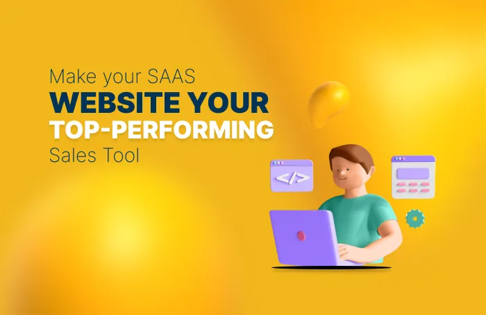
If you’re a SaaS brand, then your website has a lot of heavy lifting to do.
It needs to be your product’s first impression, your product’s best-performing salesperson, and its most effective marketing asset.
Whatever your goal is: increasing sign-ups, reducing churn, or educating new users, your website plays a huge role in the buyer journey. And in an industry where users are busily comparing similar SaaS products before they commit to making a decision, your website needs to do its job fast if it is to build trust, explain value, and drive action.
So, what does it take for your SaaS website to work for you?
Today’s blog has what you need. Whether you’re launching your product for the first time or fine-tuning an existing platform, today we’re walking you through proven strategies to help you create a high-performing SaaS website that crushes user expectations and drives conversions!
Let’s get started!
What Makes a High-Converting SaaS Website?
Before you start diving into visuals and button colors, let’s take a moment to understand the foundation of a high-converting SaaS website.
Strong web design isn’t just about looking nice— it needs to guide your visitors, answer their questions, and convince them to commit with as little friction as possible.
Here are a few things that the most effective SaaS websites have in common:
- A Clear Value Proposition — Within seconds, visitors should know what your product does, who it’s for, and how it helps. If they have to think too hard to figure it out, they’re likely to leave.
- Trust-Building Elements — Things like client logos, reviews, security badges, and clear privacy info help show your company is legit — especially when people are signing up or entering payment details.
- A Smooth User Experience — Your site should be fast, easy to navigate, and look great on any device. If it’s slow or confusing, users won’t stick around.
- Calls to Action That Work — Phrases like “Start Free Trial” or “See It in Action” should feel easy and compelling to click — not pushy or vague.
- Helpful, Educational Content — Resources like blogs, FAQs, and demo videos help users learn more and build confidence in your product. They also show that you know your stuff.
And once all of these pieces are in place, your website goes from “digital brochure” to a reliable, conversion-driving machine!
7 SaaS Web Design Tips to Boost Conversions
Now that we’ve covered the basics, let’s dig into the good stuff and put those principles in action!
The following 7 tips are focused on how you can improve the way users engage with your site and, ultimately, how often those users convert!
1. Keep Your Above-the-Fold Messaging Focused
.webp)
Consider the top of your homepage as the prime-est of real estate.
It's the first thing users see and the section of your website that will set the tone of the rest of the user experience.
Use it wisely, is what we’re saying.
To make the most of the items living above the fold, focus on these key elements and best practices.
- Headline — Your headline should be displayed prominently and communicate your product’s core benefit in 6–12 words.
- Subheadline — Follow up the headline with a quick explanation, use case, or differentiator.
- CTA Button — Include a CTA below your header and subheader. Make it obvious, direct, and benefit-driven (“Start Free Trial,” “Watch Demo,” etc.).
- Avoid Clutter — Be sure to keep your above-the-fold content free of clutter to keep from overwhelming your visitors. Stick to one core message and keep the design clean.
- Match Intent — Make sure your messaging is speaking directly to what your ideal user is looking for so that they know they’re in the right place.
- Avoid Jargon — Use plain and straightforward language here so that users can immediately understand what you have to offer.
2. Guide Visitors with a Visual Hierarchy That Converts
Good design isn’t just about aesthetics — it’s about direction too.
Your website should naturally guide your visitors through the page in a way that feels natural, clear, and effortless.
Visual hierarchy is the best way to do this. By using font and image size, spacing, color, and layout intentionally, you can lead your users’ eyes exactly where they need to go, whether it’s a feature overview, pricing section, or your primary CTA.
Here are a few best practices to help you build a layout with a high-converting flow:
- Highlight Important Elements — Use size and weight to draw the eye to what matters most—like your headline, key value prop, or call to action.
- Use Color and Contrast Strategically — Make buttons and links pop with colors that stand out (but still feel on-brand and easy on the eyes).
- Break Up Content — Give your layout some breathing room with white space, dividers, and clear sections. It helps users stay focused and prevents overwhelm.
- Keep the Flow Logical — Lay out your content in the order users expect to see it—typically: intro → benefit → action. It should feel intuitive, not like a puzzle.
- Limit Competing Elements — Stick to one main goal per section. If you ask users to do too many things at once, chances are, they’ll do none of them.
Done right, visual hierarchy not only improves readability, also creates a smoother, more persuasive user journey that helps you acquire more customers!
3. Prioritize Speed and Responsiveness
-1.webp)
Your website can be the most beautiful SaaS website in the world … but if it’s slow or buggy, your users won’t stick around to see it.
Page speed and mobile responsiveness aren’t just technical details. These days, they’re conversion killers or boosters — it all depends on how well you handle them. Today’s users expect a fast and positive experience on any device they use, and SaaS buyers are no exception.
Here are some ways to keep your site running smoothly on whatever size screen your viewers are using:
- Compress Your Media — Optimize images and videos to reduce file sizes without sacrificing quality. Formats like WebP can help keep visuals sharp and lightweight.
- Minimize Load Time — Cut down on unnecessary scripts, limit font files, and avoid overloading your site with too many plug-ins or widgets.
Design for Mobile First — More users than ever are browsing on their phones, so make sure your mobile layout isn’t just functional—it’s delightful. - Be Careful with Animations — Subtle animations can enhance the experience, but too many can slow things down or feel distracting.
- Run Speed Audits Regularly — Use tools like Google PageSpeed Insights or GTmetrix to identify what’s slowing your site down and get actionable fixes.
4. Use Strategic Social Proof
When it comes to SaaS, users feel a lot better knowing that they’re not the very first to try your product. And that others have had success with it.
That's where your social proof comes in. Social proof is a great way to build trust, ease doubt, and give people a reason to believe in what you’re trying to sell.
But not all testimonials or client/partner logos are created equal! To actually boost conversions, your social proof needs to be placed strategically and backed up by real results!
Here’s a few tips on how to use it effectively:
- Place It Near CTAs — Add testimonials or logos close to decision points, like sign-up sections or demo request forms, to give users a confidence boost when it matters most.
- Be Specific — Generic praise like “Great product!” doesn’t move the needle. Use quotes that mention outcomes, metrics, or pain points your product helped solve.
- Show Recognizable Brands — Client logos from trusted companies can quickly elevate your credibility—just make sure you have permission to use them.
- Include Case Studies — If you’ve helped a client achieve something impressive, tell that story. It’s more persuasive than a sentence or two of praise.
- Use Real Names and Faces — Whenever possible, include a name, photo, and job title to make your testimonials feel real and trustworthy.
5. Build Trust with Clean Design
Your design is going to set the tone for how users perceive your brand.
And if your website looks outdated, cluttered and overwhelming, or even off-brand, it could be making your SaaS product look unreliable, no matter how great it is.
Clean and consistent design doesn’t just look good. It also communicates your professionalism, attention to detail, credibility, and overall “with-it-ness.”
Here are some tips on how to design with trust in mind:
- Keep It Polished — Use high-quality visuals, sharp typography, and a cohesive color palette that aligns with your brand personality.
- Avoid Stocky Imagery — Generic photos or overused illustrations can make your site feel less authentic. Use custom visuals or stylized graphics when possible.
- Stay Consistent — Buttons, fonts, icons, and colors should look and behave the same across your site. Consistency = reliability.
- Design for Your Audience — An enterprise SaaS product might call for sleek, minimal design, while a creative tool can lean more vibrant and playful.
- Make It Accessible — Choose readable fonts, clear contrast, and a logical content structure so every user can comfortably navigate your site.
6. Simplify Your Navigation
%2520(1).webp)
Confusing navigation is the biggest culprit for lost conversions.
And it makes sense. If users can’t easily find what they’re looking for — or if they can’t even figure out where to get started — they’re not likely to stick around.
A good SaaS website is simple, intuitive, and focused on the actions that matter most.
Use these tips to help keep your users on the right path:
- Limit Top-Level Links — Stick to 5–7 main menu items max. Prioritize the pages that support your key goals (like product, pricing, and demo).
- Don’t Bury Pricing — SaaS buyers often want to see the cost upfront. Hiding pricing behind multiple clicks can create unnecessary frustration.
- Use Descriptive Labels — Avoid vague terms like “Solutions” or “Discover.” Make it clear where each link will take the user.
- Add Sticky Nav or Anchor Links — On longer pages, fixed navigation or in-page links help users move around without getting lost.
- Make Mobile Navigation Seamless — Use a clean hamburger menu and prioritize quick access to CTAs, product info, and pricing.
7. Make Onboarding the Star of the Show
Your onboarding experience is a huge part of your product.
If your website doesn’t reflect that, then it should start. Especially when it comes to more complex or enterprise SaaS tools, your users are going to want to know what happens next after they sign up.
Highlighting your onboarding flow right off the bat will help to reduce any lingering hesitation and boost your users’ confidence in your product.
Here are some ways to feature your onboarding effectively:
- Show, Don’t Tell — Use screenshots, short demo videos, or animations to give users a preview of what the platform actually looks like.
- Highlight Key Steps — Walk through what users can expect after they sign up—whether it’s a guided tour, checklist, or integration setup.
- Tailor It to Your Audience — For self-serve SaaS, focus on simplicity and speed. For enterprise, emphasize onboarding support and personalized setup.
- Link to Onboarding Resources — Include access to help docs, tutorials, or a knowledge base for users who want to dive deeper before committing.
Position It Near CTAs — A preview of onboarding near your “Start Free Trial” or “Book a Demo” button can make the decision feel less intimidating.
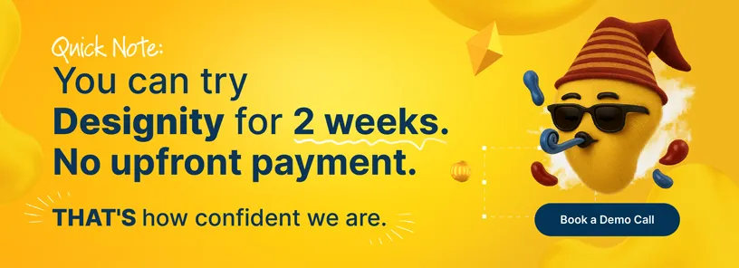
<div class="c-blog_comp-cta cc-component-1"><div class="c-blog_comp-cta-left"><div class="c-blog_comp-cta-left-wrap"><img src="https://global-uploads.webflow.com/61cdf3c5e0b8155f19e0105b/6369722e59155470b6840033_Potential-clients.png" loading="lazy" alt="" class="c-blog_comp-cta-left-img"></div></div><div class="c-blog_comp-cta-right"><div class="c-blog_comp-content"><div class="c-text-wrapper cc-mb-32"><div class="c-title-4 cc-bold"><strong>Want to save money without sacrificing the quality?</strong></div></div><div class="c-text-wrapper"><div class="c-text-2">Say goodbye to traditional, expensive agencies and unreliable marketplaces. Say hello to Designity.<br></div></div></div><div class="c-blog_comp-wrapper"><a href="/pricing" target="_blank" class="c-button cc-primary cc-inverted w-button"><strong>Get Your 2-Week Trial</strong></a></div></div></div>
Design That Converts Doesn’t Happen by Accident
Remember, a high-converting SaaS website doesn’t just look great —it’s strategically designed to guide your users, provide the right information, and get conversions.
And if your current site isn’t doing this for you … isn’t it time it did?
Designity is an innovative Creative as a Service platform that connects SaaS businesses just like yours with creative and marketing experts who know what it takes to build the kind of websites that not only reflect your brand but move your users through your funnel.
Each Designity account is led by a SaaS-savvy expert to manage your team of web designers, developers, coders, copywriters, motion graphic artists, and whoever else you need to help you turn your website into your hardest-working asset — all while you keep your focus on where your business needs you most!
Why not check out our SaaS marketing page and our web design service page and portfolio to see how Designity’s experts have been the exact right answer for brands just like yours?
Like what you see? Go ahead and take the next step and book your demo call. It only takes a few minutes, and when you’re done, we can get you started with a two-week, no-obligation trial so you can see firsthand why Designity is the SaaS web design partner your brand has been waiting for!
Are you ready to build a SaaS website that actually converts?
-2025-12-24%2520at%252010.31.02.webp)