The LGBTQIA+ community is part of the very fabric of great design. From Gilbert Baker’s Pride flag to Alan Bell’s BLK magazine, we can’t talk about the modern-day design industry without talking about the pillars and activists that brought us here.
When words weren't enough to get a message across, activists use art. Sometimes in simple ways that encouraged people to broaden their horizons, and other times born out of moments of violence.
Keep reading to learn more about some of the most impactful pieces of design in the LGBTQIA community.
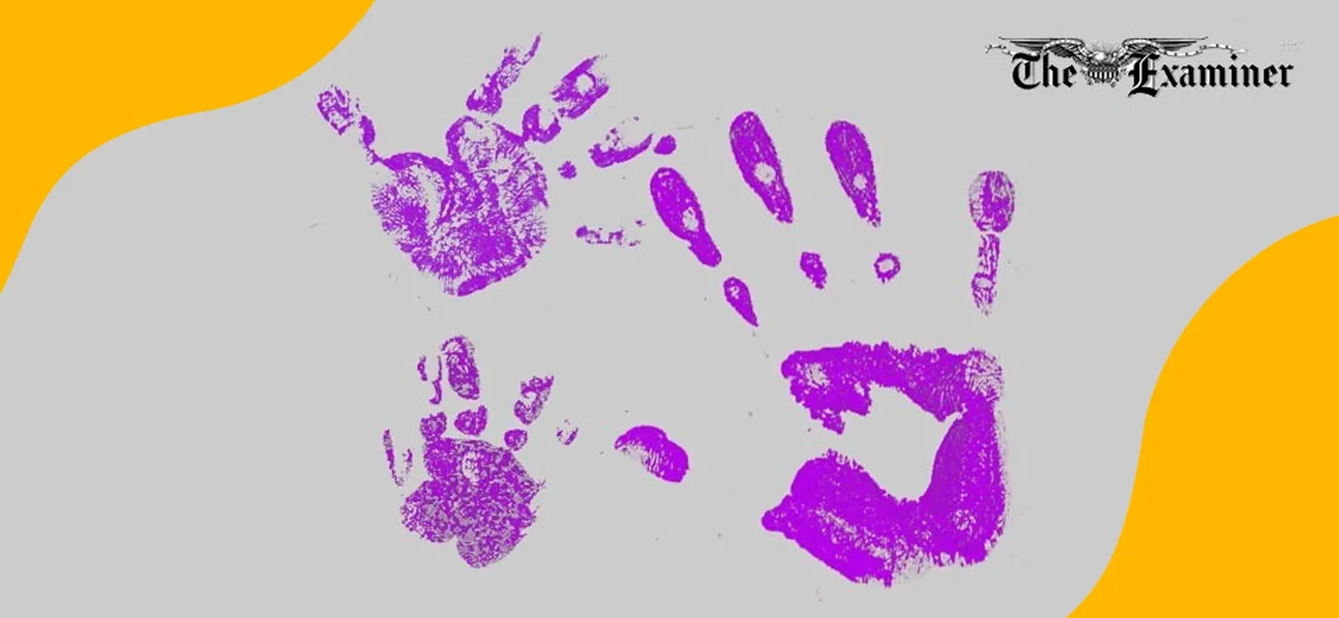
The Purple Hand, 1969- Gay Liberation Front
On Halloween in 1969, a group of protesters gathered in front of the San Francisco Examiner to protest their running of an inflammatory piece titled “The Dreary Revels of S.F. ‘Gay’ Clubs”.
Robert Patterson, the writer, called for more policing of Gay places. Patterson was known to regularly ‘out’ arrested gays and name them in the many homophobic articles he wrote.
The protestors attempted to negotiate with the Examiner, but they were chased out of the building. Instead of hearing them out, employees dumped bags of ink on them from the roof of the building.
Rather than accepting defeat, the protesters dipped their hands in the ink and stamped their hands on the building, from walls to windows to doors.
While the purple hand wasn’t an intentional design created by one person for a poster or magazine ad, it was a collective creation that still represents the Gay liberation movement today.
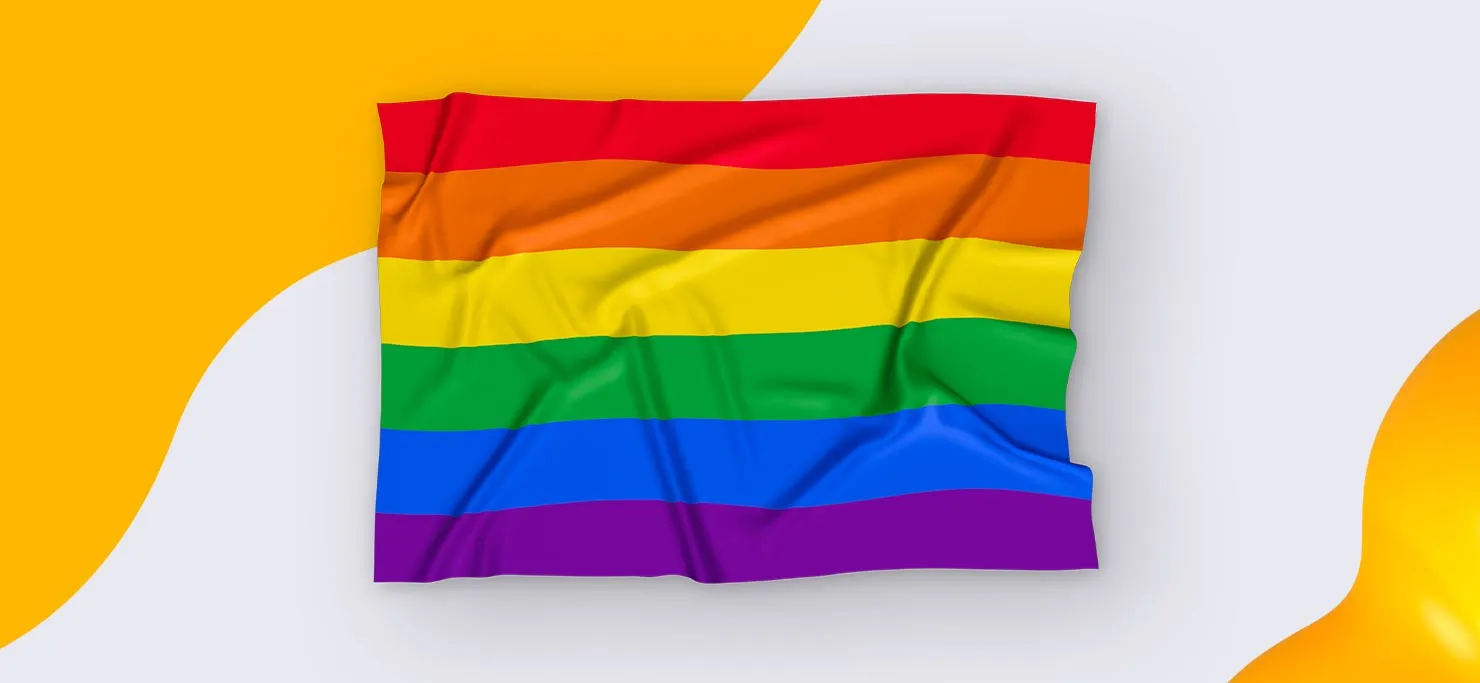
Pride flag 1978- Gilbert Baker
On June 25, 1978, at the San Francisco Gay and Lesbian Freedom Day Parade, the enthusiastic crowd watched proudly as the rainbow flag was unfurled for the very first time. There it was, a hand-dyed, hand-stitched symbol of a long-oppressed community free at last.
Designed by Gilbert Baker, an American designer, artist, activist, and drag queen, the rainbow flag was created at the urging of one of the first openly Gay elected US officials. He asked that Baker develop a symbol of pride for the Gay community.
What is the most powerful symbol of pride? A flag, of course.
Here is what the colors mean:
Hot pink: Sex
Red: Life
Orange: Healing
Yellow: Sunlight
Green: Nature
Turquoise: Art
Indigo: Harmony
Violet: Spirit
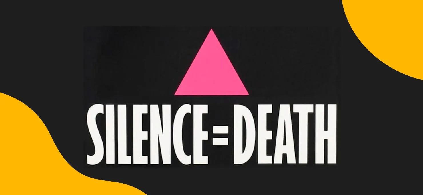
Silence=Death, 1987- Gran Fury
With the AIDS crisis bulldozing through the community, and the death toll at 4,135 in 1987 alone, Avram Finkelstein, Brian Howard, Oliver Johnston, Charles Kreloff, Chris Lione, and Jorge Socarrás founded the Silence=Death project to support one another through the crisis.
The pink triangle symbolizes the Nazi persecution of LGBTQIA people in the 1930s and 40s when it was stitched onto prisoners' uniforms, upside down. Silence=Death was a line that they chose as a way to reach multiple audiences in an abstract way.
The poster was printed and wheat-pasted around NYC, hitting the streets in 1987. To this day, it’s still one of the most impactful design works for LGBTQIA activism, over 40 years later.
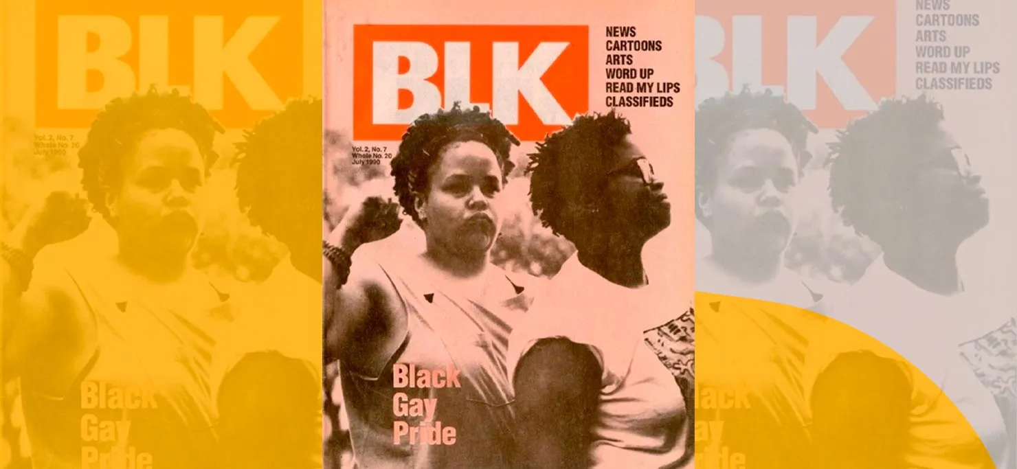
BLK Magazine, est. 1988- Alan Bell
Founded by graphic designer and illustrator Alan Bell, BLK Magazine was a news periodical for black lesbians and gay men. The magazine was instrumental in providing reliable information about black LGBTs and the HIV crisis, filling a need in an underserved and underrepresented community.
From its first publication in 1988, BLK magazine amplified the use of clever image placement and negative space on its covers, made more impactful by its red logo.
Considering that this didn’t begin as a glossy cover magazine, it’s impressive that BLK magazine was able to work in the undercurrent to drive awareness and positive change in the LGBTQ+ community in such a big way.
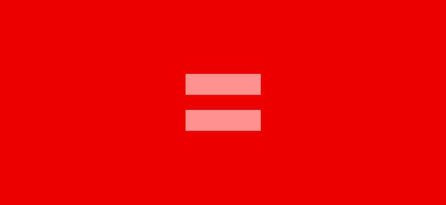
Human Rights Campaign, 1995- Stone Yamashita
As the largest LGBTQ advocacy group and lobbying organization, HRC needed a logo that would get its message across without having to say a single word. They hired design firm, Stone Yamashita for the job back in 1995.
In 2013, almost 20 years after the initial logo was unveiled, marketing director, Anastasia Khoo decided to change its colors to red and pink to show support for same-sex marriage.
The simple red and pink logo went viral as celebs and regular people changed their profile pictures (a 120% increase) to show their support of same-sex marriages. The logo took the country by storm as brands and politicians alike donned it.
<div class="c-blog_comp-cta cc-component-2"><div class="c-blog_comp-cta-left"><div class="c-blog_comp-cta-left-wrap"><img src="https://global-uploads.webflow.com/61cdf3c5e0b8155f19e0105b/6334d81a29c751ccd8c26638_brain-orchestra.png" loading="lazy" alt="" sizes="(max-width: 479px) 93vw, (max-width: 767px) 96vw, 363px" srcset="https://global-uploads.webflow.com/61cdf3c5e0b8155f19e0105b/6334d81a29c751ccd8c26638_brain-orchestra-p-500.png 500w, https://global-uploads.webflow.com/61cdf3c5e0b8155f19e0105b/6334d81a29c751ccd8c26638_brain-orchestra.png 500w" class="c-blog_comp-cta-left-img"></div></div><div class="c-blog_comp-cta-right cc-dark"><div class="c-blog_comp-content"><div class="c-text-wrapper cc-mb-32"><div class="c-title-4 cc-bold">Grow with a community that is exclusively inclusive!</div></div><div class="c-text-wrapper"><div class="c-text-2">Get inspiration from creative directors and level up from emerging creatives to the Chief of Design by collaborating on projects.</div></div></div><div class="c-blog_comp-wrapper"><a href="#" class="c-button w-button"><strong>Discover Your Growth Path</strong></a></div></div></div>
Conclusion
The creative community has traditionally been a safe haven for the LGBTQIA community. A safe space where people of all types can come together with one thing in common: the love of creating something from nothing and making their artwork speak to amplify unheard voices.
Our industry is inclusive, and we’re proud of that. It doesn’t matter what you identify as, or who you want to love. The creative space is one where we can all let our unique flags fly—-and it’s encouraged.

.webp)
.webp)








.webp)
