
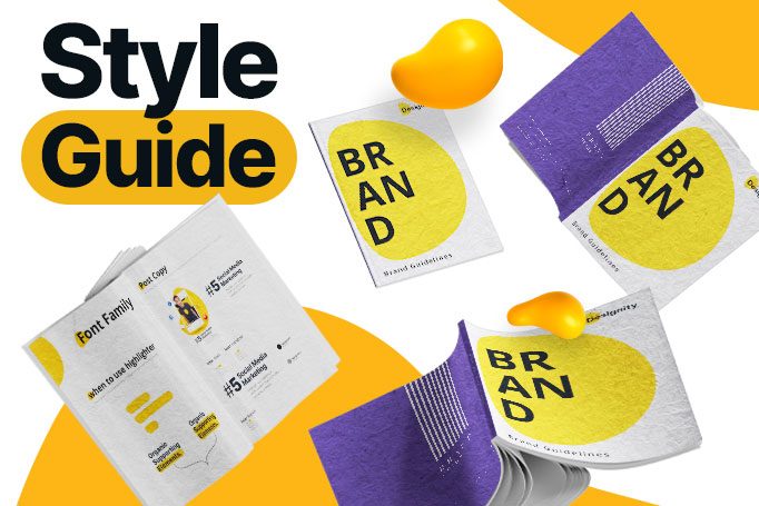
As a creative company, helping brands create great design style guides is sort of our thing. While we’ve known why having one is essential to creating a memorable brand personality, you’d be surprised at just how many small and midsize businesses don’t have one.
In our last article, we covered why you need a graphic designer and dove into the ins and outs of hiring the right one for your business. Here, we’re taking the next step in our design journey together and helping you create a great graphic design style guide that will act as the visual North Star of your business.
What is a graphic design style guide?
The best way to summarize what a brand style guide is is to think of it as a brand bible. This is the book that you refer to whenever you have a project that needs any form of design whatsoever. Which means literally, everything.
From trade shows to marketing collateral, investor relations to social media, logo updates to a big website refresh, your brand style guide ensures that you are consistent across all channels.
A brand without a design style guide is like a kayak without paddles. Sure, it’ll float, but there is no direction or consistency.
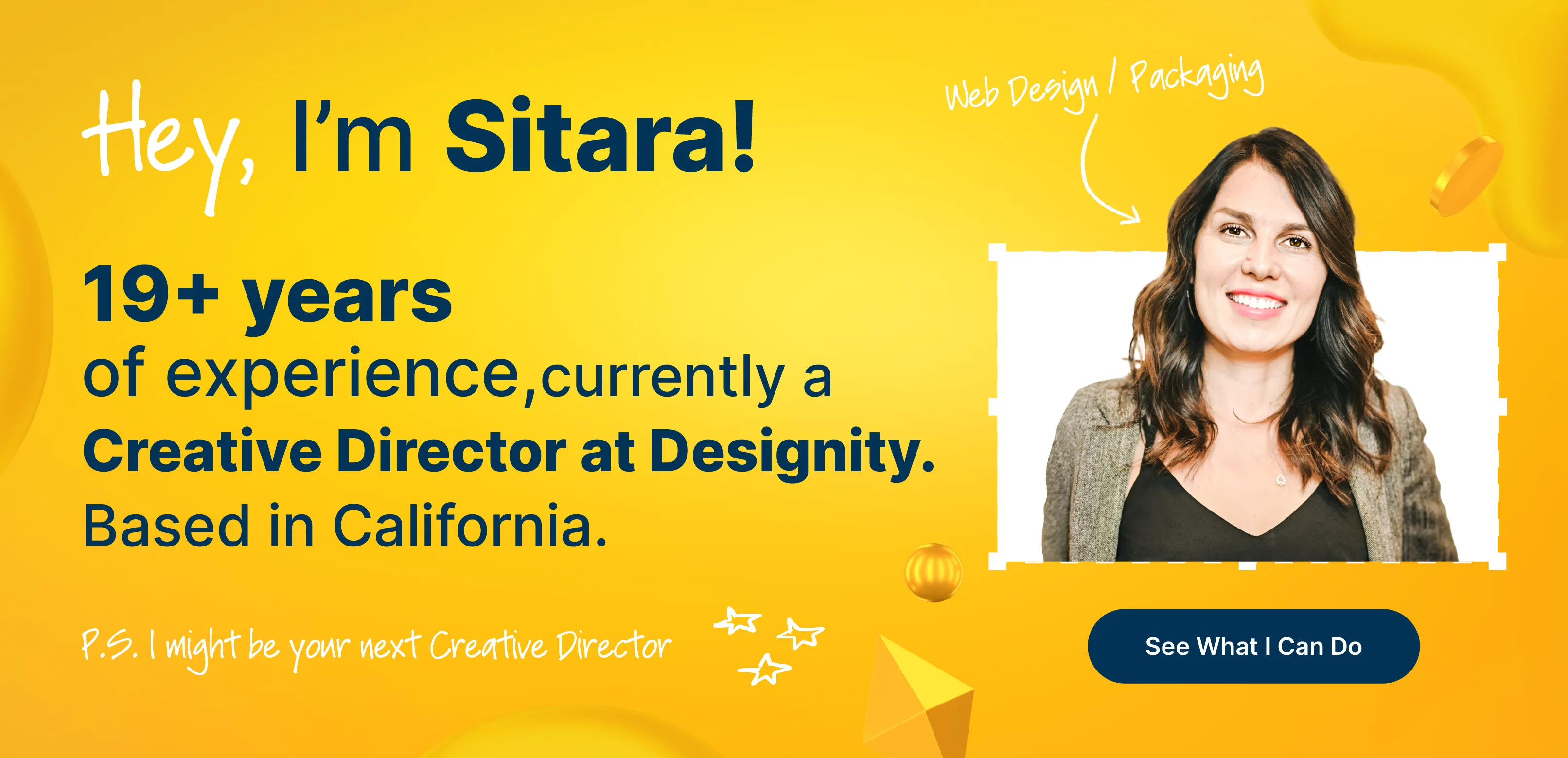
One of our brand expert creative directors, Sitara Dickson summarized it best, “Nowadays, most refer to it as a Visual Expression and Design Systems Guide to encompass all visual aspects of a brand and to cater to a more evolved, consistent presence across all platforms and mediums.”
“Style guides in the past really catered only to the print industry. Now, with the digital revolution, they need to evolve to adapt to other digital mediums.”
Let’s take a look at what it takes to create a brand guideline that crosses all channels and touches all mediums, starting with…
Your brand identity and why it matters
Your brand identity includes all visible elements that make up your brand. Think about the red and white color scheme that has been Coca-Cola’s for the last century. Or the quirky voice that shot Wendy’s to Twitter fame.
Your brand identity is what makes your brand memorable, and it’s what makes you stand out in the sea of competitors.
Something as simple as your color palette or a unique logo can be the thing that makes your customers click on you even if your competitor is sitting on top of you in a Google search query.
Cristin Bowman, one of our creative directors and brand identity design guru, put it best:
“Think of Star Trek. To a non-fan, the multiples of series are so similar up front, but they couldn’t be more different. JJ Abrams’s modern Star Trek movie is in stark contrast to the low-budget original series with pajamas as uniforms. Budgets aside, Abrams’s use of lens flares throughout his movie instantly identifies the film as his. These details add to a direct style, story, and time – the Star Trek brand.”
Now that we’ve covered why your brand identity is crucial to creating a design style guide, let’s get into the fun stuff.
<div class="c-blog_comp-cta cc-component-1"><div class="c-blog_comp-cta-left"><div class="c-blog_comp-cta-left-wrap"><img src="https://global-uploads.webflow.com/61cdf3c5e0b8155f19e0105b/6334d81a29c751ccd8c26638_brain-orchestra.png" loading="lazy" alt="" sizes="(max-width: 479px) 93vw, (max-width: 767px) 96vw, 363px" srcset="https://global-uploads.webflow.com/61cdf3c5e0b8155f19e0105b/6334d81a29c751ccd8c26638_brain-orchestra-p-500.png 500w, https://global-uploads.webflow.com/61cdf3c5e0b8155f19e0105b/6334d81a29c751ccd8c26638_brain-orchestra.png 500w" class="c-blog_comp-cta-left-img"></div></div><div class="c-blog_comp-cta-right"><div class="c-blog_comp-content"><div class="c-text-wrapper cc-mb-32"><div class="c-title-4 cc-bold"><strong>Want to save money without sacrificing the quality?</strong></div></div><div class="c-text-wrapper"><div class="c-text-2">Say goodbye to traditional, expensive agencies and unreliable marketplaces. Say hello to Designity.</div></div></div><div class="c-blog_comp-wrapper"><a href="/pricing" target="_blank" class="c-button cc-primary cc-inverted w-button"><strong>Get Your 2-Week Trial</strong></a></div></div></div>
Creating a consumer persona
For this section, we’ve brought in our research maestro, creative director Pooyan Alizadeh. We dove into the ins and outs of creating a consumer persona that extends beyond just sales strategies.
“You wouldn’t want to tell your grandmother a highly offensive joke. As a brand, you don’t want to convey a story that no one wants to hear. Every brand must resonate with not only the right people but their people. This is the best way to have an impact while staying resourcefully efficient. You need to start by asking the right questions to cut through the clutter. This will help you understand what your audience wants.”
Start with demographics: Identifying your target market’s demographics will impact everything from your typography (digital and print) to your color palette. Think about Claire’s versus Tiffany’s. These two brands are the best example of this. While they both sell jewelry, Tiffany caters to adults while Claire’s targets pre-teens and teens.
Think about how they each present themselves. Claire’s is bright, bold, and screams FUN. Tiffany’s is Henry Mancini-classic, pearls and champagne, elegant and always in style. LUXURY.
Identifying your target audience and building personas for them will help you craft the rest of your style guide. Claire’s needs to be fun and exciting, while Tiffany’s can still be fun but needs to convey elegance in that fun.
Your color palette
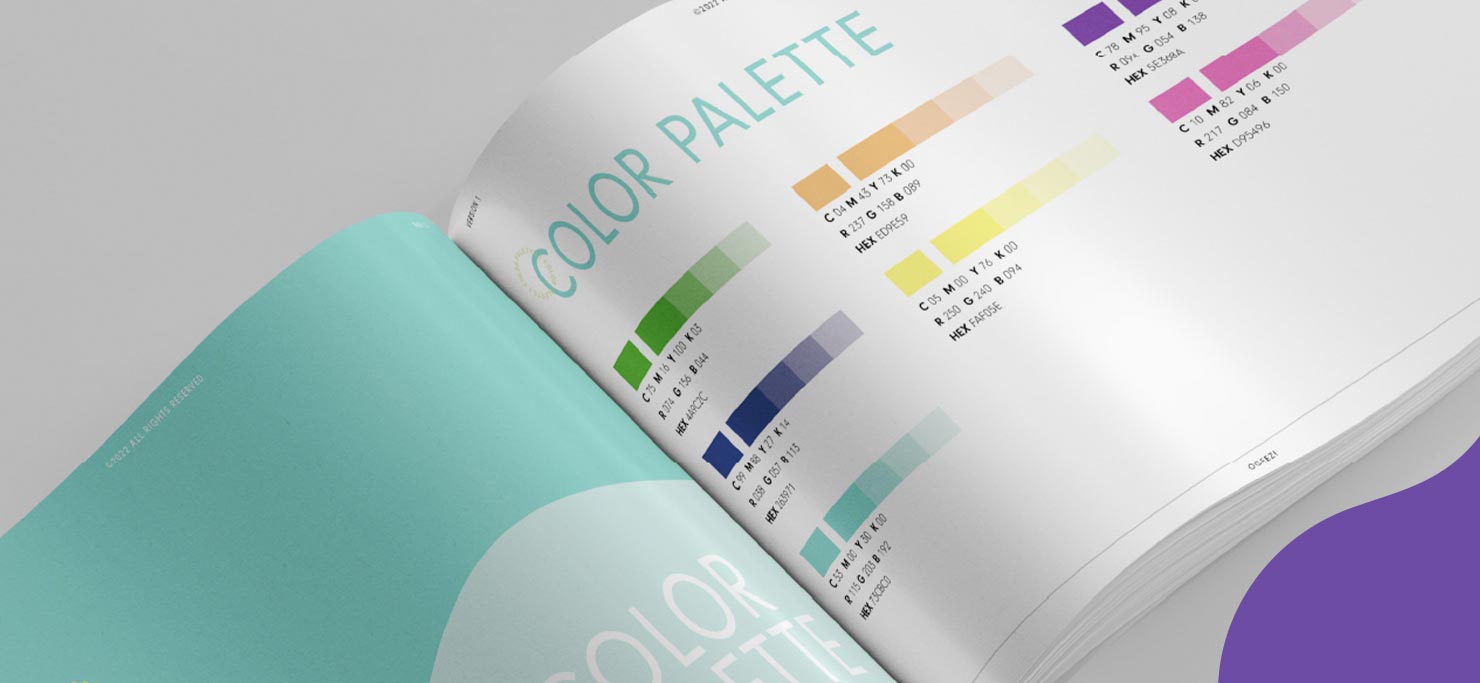
In the last section, we covered why creating highly targeted consumer personas is so important. If there’s anywhere that this will play a huge role, it’s in your color palette. Let’s kick this off with a great example of your color palette reflecting your audience.
Looking at the image above, what industry do you think this brand is in? We’ll give you four guesses:
- E-Commerce
- Financial Services
- Cannabis
- Retail
If you guessed e-commerce, financial services, or retail, then we hate to break it to you, but you are incorrect. This vibrant color palette actually belongs to a unique brand, OGEEZ!, an innovative cannabis company that approached us to help them create a consistent brand identity.
Spearheaded by creative director Sitara, we were able to communicate this in large part via their color palette. In the cannabis industry, it’s crucial that branding breaks stigmas and appeals to the right consumer.
The color palette needed to be bright but not abrasive, quirky without being cheesy, and eye-catching enough to draw their target market: the leisurely cannabis consumer.
If they used a ‘greener’ color palette, they would blend into the patchwork of cannabis companies. Rather than the Cheech and Chong feel of days past, this palette says, We’re different. We’re modern. Unwind with us.
Attention-grabbing typography
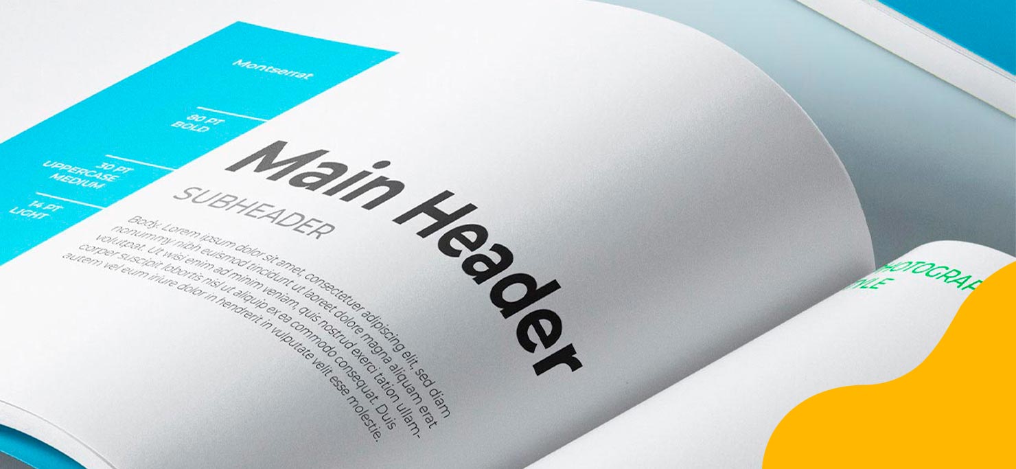
Typography design is one of those (super important) things that we tend to overlook. The thing that many brands don’t realize is that your typography design says a lot more about you than you think.
It not only makes things legible and easy to read for your customers, but it also has the power to influence how your customers view you as a brand. Having a typography design section in your style guide helps your brand stay consistent across all channels.
To kick things off, start with a font exploration session to get everyone on the same page.
It takes some trial and error and a lot of feedback from the team about what will communicate the message best, but once you’re done, the final product should look something like the image above.
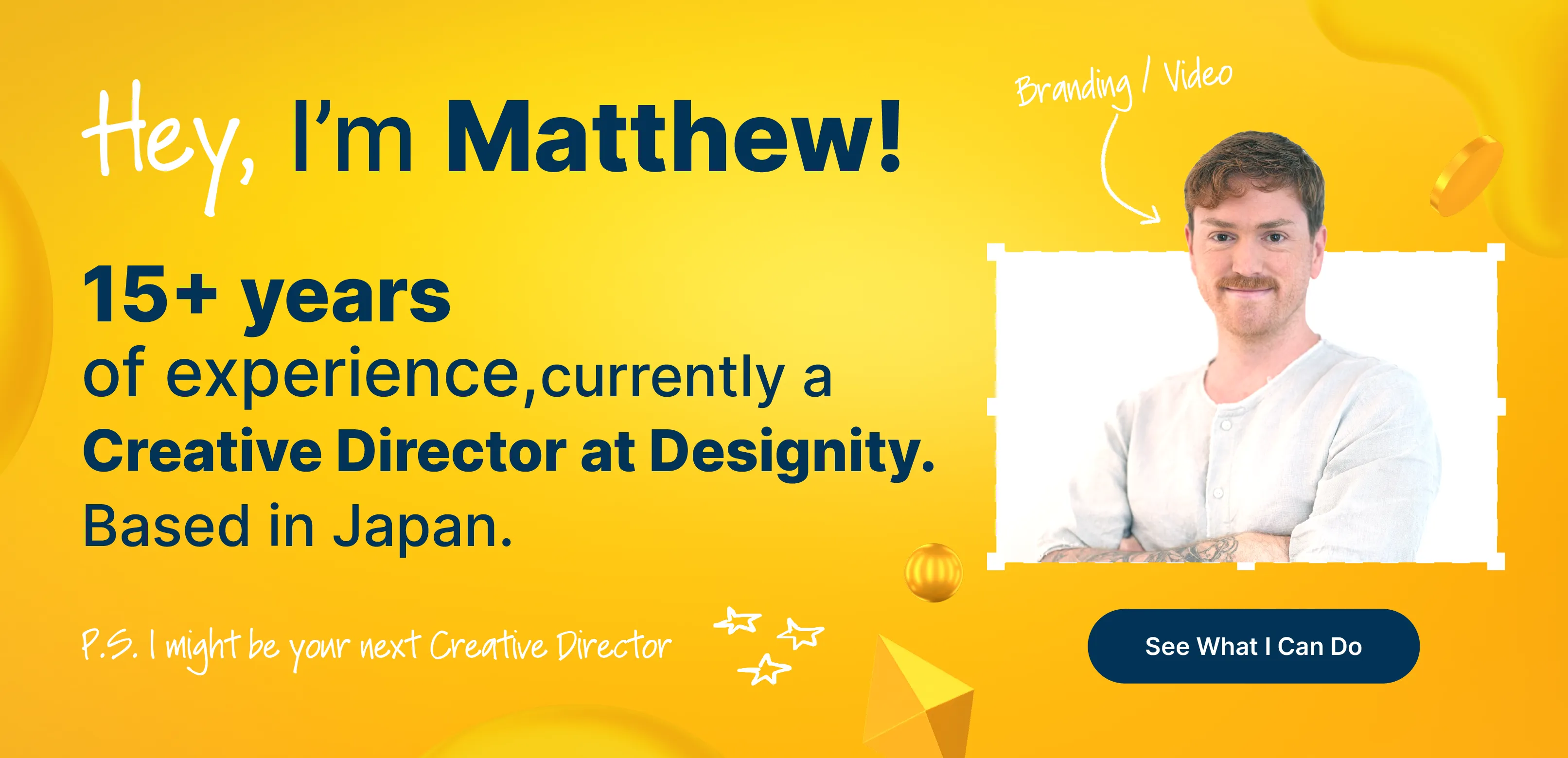
This typography design was headed by our creative director, Ruggero Vittorini. He helped Boomerang build an easy-to-digest guide that they can refer back to for all of their business collateral, no matter what the chosen channel.
Logo design
Just like your color palette, designing your logo for your target audience is integral. We asked one of our own graphic designers, Meaghan Wengert for her top tips when it comes to logo design for teen audiences:
“For Teens, it would be good to do some research into what is trending since their likes and dislikes change so frequently. For example, right now there are a lot of trends from the early 2000's coming in, so it might be good to lean into designs from that time period while still making sure that the design is solid enough to last past the fad.”
Make space for change: One popular misconception is that your logo never changes. You may refresh it every five years or so, but for the most part, it stays the same.
Your logo isn’t set in stone, it changes with the seasons, and it changes depending on what channel you’re displaying it on (social media, print ads, business collateral, etc.). When it comes to logo design, having variations of your logo is crucial.
Not only will it save your team time come Pride month or the holiday season, but it will save you the worry of not staying consistent across all channels.
A design style guide for the 21st century
Now that we’ve covered the most essential elements of what makes a great graphic design style guide, let’s put all of the pieces together with an example of a great brand style guide:
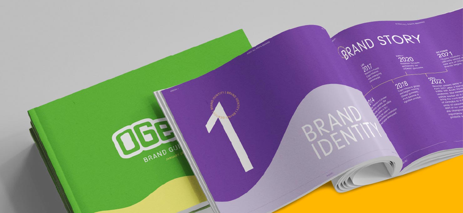
Visit their project page and scroll through. Note how OGEEZ’s brand style guide reflects the company’s values. Although this is meant to be an internal-only document, it still looks like their brand. Remember, just because no one will see your style guide but your team, doesn’t mean that it has to be boring.
Your graphic design style guide can be whatever you want it to be. Simple and straightforward or fun and exciting, the design choices are entirely up to you.
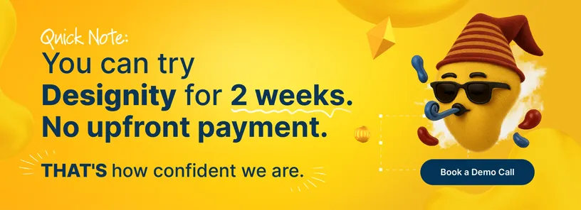
If building your own brand style guide is too daunting an undertaking, you’ve landed in the right place. See our creatives and marketers and creative directors in action by taking us out for a two-week test drive!
.webp)


.webp)
